
04.05.2022 - 06.04.2022 (Week 6 - Week 10)
Devina Angeline Wiratama / 0350824
Advanced Typography / Bachelor of Design (Hons) in Creative Media
Task 2A & 2B
<iframe src="https://drive.google.com/file/d/1dpuAlMBnmvCw2cJPwpfsn39c-KIxaWoR/preview" width="640" height="480" allow="autoplay"></iframe>
Jump link
LECTURES
INSTRUCTIONS
<iframe src="https://drive.google.com/file/d/1dpuAlMBnmvCw2cJPwpfsn39c-KIxaWoR/preview" width="640" height="480" allow="autoplay"></iframe>
Instruction 2A:
- Use the initial letters of your name or your
full name.
- Not complicated or confusing
- Not necessarily legible
Task 2 (A&B)
MUST be complete by Week 9
- Poster (A3 size)
- Animated Invite (800x800 / 1024x1024 px)
- Any 1 collateral relevant for your event/occupation
#Week9_202203 Task 2(A-B) Submission on 4 June 2022.
Key Artwork (BW & Colour) 1024 px (JPG & PDF)
Poster (A3) (1 artwork, 1 simulation) (JPG & PDF)
Animated Gif invite (800/1024 px)
1 collateral (your choice - simulate) (JPG & PDF)
PRACTICAL
Task 2A&B - Week 6 / 05.05.2022
Key ArtworkSketches - Golf


Fig. 1.1 - 1.3 / Golf Idea Sketches, Week 6 (05.06.2022)


Fig. 1.4 - 1.6 / Music Idea Sketches, Week 6 (05.06.2022)

Fig. 1.7 / Origami Idea Sketch, Week 6 (05.06.2022)
Because Im'not satisfied enough with my sketches and the feedback, I try other ideas.
Task 2A&B - Week 7&8 / 05.13&20.2022
Week 8 is Independent Learning Week
Key ArtworkOther Sketches


Fig. 1.8 / Ice Cream Logo Ideas, Week 7 (05.13.2022)


 Fig. 1.12 - 1.17 / First Poster Progress, Week 8 (05.20.2022)


Here are my sketches for the logo.
.jpg)


.jpg)

.jpg) Fig. 2.8 - 2.15 / Other Logos, Week 9 (05.27.2022)
Fig. 2.8 - 2.15 / Other Logos, Week 9 (05.27.2022)

Then I try to make the poster too since next week is the feedback session for a poster. Here are the references or elements that I used for the poster.


Fig. 1.9 - 1.11 / References for Ice Cream, Week 7 (05.13.2022)
Here is my first poster progress.


Here is my second poster progress.


Fig. 1.18 - 1.19 / Second Poster Progress, Week 8 (05.20.2022)
Task 2A&B - Week 9 / 05.27.2022
I don't know why I just cannot find the poster and logo that I want, I just don't like the result. The feedbacks also are not good. I decided to make other ideas again. Here are my references for the Logo and Poster from Instagram.


Fig. 2.1 - 2.7 / Other References Logo and Poster, Week 9 (05.27.2022)
Here are my sketches for the logo.

.jpg)


.jpg)

.jpg)
I kind of like the first and the second logo. I digitalize them in Illustrator. The first logo I will make like an Art Exhibit poster. For the second logo, I duplicate it and mirror it so it looks like an Owl, so the poster can be like a zoo poster.


Fig. 2.16 / Owl Logo, Week 9 (05.27.2022)


Here is my poster progress.


Fig. 2.17 - 2.21 / Poster Progress, Week 9 (05.27.2022)
I think I will choose these posters.
Fig. 2.22 - 2.24 / Poster Results, Week 9 (05.31.2022)
Then for the collateral and simulation, I took a template from Freepik since I don't have any time to do it. I did it on Adobe Photoshop. Here are the Collaterals for Logos.


Fig. 2.25 - 2.26 / Collaterals for Logos, Week 9 (06.01.2022)
Here are the Poster Simulations.


Fig. 2.27 - 2.28 / Poster Simulations, Week 9 (06.02.2022)
Next, we need to do a gif animation from the poster. I did it on Adobe After Effects. Here is my progress.


Fig. 2.29 - 2.30 / GIF Progress, Week 9 (06.02.2022)
Because I don't have much time, I cannot do the gif animation for both, the owl poster and art exhibit. I asked my friends. Most of them said that the Exhibit Art Poster is cool. So, I decided to choose the Art Exhibit Poster as the animated GIF. Here is the result.

Fig. 2.31 / GIF Animated for Art Exhibit Poster, Week 9 (06.02.2022)
Fig. 2.32 / Animated MP4, Week 9 (06.02.2022)
Task 2A&B FINAL - Week 10 (06.03.2022)
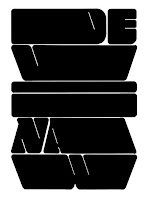
Here is my Final Digitalize Logo BW in JPG.
Fig. 3.1 / Final Logo BW in JPG, Week 10 (06.03.2022)
Here is my Final Digitalize Logo Colour in JPG.

Fig. 3.2 / Final Logo Colour in JPG, Week 10 (06.03.2022)
Here is my Final Collateral for the Logo in JPG.
Fig. 3.3 / Final Collateral for the Logo in JPG, Week 10 (06.03.2022)
Here is my Final Logo in PDF.
<iframe src="https://drive.google.com/file/d/13vRCSdok790DcApFRyI3-j6GtAz5MgQF/preview" width="640" height="480" allow="autoplay"></iframe>
Here is my Final Poster in JPG.
Fig. 3.4 / Final Poster in JPG, Week 10 (06.03.2022)
Here are my Final Simulation Posters in JPG.
Fig. 3.5 / Final Simulation Posters in JPG, Week 10 (06.03.2022)
Here are my Final Posters in PDF.
<iframe src="https://drive.google.com/file/d/1sz4hfpPU5MW83mWSYFd-ZaGd9e__YddO/preview" width="640" height="480" allow="autoplay"></iframe>
Here is my Final Animated GIF.
Fig. 3.6 / Final Animated GIF, Week 10 (06.03.2022)
Here is my Final Animated GIF.
Fig. 3.7 / Final Animated MP4, Week 10 (06.03.2022)
<iframe src="https://drive.google.com/file/d/1BLEOKzJQlB90_4FTKxV3darNRagwP_TX/preview" width="640" height="480" allow="autoplay"></iframe>
FEEDBACK
Week 7 / 05.13.2022
- Exercise:
- General FeedbackTry to make it in black and white first, instead of in colour. Many of you need to do more research on fonts
- Specific FeedbackThe third one is better than the others, do more explore
Week 9 / 05.27.2022
- Exercise:
- General Feedback
Look for more references to poster design from the expert (graphic designers, etc). - Specific Feedback
Not very imaginative. Explore more, try the cone only for the repetitive manner. Ice cream as a background is not working well.
Week 10 / 06.04.2022
- Final - Exercise:
- Specific Feedback
Why are there two KA? Please decide on one.
REFLECTION
Experience
In this assignment, I almost couldn't finish it because I couldn't find the right idea and what I wanted. In week 9, I finally found the logo idea I wanted and I had to finish it in one week for tasks 2A and 2B. I feel that on this assignment my work is not optimal, especially in the animation. However, because there was no time to revise it, I had to leave it like that. I wish I could get more time because each task is only limited to one feedback.
ObservationsI have observed that a company logo can be found by means of a font only, not necessarily an illustration. At first, I thought that a good logo always has an illustration, but that's not the case. In this assignment, I also learned that a logo can also form a poster. I am grateful to be able to take this module this 2nd semester
I find that to find good work must be accompanied by a lot of exploration as well. How balance, negative space, and other things can be very closely related to each other. I also realize that to get a good work there must be patience and persistence in doing it. In this task, never giving up is the key.
FURTHER READING

Fig. 4.1 / How to Make a Good Logo: The Dos and Don’ts, Week 10 (06.03.2022) - Source: WIX
Reference:
Ofra Lior (Social Design Team Lead) and Kylie Goldstein (BRanding Expert and Marketing Blogger).
Published online 29 June 2021
https://www.wix.com/blog/2018/07/good-logo-design-tips/
© 2021
Explore Conceptual Icons
In logo design, an icon is a simplified visual that captures the spirit of your brand. A common misconception is that your icon should literally be an image showing what your product or service is. While this may benefit some, it doesn’t have to be the case for all businesses. You can explore more conceptual (or even abstract) icons to emphasize what it is your company does.
Consider Nike, for example. The iconic “swoosh” icon evokes the feeling of movement and speed. Very fitting for a sportswear brand. Think of your icon as a symbol rather than a picture. It needs to be highly visual and easily recognizable. The advantage of a more graphic icon is that it can often carry more visual weight. Ideally, your icon should be simple enough that clients can recall it even after one quick glance.

Fig. 4.2 / Conceptual Ideas, Week 10 (06.03.2022)
Use the space you have
For most businesses, an icon is simply not enough to fully express their brand identity. If you use a logo maker, you will have a variety of options to insert your name and tagline. Also known as a slogan, taglines are dramatic phrases that sum up the tone and premise of a brand.
Now, not every company has a tagline. And that’s okay, but it doesn’t mean you should let this valuable space go to waste. If your name allows it, you can break it up into two lines while keeping the same font and size for both lines.

Fig. 4.3 / Use the space, Week 10 (06.03.2022)
Consider handwritten fonts
Creative typography remains to be one of the major logo design trends. Specifically, handwritten fonts are some of the best fonts for logos. They offer a quirky and authentic feel that is sure to delight any customer.
Handwritten typography is especially effective when used as the font of your tagline. If you’ve opted for one of these font styles, then this logo design tip is for you. Often the use of caps for handwritten fonts makes them seem less authentic, so take that into account.

Fig. 4.4 / Handwritten, Week 10 (06.03.2022)
Let your logo breathe
Just like the Mona Lisa, some logos look best when surrounded by a beautiful frame. If you decide to go in this direction, be sure to leave enough space between your chosen frame and logo. In essence, allow your logo some breathing room. If things are looking a little cramped, simply enlarge the frame or decrease the font size.

Fig. 4.5 / Breathe, Week 10 (06.03.2022)
Ensure readability
Your logo will be used in all your branding assets, from the header of your website to your business cards. Regardless of where your logo appears, your text should always be readable. To ensure this, take note of the text size and font that you use, and check the final result on various platforms (Facebook, Twitter, Instagram, etc.), and from different devices (desktop, smartphone, tablet, etc.).
If your logo is too difficult to read, what was the point of designing it in the first place? In order for your logo to serve its entire purpose, make sure it’s readable in any situation, for any potential customer.

Fig. 4.6 / Readability, Week 10 (06.03.2022)
Give your background contrast
Following the theme of visibility, another way to guarantee your logo is always ‘seen’ is by selecting a background colour that gives enough contrast with your text. If the colour of your text is white, go for darker background colour, such as black. So small, yet so effective.

Fig. 4.7 / Background Contrast, Week 10 (06.03.2022)
and more again.
Comments
Post a Comment