
04.01.2022 - 05.05.2022 (Week 1 - Week 6)
Devina Angeline Wiratama / 0350824
Advanced Typography / Bachelor of Design (Hons) in Creative Media
Task 1 - Exercise 1 & 2
Typographic Composition

Fig. 2.1 / Principle of Design - Emphasis, Week 2 (04.08.2022)


Fig. 2.2 - 2.3 / The Rule of Thirds, Week 2 (04.08.2022)

Fig. 3.12 / Laguna Copperplate Inscription, Week 3 (04.15.2022)

Fig. 3.17 / Javanese Script, Week 3 (04.15.2022)

In modern Malaysia, Jawi is of greater importance because it's the script used for all famous works of literature. Every Hikayat and Malay charm book is written in Jawi.
Jump link
LECTURES
Lecture 1 - Week 1 / 04.01.2022
Typographic Systems
"All design is based on a structural system". These are 8 major variations are as follows:
"All design is based on a structural system". These are 8 major variations are as follows:
- Axial
- Radial
- Dilational
- Random
- Grid
- Modular
- Transitional
- Bilateral
- Axial System
: All elements are organized to the left or right of a single axis.

Fig. 1.1 - 1.2, Axial System, Week 1 (04.01.2022) - Radial System
: All elements are extended from a point of focus.
 Fig. 1.3 - 1.4 / Radial System, Week 1 (04.01.2022)
 - Dilatational System
: All elements expand from a central point in a circular fashion (has hierarchy, or differentiate the info to different clubs).
 Fig. 1.5 - 1.6 / Dilatational System, Week 1 (04.01.2022)
 - Random System
: Appear to have no specific pattern or relationship.Fig. 1.7 - 1.8 / Random System, Week 1 (04.01.2022)

- Grid System
: A system of vertical and horizontal divisions.
 Fig. 1.9 - 1.10 / Grid System, Week 1 (04.01.2022)
 - Transitional System
: An informal system of layered banding (the type size and colours to make it interesting and create hierarchy).
 Fig. 1.11 - 1.12 / Transitional System, Week 1 (04.01.2022)
 - Modular System
: A series of non-objective elements that are constructed as a standardised unit.
 Fig. 1.13 - 1.14 / Modular System, Week 1 (04.01.2022)
 - Bilateral System
: All text is arranged symmetrically on a single axis.
 Fig. 1.15 - 1.16 / Bilateral System, Week 1 (04.01.2022)


Lecture 2 - Week 2 / 04.08.2022
Principles of Design Composition (the dominant principles)
: Emphasis, isolation, repetition, symmetry and asymmetry, alignment, and perspective to name a few.

Fig. 2.1 / Principle of Design - Emphasis, Week 2 (04.08.2022)
The Rule of Thirds
: A Photographic guide to composition, it basically suggests that a frame (space) can be divided into 3 columns and 3 rows.
: A Photographic guide to composition, it basically suggests that a frame (space) can be divided into 3 columns and 3 rows.


Fig. 2.2 - 2.3 / The Rule of Thirds, Week 2 (04.08.2022)
Typographic Systems
Of the 8 systems, the most pragmatic and the most used system is the grid system, which is derived from the grided compositional structure of Letter Press printing.

Fig. 2.4 / The Grid System, Week 2 (04.08.2022)
Environmental Grid
The system is based on the exploration of an existing structure or numerous structures combined (extractions of curved and straight crucial lines).

Fig. 2.5 / Environmental Grid, Week 2 (04.08.2022)
Form and Movement
Of the 8 systems, the most pragmatic and the most used system is the grid system, which is derived from the grided compositional structure of Letter Press printing.

Fig. 2.4 / The Grid System, Week 2 (04.08.2022)
Environmental Grid
The system is based on the exploration of an existing structure or numerous structures combined (extractions of curved and straight crucial lines).

Fig. 2.5 / Environmental Grid, Week 2 (04.08.2022)
The system is based on the exploration of an existing Grid system. The purpose of this system is to get students to explore, the multitude of options the grid offer, to dispel the seriousness surrounding the application of the grid system, and to see the turning of pages in a book as a slowed-down animation in the form that constitutes the placement of image, text and colour.

Fig. 2.6 / Form and Movement, Week 2 (04.08.2022)
Context and Creativity
The first mechanically produced letterforms were designed to directly imitate handwriting. Handwriting would become the basis or standard for form, spacing and conventions mechanical type would try and mimic. The shape and line of hand-drawn letterforms are influenced by the tools and materials used to make them.

Fig. 3.1 / Evolution of the Latin Alphabet, Week 3 (04.15.2022)
Cuneiform (c. 3000 B.C.E.)
: the earliest system of actual writing, was used in a number of languages between the 34C. B.C.E through the 1st century C.E. Written from left to right and evolved from pictograms.

Fig. 3.2 / Cuneiform, Week 3 (04.15.2022)
Hieroglyphics (2613-2160 B.C.E.)

Fig. 3.3 / Hieroglyphics, Week 3 (04.15.2022)

Fig. 3.4 / Letterforms, Week 3 (04.15.2022)
Printing
Movable Type (11C - 14C.)
: The earliest known printed book is the Diamond Sutra. This innovation was pioneered in China but achieved in Korea.

Fig. 3.5 / moveable Type, Week 3 (04.15.2022)
While the Phoenician letter marks a turning point in written language, the use of sound represented in letters, the script itself has been possibly influenced by the Egyptian Hieroglyphics and Hieratic Scripts.

Fig. 3.6 / Evolution of Middle Eastern Alphabets, Week 3 (04.15.2022)
From the Oracle, bone to seal script to clerical script. Traditional and simplified scripts.
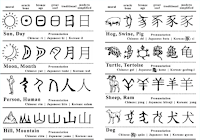
Fig. 3.7 / Evolution of the Chinese Script, Week 3 (04.15.2022)
The oldest writing found in the ‘Indian’ subcontinent, the Indus Valley Civilization (IVC) script (3500-2000 BCE)
: Is as yet undeciphered and seems to have been somewhat logo-syllabic in nature.

Fig. 3.8 / ‘Indian’ subcontinent the Indus Valley Civilization (IVC) script, Week 3 (04.15.2022)
The Brahmi script (450-350 BCE)
: The earliest writing system developed in India after the Indus script. It is one of the most influential writing systems; all modern Indian scripts and several hundred scripts found in Southeast and East Asia are derived from Brahmi

Fig. 3.9 / Brahmi Script, Week 3 (04.15.2022)
Kedukan Bukit inscription from Sumatra
: Was written in old Malay using the Pallava script. The oldest writing systems present in South East Asia were Indian scripts. But, the most important would be Pallava because it was highly influential becoming the basis for the handwriting system across South East Asia.

Fig. 3.10 / Kedukan Bukit Inscription, Week 3 (04.15.2022)
An early form of Nagari script
: Was used in India for writing Sanskrit where it can be seen today in the Blanjong inscription of Bali.

Fig. 3.11 / Pra-Nagari, Week 3 (04.15.2022)
Written in Kawi, "The bearer of a debt, Namwaran, along with his children Lady Angkatan and Bukah, is cleared of a debt by the ruler of Tondo." The word Kawi comes from the Sanskrit term Kavya which means poet and Kawi are used for contact with other kingdoms and became the basis of other scripts in Indonesia and the Philipines.

Fig. 2.6 / Form and Movement, Week 2 (04.08.2022)
Lecture 3 - Week 3/ 04.15.2022
Context and Creativity
The first mechanically produced letterforms were designed to directly imitate handwriting. Handwriting would become the basis or standard for form, spacing and conventions mechanical type would try and mimic. The shape and line of hand-drawn letterforms are influenced by the tools and materials used to make them.

Fig. 3.1 / Evolution of the Latin Alphabet, Week 3 (04.15.2022)
Cuneiform (c. 3000 B.C.E.)
: the earliest system of actual writing, was used in a number of languages between the 34C. B.C.E through the 1st century C.E. Written from left to right and evolved from pictograms.

Fig. 3.2 / Cuneiform, Week 3 (04.15.2022)
Hieroglyphics (2613-2160 B.C.E.)
- As ideograms, to represent the things they actually depict.
- As determinations to show that the signs preceding are meant as phonograms and to indicate the general idea of the word.
- As phonograms represent sounds that "spell out" individual words.

Fig. 3.3 / Hieroglyphics, Week 3 (04.15.2022)
Early greek (5th C. B.C.E.)
: These early Greek letters were drawn freehand, not constructed with compasses and rules, and they had no serifs. In time the strokes of these letters grew thicker, the aperture lessened, and serifs appeared.
Roman Uncials
: By the 4th century, Roman letters were becoming more rounded, the curved form allowed for fewer strokes and could be written faster.
English Half Uncials (8th C.)
: In England, the uncial evolved into a more slanted and condensed form.
Carolingian Minuscule
: Capitals at the start of a sentence, spaces between words and punctuation. A new script emerged. It was this style that became the pattern for the Humanistic writing of the fifteenth century; this latter, in turn, was the basis of our lower-case roman type.
Black Letter (12-15 C. CE)
: Characterized by tight spacing and condensed lettering. Evenly spaced verticals dominated the letterform. Condensing line spacing and letter spacing reduced the number of costly materials in book production.
The Italian Renaissance
: The newly rediscovered letterforms Antica. The renaissance analysis of form that was being applied to art and architecture was directed toward letterform — resulting in a more perfect or rationalised letter.

Fig. 3.4 / Letterforms, Week 3 (04.15.2022)
Printing
Movable Type (11C - 14C.)
: The earliest known printed book is the Diamond Sutra. This innovation was pioneered in China but achieved in Korea.

Fig. 3.5 / moveable Type, Week 3 (04.15.2022)
While the Phoenician letter marks a turning point in written language, the use of sound represented in letters, the script itself has been possibly influenced by the Egyptian Hieroglyphics and Hieratic Scripts.

Fig. 3.6 / Evolution of Middle Eastern Alphabets, Week 3 (04.15.2022)

Fig. 3.7 / Evolution of the Chinese Script, Week 3 (04.15.2022)
The oldest writing found in the ‘Indian’ subcontinent, the Indus Valley Civilization (IVC) script (3500-2000 BCE)
: Is as yet undeciphered and seems to have been somewhat logo-syllabic in nature.

Fig. 3.8 / ‘Indian’ subcontinent the Indus Valley Civilization (IVC) script, Week 3 (04.15.2022)
The Brahmi script (450-350 BCE)
: The earliest writing system developed in India after the Indus script. It is one of the most influential writing systems; all modern Indian scripts and several hundred scripts found in Southeast and East Asia are derived from Brahmi

Fig. 3.9 / Brahmi Script, Week 3 (04.15.2022)
Kedukan Bukit inscription from Sumatra
: Was written in old Malay using the Pallava script. The oldest writing systems present in South East Asia were Indian scripts. But, the most important would be Pallava because it was highly influential becoming the basis for the handwriting system across South East Asia.

Fig. 3.10 / Kedukan Bukit Inscription, Week 3 (04.15.2022)
An early form of Nagari script
: Was used in India for writing Sanskrit where it can be seen today in the Blanjong inscription of Bali.

Fig. 3.11 / Pra-Nagari, Week 3 (04.15.2022)
Written in Kawi, "The bearer of a debt, Namwaran, along with his children Lady Angkatan and Bukah, is cleared of a debt by the ruler of Tondo." The word Kawi comes from the Sanskrit term Kavya which means poet and Kawi are used for contact with other kingdoms and became the basis of other scripts in Indonesia and the Philipines.

Fig. 3.12 / Laguna Copperplate Inscription, Week 3 (04.15.2022)
Indonesia has a great number of historical writing systems. Scholars have theorized the existence of an Ancient Gujerati-derived Proto-Sumatran writing system which was the basis of medieval scripts on the Island. For example, Incung from Kerinci. Incung comes from a South Sumatran grouping of scripts known as Rencong.


Fig. 3.13 - 3.14 / Incung and Rejang, Week 3 (04.15.2022)
The Batak script was taken from a handbook on magic and divination while the Bugis script was called Lontara derived from the word Lontar is a type of palm used for writing manuscripts in the Malay Archipelago.


Fig. 3.15 - 3.16 / Batak and Bugis, Week 3 (04.15.2022)
Javanese script is a medieval descendant of Kawi, the image above (left) is the Surya Ngalam, a legal treatise and on the right, is a record sale of a female Batak slave to a British.

Fig. 3.17 / Javanese Script, Week 3 (04.15.2022)
Jawi is an Arabic-based alphabet, it was introduced along with Islam. Ancient Hindu societies in both South and South East Asia were classist and often caste-based while the lower classes were illiterate. When those traders engaged in missionary, they taught Jawi to people that have not learned to read and write. This then spread among the upper and middle class in trading ports.

Fig. 3.18 / Jawi - Record of Sale, Week 3 (04.15.2022)

Fig. 3.19 / Manuscript from the 19th Century (still uses traditional Javanese writing system), Week 3 (04.15.2022)
Lecture 4 - Week 4/ 04.22.2022
Designing Type
Consideration/ Limitations when making a typeface
: Needs to be recognized even in poor light conditions or when the reader was moving quickly past the sign.
Matthew Carter's fonts were created to address specific technical challenges like those posed by early computers. The purpose of this font was to be extremely legible even at a very small size on the screen due in part to the popularity of the internet and electronic devices.

Fig. 4.1 / Georgia and Verdana, Week 4 (04.22.2022)
In 1976, AT&T commissioned a new typeface whose sole purpose is for their telephone directories. The design had to solve multiple technical and visual problems related to the existing typeface in the phonebook. Thus, Bell Centennial was made.

Fig. 4.2 / Bell Centennial, Week 4 (04.22.2022)
Edward Johnston is the creator of the hugely influential London "Underground" typeface which was known as Johnston Sans (1916). He was tasked to create a typeface with bold simplicity that was modern yet rooted in tradition for the London's Underground railway's posters and signages, thus he combined classical Roman proportions with humanist warmth, but still had elegance and simplicity that absolutely fitted the modern age.


Fig. 4.3 / Johnston Sans, Week 4 (04.22.2022)
General Process of Type Design
- Research
- Sketching
- Digitization
- Testing
- Deploy
1. Research
- Understand type history, type anatomy, type conventions and terminologies.
- Determine the type’s purpose or what it would be used for and what different applications it will be used in.
- Examine existing fonts that are presently being used for inspiration/ideas/reference/context/usage pattern/etc.
2. Sketching
- Traditional
- Digital
- Use their brushes/pen/ink set because they are more confident with their hands and then scan them for digitization while some use digital toolsets like Wacom for much quicker, persistent, and consistent strokes, however, this hinders the natural movement of hands.
3. Digitization
- Professionals use apps: Glyphs and FontLab when digitizing their typeface. Some also use Adobe Illustrator to craft the letterforms and then introduce them to the specialized apps, however, this was frowned upon.
- When digitizing, attention should be given to the whole form and also the counter form since the readability of the typeface depends on it.
4. Testing
- The result of testing is part of the process of refining and correcting aspects of the typeface.
- Prototyping is also a part of the testing process that leads to important feedback. Depending on the typeface category (display type/text type), the readability and legibility of the typeface become an important consideration, however, it is not crucial if the typeface is display type, where expressions of the form take a little more precedence.
5. Deploy
Even after deploying a completed typeface there are always teething problems that did not come to the fore during the prototyping and testing phases. Thus, the task of revision doesn’t end upon deployment. The rigour of the testing is important so that the teething issues remain minor.
Typeface Construction
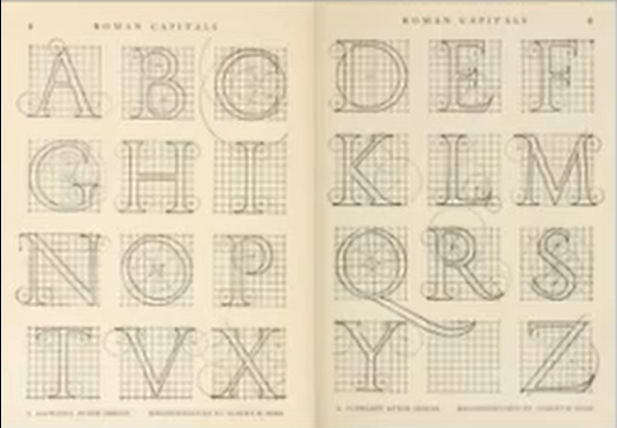
Fig. 4.4 / Construction Grid for Roman Capital, Week 4 (04.22.2022)
Roman Capital: the grids consist of a square and inside it was a circle that touches the lines of the square in 4 places. Within the square, there are rectangles that are 3 quarters the size of the square and are positioned in the centre of the square.
Grids (with circular forms) can facilitate the construction of letterforms and is a possible method to create your own letterform.
Construction and Considerations
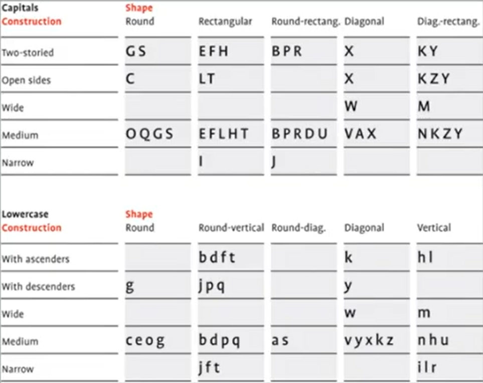
Fig. 4.5 / Construction and Consideration, Week 4 (04.22.2022)
The 26 alphabets can be arranged into groups and distinction is made between a group for the capitals and the lowercase letters.


Fig. 4.6 - 4.7 / Visual Correction, Week 4 (04.22.2022)
Many different forms and constructions must be taken into account when designing a new type. An important visual correction is the extrusion of curved (and protruding) forms past the baseline and cap line, which also applies to the vertical alignment between curved and straight forms.
Visual correction is also needed for the distance between letters. The letters must be altered to a uniform 'visual' white space which means that the whitespace between the letters should appear the same, this is called 'fitting' the typeface.
Lecture 5 - Week 5/ 04.29.2022
Perception & Organization
Perception is the way in which something is regarded, understood, or interpreted. Perception in typography deals with the visual navigation and interpretation of the reader via contrast, form, and organisation of the content. Content can be textual, visual, graphical or in the form of colour.
Contrast

Fig. 5.1 / Several Methods of Contrast, Week 5 (04.29.2022)
There are several methods of making contrast, the image above are methods of contrasts devised by Rufi Ruegg, but Carl Dair on the other hand, adds 2 more principles which are texture and direction. Thus, there are 7 methods:
- Size
- Weight
- Form
- Structure
- Texture
- Direction
- Colour
1. Size
The contrast of size provides a point to which the reader's attention is drawn, e.g; small and big letters, we will see big letters first and then the small letter, thus people usually make the title or heading in a bigger point size than the body text.


Fig. 5.2 - 5.3 / Size, Week 5 (04.29.2022)
2. Weight
Weight describes the bold type that can stand put in the middle of the lighter type of the same style. The heavy is the powerful point of visual attraction or emphasis, thus not only types can have varying weights.


Fig. 5.4 - 5.5 / Weight, Week 5 (04.29.2022)
The form is the distinction between a capital letter and its lowercase equivalent, or a roman letter and its italic variant, condensed and expanded versions of the typeface are also included under the contrast of form.


Fig. 5.6 - 5.7 / Form, Week 5 (04.29.2022)
4. Structure
Structure means the different letterforms of different kinds of typefaces such as monoline sans serif with a traditional serif, or an italic and a blackletter.


Fig. 5.8 - 5.9 / Structure, Week 5 (04.29.2022)
5. Texture
By putting together contrast, size, weight, form, and structure, Texture refers to the way a type looks like a whole up close and from a distance, it depends partly on the letterforms themselves and partly on how they're arranged. 

Fig. 5.10 - 5.11 / Texture, Week 5 (04.29.2022)
6. Direction
Direction is the opposition between vertical and horizontal, and the angles in between. Turning one word on its side can have a dramatic effect on a layout. Text blocks also have their vertical or horizontal aspects of direction. Mixing wide blocks of long lines with tall columns of short lines can also create a contrast.

Fig. 5.12 - 5.13 / Direction, Week 5 (04.29.2022)
The use of colour is suggested that a second colour is often less emphatic in value than plain black on white. Therefore it is important to which element needs to be emphasized and pay attention to the tonal values of the colours that are used.7. Colour


Fig. 5.14 - 5.15 / Colour, Week 5 (04.29.2022)
Form
Form refers to the overall look and feel of the elements that make up the typographic composition. It is the part that plays a role in visual impact and first impressions. A good form tends to be visually intriguing to the eye which means it leads the eye from point to point, entertains the mind and is most often memorable.
Fig. 5.16 / Form, Week 5 (04.29.2022)
Originates from the Greek word "typos" (form) and "graphics" (writing), typography means to write in accordance with the form and have 2 functions:
- To represent a concept
- To do so in Visual form
The form provides a sense of letterforms' unique characteristics and abstract presentation.


Fig. 5.17 - 5.19 / Form, Week 5 (04.29.2022)


Fig. 5.20 - 5.21 / Manipulation Typeface in Form, Week 5 (04.29.2022)
Organisation / Gestalt
Gestalt psychology is an attempt to understand the laws behind the ability to acquire and maintain meaningful perceptions. The gestalt theory emphasizes that the whole of anything is greater than its parts.
Organisation / Gestalt: Perceptual Organisation / Grouping
- Law of Similarity
- Law of Proximity
- Law of Closure
- Law of Continuation
- Law of Symmetry
- Law of Simplicity (Praganz)
- etc

Fig. 5.22 / Gestalt Principles of Grouping, Week 5 (04.29.2022)
1. Law of Similarity
: All elements that are similar to each other tend to be perceived as a unified group. Similarity refers to any number of features including colour, orientation, size, or intended motion.

Fig. 5.23 / Law of Similarity, Week 5 (04.29.2022)
2. Law of Proximity
: Elements that are close together tend to be perceived as a unified group meaning that item that is close to each other tend to be grouped together, whereas item further are less likely to be grouped together.

Fig. 5.24 / Law of Proximity, Week 5 (04.29.2022)
: Refers to the mind's tendency to see complete figures or forms even if a picture is incomplete, partially hidden, or part of the information needed is missing.


Fig. 5.25 - 5.26 / Law of Closure, Week 5 (04.29.2022)
4. Law of (Good) Continuation


<iframe src="https://drive.google.com/file/d/1dpuAlMBnmvCw2cJPwpfsn39c-KIxaWoR/preview" width="640" height="480" allow="autoplay"></iframe>
Task 1
#Week5_202203 (Friday’s class) Task 1 submission: 5th May, 5PM (week 6).


Fig. 6.1 - 6.2 / Axial System, Week 1 (04.01.2022)
#Feedback:


Fig. 6.4 - 6.5 / Bilateral System, Week 1 (04.01.2022)
#Feedback:

Fig. 6.7 - 6.8 / Dilatational System, Week 1 (04.01.2022)
#Feedback:
Human tends to perceive each of 2 or more objects as different, singular, and uninterrupted object even when they intersect. The alignment of the objects/forms plays a major role in this principle taking effect.

Fig. 5.27 / Law of Continuation, Week 5 (04.29.2022)
5. Law of Symmetry (Praganz)
States that elements that are symmetrical to each other tend to be perceived as a unified group. Similar to the law of similarity, this rule suggests that objects that are symmetrical with each other will be more likely to be grouped together than objects not symmetrical with each other.

Fig. 5.28 / Law of Symmetry, Week 5 (04.29.2022)
INSTRUCTIONS
<iframe src="https://drive.google.com/file/d/1dpuAlMBnmvCw2cJPwpfsn39c-KIxaWoR/preview" width="640" height="480" allow="autoplay"></iframe>
Task 1
Exercise 1
The text given was included in the Module Information Booklet:
The Design School,
Taylor's University
Taylor's University
All Ripped Up: Punk Influences on Design
or
The ABCs of Bauhaus Design Theory
or
Russian Constructivism and Graphic Design
Open Public Lectures:
June 24, 2021
Lew Pik Svonn, 9AM-10AM
Ezrena Mohd., 10AM-11AM
Suzy Sulaiman, 11AM-12PM
June 25, 2021
Lim Whay Yin, 9AM-10AM
Fahmi Reza, 10AM-11AM
William Harald-Wong, 11AM-12PM
Lecture Theatre 12
#Week5_202203 (Friday’s class) Task 1 submission: 5th May, 5PM (week 6).
PRACTICAL
Task 1 - Week 1 / 04.01.2022
We need to make 8 Typographical Systems (Axial, Bilateral, Dilatation, Grid, Modular, Radial, Random, and Transitional Systems).
Axial System
Axial System


Fig. 6.1 - 6.2 / Axial System, Week 1 (04.01.2022)
#Feedback:
Interesting Difficult to read. The large body of the text does not have much differentiation makes it hard to read.

Fig. 6.3 / Axial System after feedback, Week 2 (04.08.2022)
Bilateral System

Fig. 6.3 / Axial System after feedback, Week 2 (04.08.2022)
Bilateral System


Fig. 6.4 - 6.5 / Bilateral System, Week 1 (04.01.2022)
Incorrect bilateral.

Fig. 6.6 / Bilateral System after feedback, Week 2 (04.08.2022)
Dilatational System

Fig. 6.6 / Bilateral System after feedback, Week 2 (04.08.2022)
Dilatational System


Fig. 6.7 - 6.8 / Dilatational System, Week 1 (04.01.2022)
#Feedback:
Nice one.
Grid System


Fig. 6.9 - 6.10 / Grid System, Week 1 (04.01.2022)
#Feedback:


Fig. 6.9 - 6.10 / Grid System, Week 1 (04.01.2022)
Excellent work. Having slightly more paragraph space. Differentiated name-date for readability.

Fig. 6.11 / Grid System after feedback, Week 2 (04.08.2022)
Modular System


Fig. 6.1 - 6.13 / Modular System, Week 1 (04.01.2022)
#Feedback:
Creating a modular might be correct but not sure.

Fig. 6.14 / Modular System after feedback, Week 2 (04.08.2022)
Radial System


Fig. 6.15 - 6.16 / Radial System, Week 1 (04.01.2022)
#Feedback:
Good one.
Random System


Fig. 6.17 - 6.18 / Random System, Week 1 (04.01.2022)
#Feedback:
Needs more work.

Fig. 6.19 / Random System after feedback, Week 2 (04.08.2022)
Transitional System
Fig. 6.20 - 6.21 / Transitional System, Week 1 (04.01.2022)
#Feedback:
A bit empty. Spread down a little bit more, and increase point size for important information.
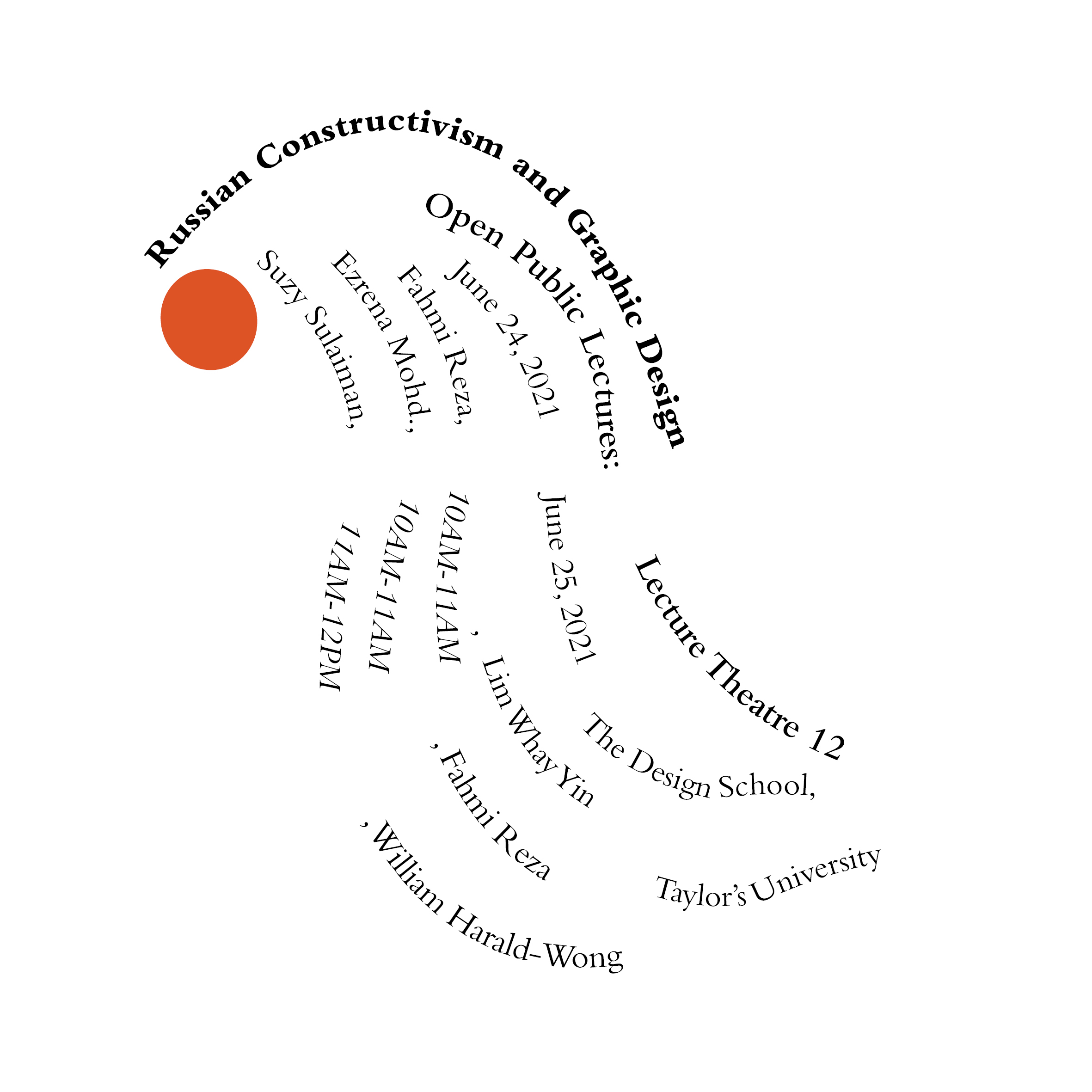
Fig. 6.22 / Transitional System after feedback, Week 2 (04.08.2022)

Fig. 6.23 / First Result, Week 1 (04.01.2022)
Then I tried to make some revisions. Here is my second result.

Fig. 6.24 / Second Result, Week 2 (04.08.2022)
Result in JPG.

Fig. 6.24 / Second Result, Week 2 (04.08.2022)
Result in JPG.

Fig. 6.25 / Final Grid System, Week 2 (04.08.2022)

Fig. 6.26 / Final Modular System, Week 2 (04.08.2022)

Fig. 6.27 / First Modular, Week 2 (04.08.2022)

Fig. 6.28 / Final Bilateral System, Week 2 (04.08.2022)

Fig. 6.29 / Final Random System, Week 2 (04.08.2022)

Fig. 6.30 / Final Transitional System, Week 2 (04.08.2022)

Fig. 6.31 / Final Axial System, Week 2 (04.08.2022)

Fig. 6.32 / Final Radial System, Week 2 (04.08.2022)

Result in PDF.
<iframe src="https://drive.google.com/file/d/1ti9nHhiXRYCTbOVM-KemjgbqPRFeDGMu/preview" width="640" height="480" allow="autoplay"></iframe>
Task 2A - Week 2 / 04.08.2022
For exercise 2 part 1, we are tasked to analyse, dissect, and identify potential letterforms (4 letters only) within a chosen image of a subject. The instructions:
- Uppercase or lowercase only
- Choose a reference typeface from the 10 typefaces or outside that.
Here is the object that I choose, from black and white photography and I tried to trace the font that I found. Here it is.
Here is the object that I choose, from black and white photography and I tried to trace the font that I found. Here it is.


Fig. 7.1 - 7.2 / Traced Letters L, U, Y, R, V, J, Week 2 (04.14.2022)
Here are the traced letters. I decided to choose the word L, J, Y, and V capital.

Fig. 7.3 / First try, Week 2 (04.14.2022)
Here is the font reference. It is ITC New Baskerville Std - Bold.

Fig. 7.4 / Font Reference, Week 2 (04.14.2022)
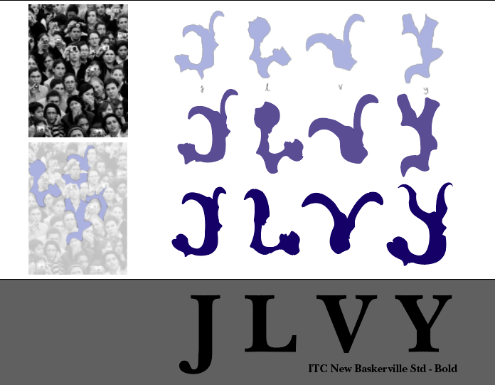
Fig. 7.5 / Second try, Week 2 (04.14.2022)
After I found the characteristic, I tried to make the consistency smooth again. I tried to make the consistency by handwriting first for the idea.

Fig. 7.6 / Try to be consistent more, Week 3 (04.21.2022)
I find it hard on the V and Y words. I tried again in the Adobe Illustration. Here is the evolution.

Fig. 7.7 / Evolution#1, Week 3 (04.21.2022)

Fig. 7.8 / Guide, Week 3 (04.21.2022)

Fig. 7.9 / First Result, Week 3 (04.21.2022)
#1Feedback:

Fig. 7.6 / Try to be consistent more, Week 3 (04.21.2022)

Fig. 7.7 / Evolution#1, Week 3 (04.21.2022)

Fig. 7.8 / Guide, Week 3 (04.21.2022)
Here is my first result.

Fig. 7.9 / First Result, Week 3 (04.21.2022)
#1Feedback:
Need work again with the Y and V. The guide from Baskerville does not work for your font. Need to remove the circle part from V and the Y is incorrect.
I did some revisions, here is my second try.

Fig. 7.10 / Second Try, Week 3 (04.21.2022)
No need to erase the tiny sharp thing. Sharper in the base of Y, a little bit cut in the cap.
Here is my last try.


Here is the result in JPG.

Fig. 7.13 / Result in JPG, Week 4 (04.22.2022)
<iframe src="https://drive.google.com/file/d/1fJAMRvNjWxzNaTPPCSoW90V9GdoWMtRi/preview" width="640" height="480" allow="autoplay"></iframe>


Here is my last try.


Fig. 7.11 - 7.12 / Last try, Week 4 (04.22.2022)
Fig. 7.13 / Result in JPG, Week 4 (04.22.2022)
Result in PDF.
<iframe src="https://drive.google.com/file/d/1fJAMRvNjWxzNaTPPCSoW90V9GdoWMtRi/preview" width="640" height="480" allow="autoplay"></iframe>
Task 2B - Week 4 / 04.22.2022
This week we started with our next task, Type & Image.


Fig. 8.1 - 8.3 / Image, Week 4 (04.22.2022)
I tried to put a type font on the water image. I tried the displacement map from this tutorial. Then I liquefy and give the gaussian blur on the reflection. Here is the progress.


#Font: Futura Std - Bold
Here is the result.

Fig. 8.6 / Result#1, Week 4 (04.22.2022)
Next, I tried to put a type font on the water image. I tried the honey candy texture from this tutorial. Here is the progress.


#Font: ITC New Baskerville Std - Bold
Here is the second result.

Fig. 8.9 / Result#2, Week 4 (04.22.2022)
#Feedback
#1, It's okay but not great
#2, wrong choice typeface, don't use serif. Don't look like it's part of the honey thing. Needs more work.
Task 2B - Week 5 / 05.02.2022
I tried with another image. Here is the original image.


Fig. 9.1 / Burning Rose Image, Week 5 (05.02.2022)


Fig. 9.2 - 9.5 / Third Progress, Week 5 (05.02.2022)
Footlight MT Light - Regular
Here are the results.

Fig. 9.6 / First Result, Week 5 (05.02.2022)

Fig. 9.7 / Second Result, Week 5 (05.02.2022)

Fig. 9.8 / Third Result, Week 5 (05.02.2022)
I feel I more like the third result.
Final in JPG.
Fig. 9.9 / Final Result, Week 5 (05.02.2022)
Final in PDF.
<iframe src="https://drive.google.com/file/d/1eULDykk10kznQQI_NbxjzJpghlBberRk/preview" width="640" height="480" allow="autoplay"></iframe>
Week 2 / 04.08.2022
FEEDBACK
Week 2 / 04.08.2022
- Exercise:
- General FeedbackMany of you guys doing it in AI and it's wrong. For the font colour, should not be using pastel colours.
- Specific Feedback- (Axial) Interesting but difficult to read. The large body of text does not have much differentiation makes it hard to read.- (Bilateral) Incorrect bilateral.
- (Dilatation) Nice one.
- (Grid) Excellent work. Having slightly more paragraph space. Differentiated name-date for readability.
- (Transitional) A bit empty. Spread down a little bit more, and increase point size for important information.
- (Random) Need more work - (Radial) Good one.
- (Modular) Create modularly, this might be correct but not sure
Week 3 / 04.15.2022
- Exercise:
- General Feedback
You need to have font references and must be documented at the beginning of your blog, the purpose is that your font is not incorrect in the future - Specific Feedback
Interesting. Give it to go, you seem to know what you want.
Week 4 / 04.22.2022
Week 5 / 04.29.2022- Exercise:
- General Feedback
Many of you make the stroke too thin - Specific Feedback
#1. Need work again with the Y and V. The guide from Baskerville does not work for your font. Need to remove the circle part from V and the Y is incorrect
#2. No need to erase the tiny sharp thing. Sharper in the base of Y, a little bit cut in the cap.
- Exercise:
- General Feedback
The colour can adapt from the image colours. Pay attention to the texture, edge, etc. - Specific Feedback
#1, It's okay but not great
#2, wrong choice typeface, don't use serif. Don't look like it's part of the honey thing. Needs more work.
Week 7 / 05.13.2022
- Final - Exercise:
- Specific Feedback
W7 - Ex1 Excellent work. Ex2: FT choice of image is an issue which affected the outcome as it is difficult to relate the two, T&I is excellent. - Final - Blog:
W7 - Neat, detailed, good.
REFLECTION
Experience
For exercise 1, I gained a lot of experience in typographic systems. I know there are many different types of typographic systems and I've been trying hard to think of them. In my opinion, the most difficult typography system is the random system. Maybe because you're used to always following the rules, it's rare to get out of the rules so it's a little difficult to create a random system. For exercise 2 was actually quite fun, but quite heavy because of the limited time. But overall, these exercises are good exercises, to train typography sensitivity, and creativity, and also to get out of the rules themselves.
ObservationsThere are many things that I can observe in this exercise. In exercise 1, I had to observe point size, balance, and rhythm. In exercise 2, I had to be sensitive to the shape of the font type, imagine how the font would be applied, and also be able to edit in exercise 2B. I'm having a bit of trouble in the 2B exercise because I haven't used Adobe Photoshop in a long time and I don't really understand how to manipulate or edit the font.
I find myself less rigid in typography. I learned to get out of that rigidity, and learned to get out of my comfort zone. When doing type and drawing exercises, I find that the fluidity/movement of the text is a key point when creating interactions between the two. I also find myself more patient and more thorough in viewing and observing typography. I feel like all the typography exercises in class so far have been worth it. I'm grateful to be able to take this class
FURTHER READING

Fig. 9.1 / Artifact 2015 | Volume 3, Issue 4 | Page 8.1 - 8.8, Week 3 (04.21.2022) - Source: Facebook
Based on one of the requirements of this typography blog, I did some further reading with the book "ARTIFACT 2015 | Volume III, Issue 4 | Pages 8.1-8,8" by Sofie Beier, The Royal Danish Academy of Fine Arts, School of Design, which Mr Vinod recommended.
Reference:
Beyer Sofie (2015). Artefact 2015.
Published online 28 July 2015
ISSN 1749-3463 print/ISSN 1749-3471
http://dx.doi.org/10.14434/artifact.v3i4.6199
© 2015 Artifact
Baskerville was the first typefounder of his era that took inspiration from the calligraphic trade, and he did this at a time when the calligraphic culture of using a pointed nib pen had been en vogue for at least half a century. It is an interesting observation that in this period, printers had lost any connection to type as originating in the writing hand. Not only did Baskerville develop a new paper, ink and type, he also introduced a novel page layout of large margins, wide-spaced text, and no ornaments, which at the time must have appeared highly radical (Figure 9.2).

Fig. 9.2 / John Baskerville’s type in his famous edition of Virgil’s poetry (1757), Week 3 (04.21.2022)
How did Baskerville manage to develop innovative designs? Did he apply a work method similar to that defined in present-day design theory, or did the ideas just come to him? Here is the design process.
Stage 1: Specification
In the first stage of designing, the task is to identify all aspects of the problem at hand. This is the moment to identify the “existing situation” that needs to be changed into a preferred one (Simon 1988), as the designer combines his or her own experiences and understandings of the problem, and through that specifies the starting point of the project. Nigel Cross (2007, p. 24) has emphasized that design problems by nature are ill-defined, as not all are solvable. It is impossible to find adequate answers to all possible questions. The designer will need to apply a working method that accommodates a certain level of constant uncertainty.
John Baskerville intended to produce a new style of printing type; his type should be different from anything seen in print before (Baskerville 1758, p. A3). His aim was to produce a typeface that stood clear on the page with high contrast between the black and white colours. This was his clear specification, and supposedly, this was what kept him going throughout the seven years of hard work.
Stage 2: Analysis
At the analysis stage, the designer no longer is focused on his or her own experiences and opinions, but instead focuses on how the project fits into the world. In addition to traditional information gatherings such as literature and online searches, and to the identification and analysis of similar projects, the designer will be further informed of the objectives by carrying out various forms of audience research. Nini (2006) suggests three different methods for this, one being surveys of questionnaires and interviews, another being behavioural research of observing the design in use, and the third being participatory research where the user is involved in the development of the product.
While gathering new material, it is crucial to continuously structure the information and to look for patterns. The designer starts out by first collecting all the information that springs to mind and then sits down to evaluate its importance and will most likely end up considering the majority of the findings as irrelevant for the final solution. Baskerville’s analysis was most likely based on close visual inspections of calligraphic writing hands and on printed books. His main inspiration came from the contemporary calligraphic culture of the pointed nib pen, while he used his study of the printed books to understand his competitors’ work. Baskerville’s goal was to “obtain a ‘reputation of excelling in the most useful art known to mankind’” (Straus & Dent 1907, p. 102). There is no record indicating that he made use of any form of modern-day audience research. Had he asked for the opinion of his peers, he would most likely have received somewhat negative feedback.
Stage 3: Creating
Exploration and creative thinking dominate this next stage of the process. At this point, the designer will generate a response to the defined problem using the designer’s own imagination. To motivate creative thinking, Lau and colleagues (2009) describe a number of thinking techniques that all facilitate a shifting perspective on the project through divergent thinking. Another way of shifting perspective is to apply the mental operation of Conceptual Blending; proposed by Fauconnier and Turner (2002; 2003), the idea is to combine elements from within two matters that normally do not have a natural relation, and by doing so, produce a novel unexpected angle on the project. This method has often been used in the fashion industry.
In fact desired, as the lack of control brings on a certain kind of coping strategy that can lead to great insight and innovative combinations of elements. At this point of the process, hand sketching will provide the designer with a unique opportunity to carry out a discussion with one’s self and facilitate a critical evaluation of the different solution attempts, which then can be held up against the various objectives identified in the analysis stage. Through sketching, the designer can try out the validation of an idea, and reflect on all the possible angles to see which is the strongest. When working on multifaceted projects, sketching further allows for more aspects to be visible at once, and to maintain an overview of the complexity, while keeping a focus on all critical details that will need to be reworked. By doing so, the designer will be able to move up and down in the level of complexity of the overall project.
He would apply a method of conceptual blending by drawing on elements from within two unrelated matters: calligraphy and printing type. The nature of the blend was so that he drew on the visual features of the calligraphic letters, and combined these with the media of print. All the shapes of Baskerville’s type can be created with the pointed nib pen (Figure 9.3); knowing that Baskerville was a writing master, the pointed nib pen must have been his preferred sketching tool in the exploration of the letter shapes.

Fig. 9.3 / Baskerville was inspired by this calligraphic style of writing, Week 3 (04.21.2022)
Stage 4: Form Making
Occasionally, when the designer reaches the Form Making stage, all major decisions and reflections on ideas and strategies have been made. In such rare situations, the designer will be able to dig into the world of creating beautiful and harmonious shapes and forms. Yet, in most projects, aspects of form-making will have a significant influence on all the stages of the process. What really separates this stage from the previous stages is the central influence of the craft. In most fields within design, successful form-making is closely tied to mastering the skills of the trade. The furniture designer needs to know how the wood behaves when bent, the fashion designer needs to understand the nature of the drape, and the type designer needs to understand the balance between the inner and outer shapes of the letters. These trades are all heavily influenced by tacit knowledge gained through practice, and by specific rules of the trade that can be learned through a master-apprentice relationship, or through trial and error.
Comments
Post a Comment