23.04.2024 - 11.08.2024 (Week 01 - Week 16)
Devina Angeline Wiratama / 0350824
Major Project / Bachelor of Design (Hons) in Creative Media
RANTAU // Final Year Project
Major Project / Bachelor of Design (Hons) in Creative Media
RANTAU // Final Year Project

MIB
<iframe src="https://drive.google.com/file/d/1I3bA1WHVQIyRcvUmUWT6yKrFRIj-VWmG/preview" width="640" height="480" allow="autoplay"></iframe>
Assessment Tasks:
1. Digital Proposition (cont)
2. Project Management (cont)
3. Project Presentation
4. Final Project
Description:
1) Digital Proposition (Deadline: W5)
a. Research Dissertation/ Document for the theme.
Title, theme, target audience, objective, key visual, etc.
2) Project Management (MIB)
a. Weeklog
b. Google document
3) Project Presentation
Outcome: Slide
4) Final Project
Outcome: Video link
RESEARCH
WEEK 1 / 22.04.2024
Today is the first class of major projects. Mr Asrizal gave us a brief explanation of our module.
Note:
- 30 April (2pm): Seniors come
- 14 May: workshop
- Idea has to be finalized by W3
💬How to get the topic:
- Take a look back at my dissertation.
- Actual live brief (go to get a client)
- Find any topic (start from zero)
🤔Question to ourselves:
- What is the purpose?
- Who is our target audience?
- Who does benefit from it?
- What problems are you solving? (blue ocean strategy - create a totally new market)
- 5W1H
Mr Asrizal also mentioned that now we can have our final project with a friend/ partner. We have to create something that has value, not only aesthetically but functional.
🌸IDEATION RESEARCH (Ideation)
I decided to be in the same group as Abigail (UI/UX). After the class, we had a meeting together to discuss the idea or concept for our project. We put our ideas in Miro.
I told her that, what if we create something that we are confident with because we have experience with it already. We created an application that can help Anak Rantau to survive by buying groceries, medical, or maybe gym, accommodation, etc but it's only for students (so it's filterable with student price), for example, want a gym but under RM10 so there will be a map that guides to that place. But it may sound like people can use Google as well to look for this information. So I try to think about what makes it special and different from Google. This is what I suggest to the group:
Unique points to differentiate with our competitor (Google Maps)
1. Login using a student card (because is personalized for students, not adults)
2. Can set budget (when students search location, let's say gym. Then under gym got space for the budget. Then the student only wants rm10. The pin 📍location only shows the gym with price rm10, while more than rm10 will not show up in the maps)
3. Scan receipts then you will get points (by scanning the receipt, the student can get points)
4. Expenses report (from the scanned receipt, OCR will detect and manage your expense data. So every month student will get a report on how much is their expenses). OCR is optical character recognition.
5. Collect points to get a discount or voucher (to boost up the student condition, which makes a lot of students join -> make a community. This app can’t stand alone, and needs a community inside it to give reviews, like Grab). And because community-based apps, it is more trustworthy. Let's say a student wants to rent a place, but with a good landlord and or agent (because based on my experience, my previous landlord was not that great so I wish that I could tell other students don't get the same bad experience as me). so from here we can make it come true by having a community-based.
6. Review (students can give a review of each of the locations)
How do we get the money to give the student voucher?
1. Ads from the targeted location that we have (for example: Jaya grocer, etc) from there Jaya will pay us for the advertising
2. Students can get a premium account (there are no ads) by paying only RM 1 every month
These were the ideas that I thought of. Some of my ideas my friend agrees some of them she disagrees. So since need to do a final year project based on our specialisation, I let my friend do the application and I will do the animation.
⭐Result ideas #1 meeting:
We had 3 ideas in our discussion, but only one that we think is solid enough. For the ideation, I suggested to Abigail the Anak Rantau idea. Because I believe we can do better in this topic since we are foreigners and we experienced it.
1. Cooking Made Easy (Abigail's Idea)
2. Recycling Made Fun (Abigail's Idea)
3. Anak Rantau (Devina's Idea)
1) Cooking Made Easy
Problem:
The daunting task of learning to cook for individuals with no prior experience necessitates the development of an accessible cooking guide application tailored to beginners, addressing their lack of culinary knowledge and providing step-by-step instructions, recipes, and essential cooking tips in a user-friendly format.
Idea:
An application that guides cooking
Main Feature:
- AR that guides based on your surrounding
- Informational Animation Video
Competitor:
2) Recycling Made Fun
Problem:
The lack of accessible and comprehensive recycling information leads to confusion and inefficiency, highlighting the critical need for a user-friendly recycling guide application to empower individuals in making informed recycling decisions and ultimately reduce waste generation and environmental harm.
Idea:
An application that educates, gives information and challenges people to do recycling
Main Feature:
- AR that guides about recycling
- Points/ gamification that can be redeemed.
Competitor:
none.
3) Anak Rantau (🏆)
Description:
Anak Rantau is an Indonesian and Malaysian language. This means someone who is looking for a living, and knowledge outside his hometown
Problem:
The challenge of non-local students navigating unfamiliar surroundings to find essential amenities underscores the necessity for an intuitive application providing localized guidance to streamline their search and access to daily necessities.
Target Audience:
Non-local student (15+). Specifically in Malaysia, around Taylors' University (?).
Idea:
An application that guides non-local students' essential needs
Main Feature:
- Maps - can be chosen based on location
- Groceries, transport, Medication, Accommodation, shops (filter-able).
- Review rating, pricing, and community.
- Trivia (promotion of the day).
Objectives:
a. Streamlined Access: Develop an intuitive application to swiftly connect non-local students with nearby essential amenities such as grocery stores, pharmacies, and public transport, easing their transition into unfamiliar environments.
b. Personalized Support: Offer personalized recommendations and user-generated reviews to empower informed decision-making, catering to diverse preferences and ensuring students find amenities that align with their needs and preferences.
c. Community Engagement: Foster a sense of community by facilitating connections among non-local students, enabling them to share insights, tips, and experiences, thereby enhancing their overall experience and well-being in their new surroundings.
Competitor:
- Google Maps (cons: universal, unspecified target audience).

Fig. 1.1 / #1 Meeting Result Ideation and Research
We feel that the third idea, Anak Rantau is the most solid compared to the other ideas. We believe that this is considered a Blue Ocean Strategy, creating a totally new market.
🌸ANIMATION RESEARCH (Ideation)
After the meeting, I decided to research and prepare for my specialisation side (Animation/ Motion graphic) to propose to Mr Asrizal later on.
There are 2 types of the promotion video that I found.
1. Introducing the app and the feature
: the mascot explains each of the features.
Reference:
2. Story
: the mascot lives inside a virtual world that helps the users to solve their problems.
Reference:
Additional:
WEEK 2 / 30.04.2024
Then today (26.04) we had a short meeting with Mr Asrizal. After receiving the feedback, we did deeper research on UGC.

Fig. 1.2 / UGC
After receiving the feedback, I was very confused. We would like to have 2 solutions (Animation and Application) for 1 problem. So there are 2 outcomes for this problem. However, Mr Asrizal kept cutting me off when I was trying to explain and he kept saying that he understood, in fact, he didn't really understand what we were trying to say. I feel very helpless and stressed handling this major project with Mr Asrizal.
I created the narrative text of 2 ideas of the story to convince Mr Asrizal, as Mr Kamal suggested. However, he didn't want to read my narrative text and asked for the storyboard. In the end, I did research for campaign launch products. Here is my research.
WEEK 3 / 06.05.2024
I feel tired and stressed, I wanted to just do separate with Abigail. So it's not a group project, but an individual project, creating a short animation. However, Mr Asrizal did not let us do it separately. He wants us to proceed with the group project. He asked me why I wanted to create animation? if want to educate people why don't just use videography? He wants us to do something that is not just animation or just an application, but something more than that (for example campaign). Then me and Abigail did the campaign concept.
1. Social Media
- Short-reels, brand identity
2. Website
- or microsite
3. Promotion
- poster
- digital infographic
- short video
- application
Then he asked me what I wanted to do in the future (in terms of work)? I would like to join an advertising company (post-production based). But he asked me why I plan to create animated stuff if in the future I want to pursue post-production? Then I explained that motion graphics (post-production) is under animation. But in the end, he still asked me the same question. He assigned us to Ms Anis as our supervisor.
I felt clueless and lost direction, but thankfully Ms Anis has guided us through the ideation.
On (07.05), we have a meeting with Ms Anis, our supervisor for a major project.
WEEK 4 / 13.05.2024
After receiving approval for the ideation from Ms Anis. We plan to do the research by conducting interviews and surveys. First, we decide on the character or message of our platform that we want to show to the public. I found the template for the branding identity.
✔️Anak Rantau's Branding Identity:
Tagline:
"Navigating New Paths, Embracing New Worlds"
Purpose:
Educate and spread awareness for international students who are coming abroad for the first time.
Vision:
Empowering international students to thrive in their new environments through education, support, and cultural awareness.
Mission:
Anak Rantau is dedicated to providing comprehensive resources, guidance, and community for international students transitioning to life abroad. Through our programs and initiatives, we aim to equip students with the skills, knowledge, and networks necessary to succeed academically, socially, and culturally in their new surroundings.
Target Audience:
- Non-local student (outside a certain area; not limited to country).
- Age: +15 years old
- High School - University student
Competitors:
Global Education Agencies (General), Student Associations (General), Google Maps (App), and Ted Ed (Animation - Reference).
Key Differentiators:
- Student oriented
- Focusing on daily necessities
- Give support to users
✔️Colour Psychology:
Here is the colour palette that we chose.

Colour #1
✔️Typography:
✔️Moodboard #1:

- Shape language: Rounded
- Signature colours: Blue/ green
- Size combination: All simple shape
- Value pattern: Low and high contrast
- Clearly identifiable and easy to memorise at first glance
✔️Is - Is Not Statement
We go back to the Art Direction class files to do a better Art Direction.

✔️Interview Questions
Then we prepared the questions to conduct the interview and survey with non-local students as the targeted audience. The purpose is we can gather a lot of information that other people have the same needs and also feel the same emotions. For my side, I interviewed my sister (Indonesian), Guijen (Sabah), and Sea (Japan). For the survey, I shared with some people that I believe are non-local as well.
Here are the challenges that we feel as a foreigner.

Here are the interview questions. We shared it through Google Forms.
Ms Anis suggested for the animation to have a writing style as same as Ted-ed Animation.
Here is the script.
WEEK 5 / 20.05.2024
This week, we gathered all the results for the Interview.
✔️Interview Analysis

Interviewee: Gui Jen
Guijen's
Pain points:
Confused with the transportation (because in Sabah the transport is different) and wants to buy stuff with a price budget-friendly.
Positive:
Healthcare, security, wants community, has finance tracker

Interviewee: Daisy
Daisy's
Pain points:
Confused with the transportation, feel harassed, struggle to look for a hospital nearby, having problems with the landlord.
Positive:
Ordinary medicine is secure, wants community, has a finance tracker

Interviewee: Su Yi
Su Yi's
Pain points:
Community
Positive:
an app like that will be very useful
✔️Survey Analysis

In summary, Interview and Survey results:
- Loneliness, need for community
- struggle with transportation mostly like how to find a bus
- Some places are far and not within walking distance, even using public transport still need to go again with a rides
- Housing issues, mostly on agent and landlord. some got scammed, and some got racism. Overpriced unit but not well maintained.
- Difficult and time-wasting to find cheap stuff. need to make the effort by looking it one by one.
- Some also struggle with language issues. mostly encountered a language barrier
- If there's a platform that helps to give assurance through education and guide in one will be a big blessing, as will save lots of time
✔️Proposal
Then we create a proposal for Anak Rantau.
✔️Is - Is not Statement #2

For the animation, I am still confused to decide the style between lineart or without lineart style.


LineArt


The writing style inspired from:
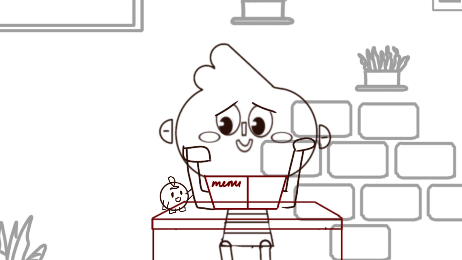
Here is the character's first draft that I created.
Character #1
After having a consultation with Ms Anis, I decided to choose non-line Art. The reason:
- Educational Purposes (following Duolingo style)
- Motion graphics (I'm an After Effect girl, and in the future, I want to work in motion graphics and video editing - so I need to hone my After Effects skills).
Here is my reference from Duolingo Design. So I suggest my friend do an application following the Duolingo style as a reference.
For the animation, I planned to use AI voice for the narrator for a draft as my guide timing. At the end later I will ask my sister to help me to voice over for me because I know that she is really good at impersonating something. Here are some sketches that I made for the First draft animation.

Storyboard very rough
PROCESS
WEEK 6 / 27.05.2024
I tried to make the storyboard using a stickman since I was still confused with the character.
First draft
We discussed the logo using the character that I created.

Logo#1
- Simple, not too many details
- Ours still have a lot of details
It doesn't have to be a globe, you can use other elements that represent travel/ map
This is another character, but I did not show it to Ms Anis because I feel it really looks like Duolingo now. I have to be different so that I don't plagiarism.

Character#2
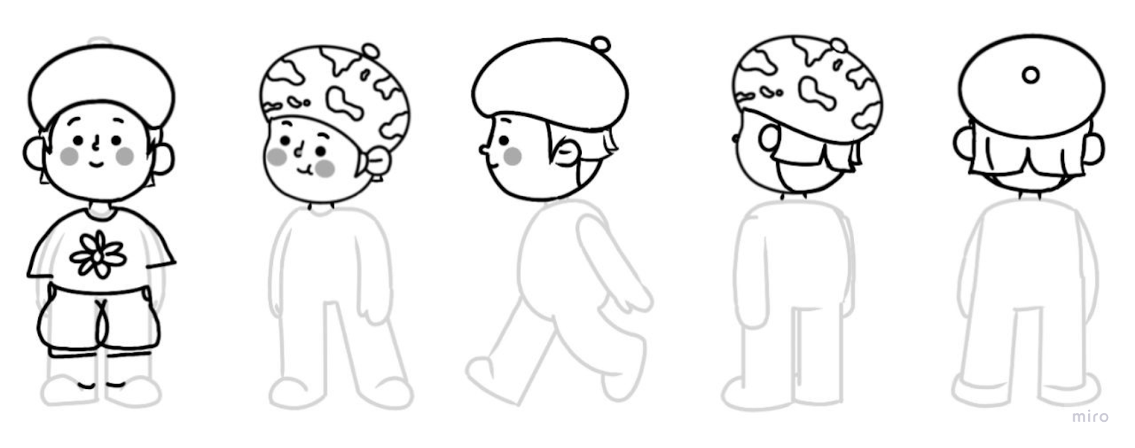
I decided to change the character drawing. I want it to be more simple, rounded, and no stroke
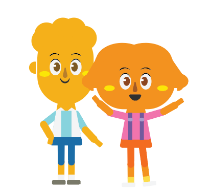
Here is the mascot's first attempt: It's a globe with having yellow cheek, oval eye, cloud and location point.
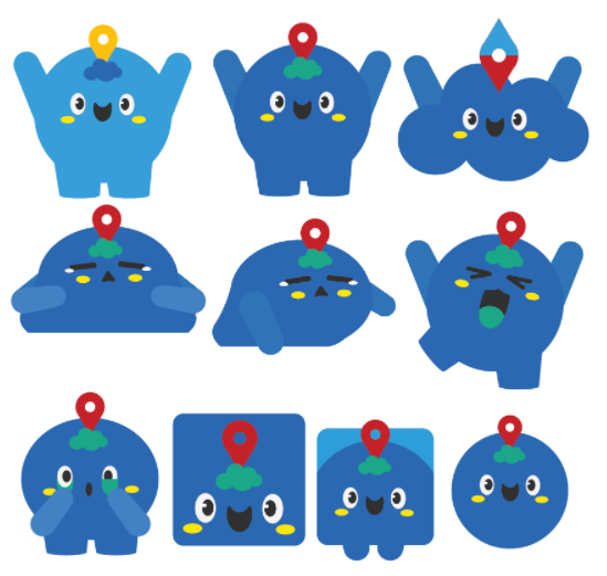

Mascot#1
Here is the character's second attempt: the hair uses a cloud shape as well as and yellow cheek so that there is a similarity with the mascot.

Character#2
The reason why the hair is combined with the head is because it's cloud, inspired by the Elemental movie, The Cloud Woman.

Elemental
I also create another colour version for the characters because I have not put the character into the background yet so I'm not sure if it's compatible or not since the colour is all vibrant.
Character#3
Shape: Rounded, globe, cloud, and location mark
Meaning:
Meaning:
- Global: International aspect
- Adaptable: Change shape and size (cloud), adaptability and flexibility.
- Supportive and warm: (cloud) represents warm, comfortable welcoming, emotional and practical support.
- knowledgeable: (cloud and globe) from above can see everything & smart.
- Adventure: (Location mark) represents map, adventure, and journey.
- Globi / Globy / Globee
- GloClo (Globe and Cloud)
- Globito / Globita
- Wonder / Wander
- Ranto
- Buddy / Matte
- Navi / Navy (Navigator)
For the colour, we add Red colour after receiving Ms Anis's feedback about putting the contrast.

Blue: Trust, reliability, calm, confidence, communication (Support and Guidance)
Yellow: Warm, positive energy, happy encouragement, optimist.
Green: Growth, harmony/ balance, stability, knowledge, safety
Red: Passion, action, excitement, contrast/ attention
In the end, we try to make the logo using the current mascot and character.
Here is my friend's attempt.

Abigail's Logo Attempt

My Logo Attempt


Sketches#2
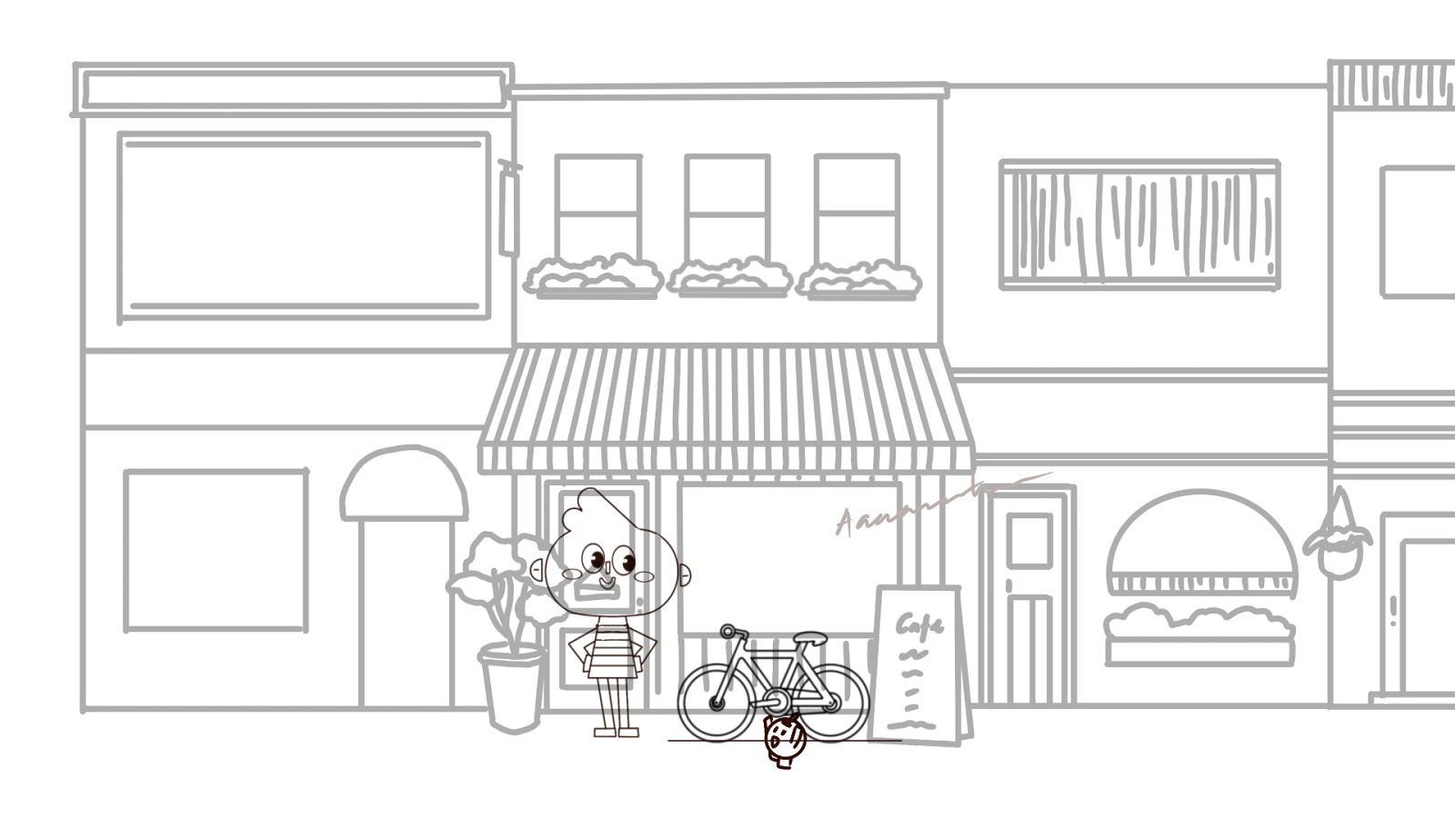
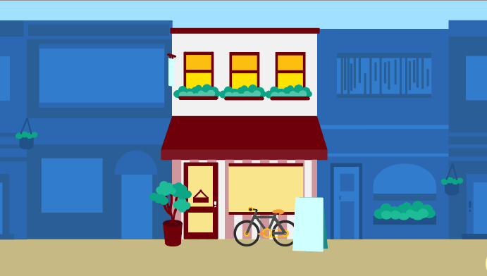
Here are some scenes that I created to see whether the character can fit or not with the colour of the environment.


Trying to fit the character into the environment
WEEK 7 / 03.06.2024
After having a consultation with Ms Anis, here is what we chose.

Logo, Mascot, Character
For the animation, the scene where he had a speech may be changed to something more convincing like he talks to foreigners it would be better. The flying head is a little bit disturbing so I need to change it.I change it into 3 split screen scenes.
Sketch 3 split screen
Actually, I still feel lacking in the animation visual story. I want to change it into better visual storytelling. This week I didn't do much for my major project since I was focusing on the Design Portfolio class as a Design Team.
WEEK 8 - 10 / 10 - 24.06.2024
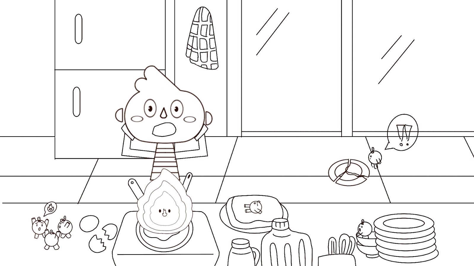
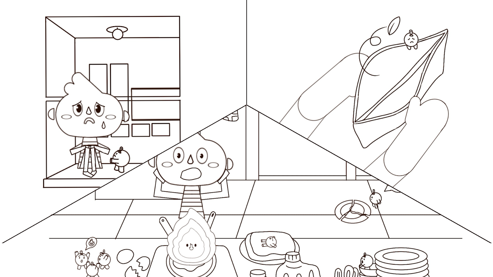
This week, I decided to change most of the scenes.


Sketches#3
For some of the scenes that I coloured already at the end, I don't use it because the visual storytelling is changed. After having a consultation, Ms Anis suggested I animate at least the first 30 seconds for next week's presentation.


Here is the result.
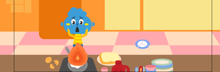
Animation#3
Presentation Slide
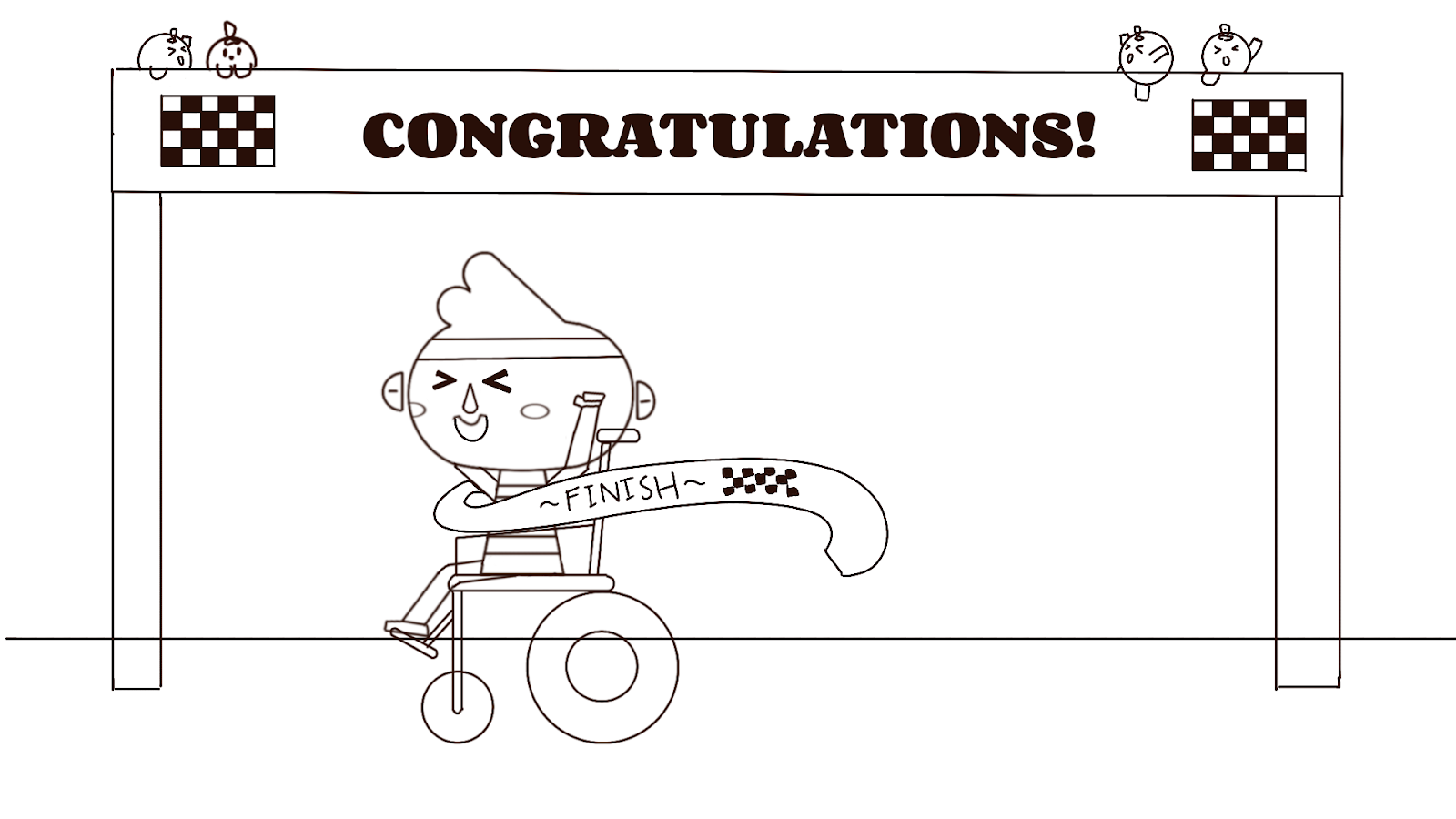
WEEK 11 / 02.07.2024
Today (02/07) is the presentation day round 1. I would say it was a success(?). The comments for both Animation and UIUX are minor.
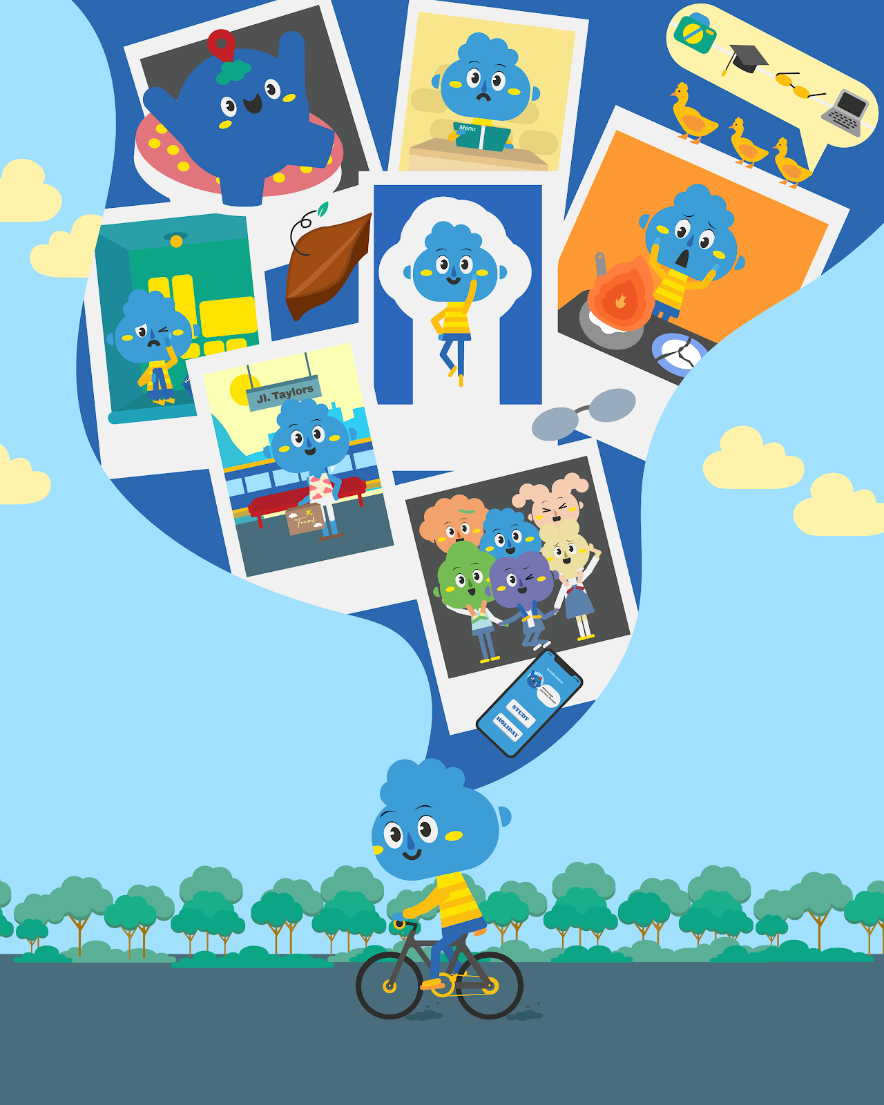
I create another supporting role.


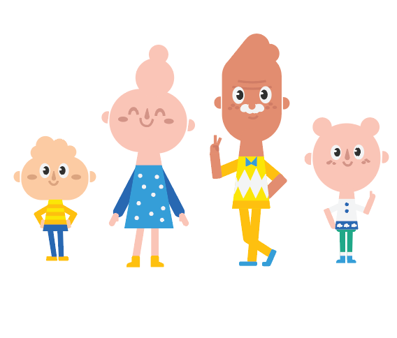
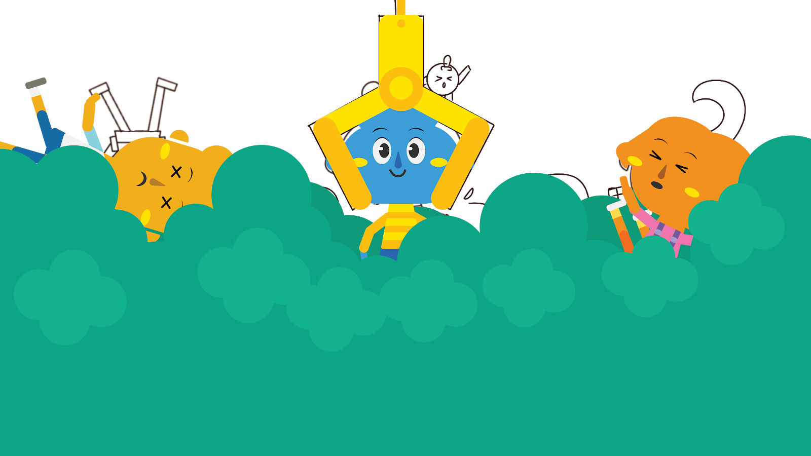
Characters
I also helped Abigail to show her walking side animation so that she could transfer it into Figma.


Side walking Main Character
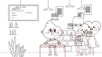
WEEK 12 / 10.07.2024
I'm very grateful that Abigail helped me to trace the LRT scene.

Abigail helped me
We need to submit KV for the presentation board that the Design Portfolio class made.
Here is what my friend created.


Abigail's KV
She suggested I make another 2 KV and an animation poster. Here is what I created.


Continue Coloured Assets
WEEK 14 / 17 - 24.07.2024
This week I plan to finish all the assets so I can start to animate.


Other coloured assets
Thank God finally I finished all the assets.
WEEK 15 - 16 / 24 - 31.07.2024
This week I have to finish all of it.
Here are some common keyframe styles that are used in this type of animation:
1. Smooth Transitions:
- Ease In/Out: Keyframes with easing (Easy ease, Easy out, Easy in) are used to create smooth transitions between movements. This helps in conveying a natural, flowing motion, such as a character walking or looking around.
- Subtle Camera Movements: Using keyframes to slightly move the camera can add depth and focus to a scene. This can be done with easy keyframes to create gentle zooms or pans that draw the viewer's attention to specific details.
2. Expressive Motions:
- Exaggerated Keyframes: For moments of strong emotion (like joy, frustration, or surprise), the keyframes might be more exaggerated, with quick, sharp movements. This adds intensity to the scene, making the character's feelings more apparent.
- Slow Motion Keyframes: In emotional or reflective moments, keyframes might be spaced out to create a slow-motion effect, allowing the audience to focus on the character's expression or a significant detail in the scene.
3. Timing for Emotional Impact:
- Hold Keyframes: These are used to pause the motion at certain keyframes, allowing the scene to linger and emphasize a particular emotion or moment. For example, holding a close-up of the character’s face can intensify a feeling of loneliness or contemplation.
- Staggered Keyframes: To show complex emotions, different elements of the character or scene might move at slightly different times. For example, the character’s eyes might move first, followed by the head, and then the body, creating a layered, realistic movement.
4. Environmental Interactions:
- Parallax Movement: By offsetting the movement of foreground, middle-ground, and background elements with keyframes, a parallax effect is created, giving depth to the scene. This style helps immerse the viewer in the environment, making the new place feel more real and tangible.
- Subtle Animations: Keyframes that add small, subtle animations to background elements (like leaves rustling or lights flickering) can enhance the mood and atmosphere, making the setting feel alive and reflecting the character’s emotions.
6. Facial Expressions and Body Language:
- Detailed Facial Animation: Keyframes focused on the character’s facial expressions might be used to convey complex emotions. Small adjustments to eyebrows, eyes, and mouth can significantly affect how the character's feelings are perceived.
- Body Language Keyframes: Keyframes that define the character’s posture and gestures (like slumping shoulders or fidgeting hands) can communicate their emotional state without needing dialogue.
So the style of the animation that I want to create is to emphasize smooth, expressive motions that align with the emotional narrative. In my opinion, by careful timing and adjusting keyframes, the animation can effectively connect with the viewer’s emotions, making the experience of "Rantau" feel personal and relatable.
This is some of the progress of the rigging part.
Here is my Mascot Rigging.
Mascot Rigging
Here is my Main Character Face Rigging.
Face Rigging
Here is my Main Character Body Rigging. I have two types of rigging, manually and using plug-ins.
Body Rigging Plug-ins
Body Rigging Manually
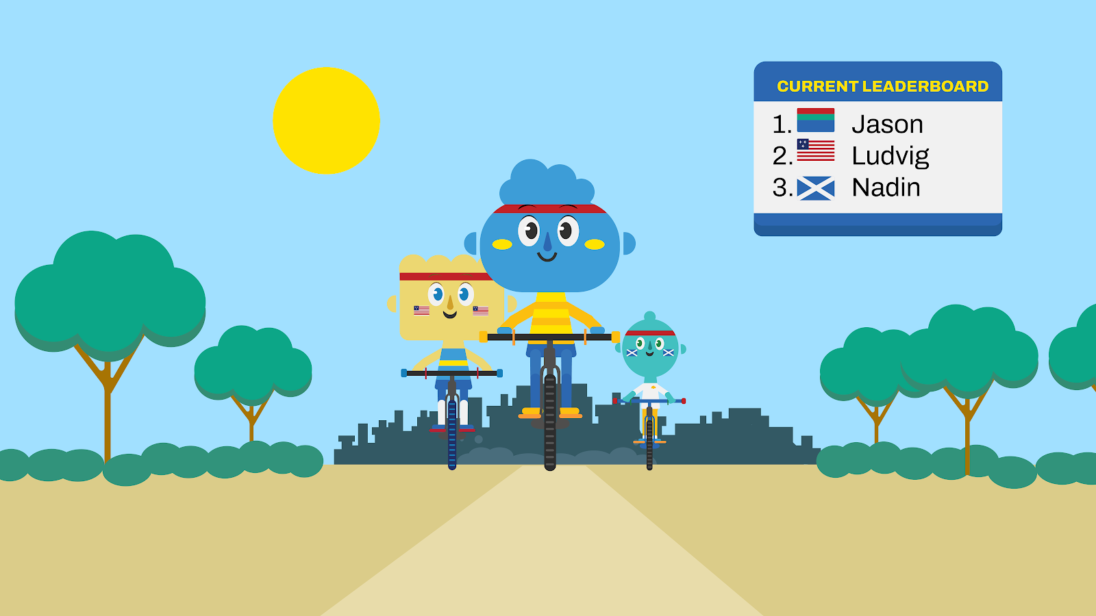
Front Walk Cycle
Front Riding Bicycle
Besides the Rigging, there is some Coding (JavaScript) as well inside the Adobe After Effects. This code I found this from one of the tutorials on YouTube and it is special and complex since it is custom code. One of my scenes that uses this custom code is the walk front cycle.
Looping
Custom Code
if (numKeys >1 && time > key(numKeys).time) {
t1 = key(1).time;
t2 = key(numKeys).time;
span = t2 - t1;
delta = time - t2;
t = delta%span;
valueAtTime(t1 + t)
} else {
value
}Meaning/ Explanation
The script checks if there are more than one keyframe ( If both conditions are met, it calculates a looping behaviour for the property after the last keyframe. If the conditions are not met, it simply returns the current value of the property.
numKeys > 1) and if the current time (time) is greater than the time of the last keyframe (key(numKeys).time).It repeats the animation cycle between the first and the last keyframe indefinitely after the last keyframe’s time has passed. If the current time is before the last keyframe or if there is only one keyframe, the property just holds its current value without any looping.
What makes it different with Loop Out/ In?
The custom code provides greater control and flexibility, allowing you to fine-tune the looping behaviour to meet specific needs that loop out might not cover. Such as more control and customization. I can tweak the way time is calculated, introduce different looping intervals, or even add more complex conditions. It also requires more effort to write and understand, but it’s more powerful for complex scenarios (which to be honest I don't really understand that well also hahaha).Abigail took one of the scenes and put a thank you word as a credit card
credit card
Here is the Gantt Chart
Gantt Chart Our Progression
FEEDBACK
WEEK 1 / 26.04.24
- Shape your research toward UGC (User Generated Content, community-based app)
- Explain about the community-based app instead of explaining the feature first.
WEEK 2 / 30.04.24
(Mr Asrizal)
- if you coming up only with an application, you will be in a supporting role
- do research rabbit r1
- research on launching company products, so that you can explore more
(Mr Kamal)
- Don't do motion graphic style for a major project, so the outcome would be heavy.
- create the narrative text to convince Mr Asrizal
- make sure it's in 3 acts, not 5 acts.
WEEK 3 / 06.05.24
Mr Asrizal:
- the outcome: 'more than' only animation -> campaign
- try to solve this matter instead of do individually
- do something that you want to do in the future.
- why are you creating animated if you pursue motion graphics in the future?
- the assigned teacher: Ms Anis
Ms Anis:
- You're not the supporting role
- Can come out with 2 outcomes: Emotional aspect (Animation) and Physical aspect (App)
- Your Animation is not for the tutorial of the application, but make it into a short animation about someone's journey when studying overseas ('merantau') at the end, if you feel related to this, you can download this Application called Anak Rantau.
- Both of your roles have connections and can stand alone.
- For the references, you can see the Ted-ed Animation, it's an educational short animation.
WEEK 4 / 13.05.24
- The narrative is quite long, maybe later in the execution you can take out some
- It fits to the app
- the way you describe anxieties and contrast them to the benefits has a nice flow
- Boleh start buat storyboard.
WEEK 5 / 20.05.24
- You guys can refer to this, Using Design Adjectives to Determine Look and Feel and Tell Better Tales with Composition.
WEEK 6 / 27.05.24
- Simple, not too many details
- Ours still have a lot of details
-It doesn't have to be a globe, you can use other elements that represent travel
- Example:


- The idea looks fine but at 0:49 there is a floating head, what is that?
WEEK 9 / 20.06.24
- I think the current progress looks great. just be careful with the tweening for the animations else you gonna have demon eyes hahaha
WEEK 10 / 27.06.24
- The animation looks great! keep going
- Maybe next week during the presentation, you can give a sneak peak at least the first 30 seconds.
WEEK 11 / 02.07.24
Presentation day (70%) progress
- Maybe you can make the animation faster and play with the graph.
WEEK 14 / 01.08.24
Ms Anis
- The third scene maybe you can make it come out one by one
- In the cafe scene, you can add visuals like from one place to another place
- Looks great! keep going
Mr Kamal
- If you can't make it faster the timing it's alright, as long as consistent from the start until the end.
- At the ending, no need to make the character jump, just keep walking straight as he continues the journey
WEEK 16 / 11.08.24
- The current timing is better than previously
- I really like the secondary animation
- Great job! You're doing great!
SUBMISSION
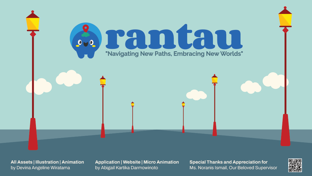
Here is the final Animation of Rantau
Poster

Poster
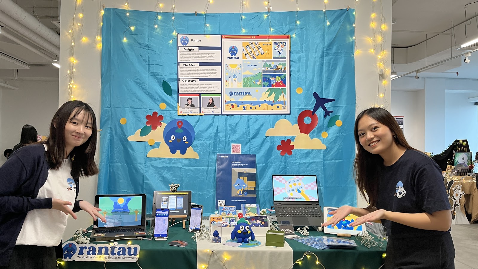
Booth

REFLECTION

24. Interlude
I am immensely grateful that we successfully completed the Rantau project. This journey has been both challenging and rewarding, and I thank God for giving me the strength and perseverance to finish my longest animation within 14 weeks. The sense of accomplishment I feel is indescribable, and it has been a truly transformative experience.
I want to extend my deepest gratitude to Ms. Anis, whose unwavering support and guidance have been invaluable to our project's success. Her expertise, encouragement, and insightful feedback have significantly shaped not only our project but also our academic growth. I am incredibly fortunate to have had such a dedicated and inspiring supervisor.
I would also like to express my heartfelt thanks to my groupmate, Abigail, who has been a phenomenal partner throughout this journey. Her expertise in UI/UX design was instrumental in bringing our vision to life. Her support and collaboration made the entire process smoother and more enjoyable, despite the occasional challenges that come with such an ambitious project.
A special thank you goes to George for helping me decorate the booth and for always being there for me during the hard days. Your assistance and unwavering support meant a lot to me, and I couldn’t have done it without you.
I also want to thank my sister, Daisy, for providing the voiceover in my final year project. Her voice and accent were so impressive that many people thought I had used an AI voice. Having her involved added a personal touch to the project that I am incredibly proud of.
I am also deeply thankful to the church members who took the time to visit and celebrate my showcase. Your presence brought me so much joy and made me feel truly supported. I am grateful for the love and encouragement you showed during this significant moment.
Last but not least, I want to extend my heartfelt thanks to everyone who contributed to this project in ways both big and small, even if I cannot mention each of you by name. Your support, guidance, and encouragement have been instrumental in making this journey a success.
Throughout this project, I have gained so much, not only in terms of technical skills but also in life lessons. On the academic front, I deepened my knowledge of Adobe After Effects and enhanced my animation skills, pushing myself to new creative heights. Beyond the technical aspects, I also learned crucial lessons in time management and navigating the complexities of collaboration. These experiences have taught me patience, discipline, and the importance of standing firm in my contributions, even when faced with challenges.
This project has been a profound learning experience, and I am thankful for the growth it has brought me. As I move forward, I will carry these lessons with me, both in my future academic endeavours and in life.
Comments
Post a Comment