Devina Angeline Wiratama / 0350824
Typography / Bachelor of Design (Hons) in Creative Media
Task 2: Typographic Exploration and Communication (Text Formatting and Expression)
Jump Link
LECTURES
💁♀️: Lectures 1 to 4 completed in Task 1 - Exercise 1&2
Typography: Letters / Understanding Letterforms
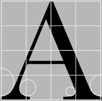
The uppercase letterforms below suggest
symmetry, but in fact, it is not symmetrical. It is easy to see the two
different stroke weights of the Baskerville stroke form (below); more
noteworthy is the fact that each bracket connecting the serif to the stem
has a unique arc.

Fig. 1.1 / Baskerville, Week 5 (09.24.2021)
The uppercase letterforms may appear
symmetrical, but a close examination shows that the width of the left
slope is thinner than the right stroke. Both Baskerville (previous) and
Univers (below) demonstrate the meticulous care a type designer takes to
create letterforms that are both internally harmonious and individually
expressive.
The complexity of each individual
letterform is neatly demonstrated by examining the lowercase ‘a’ of two
seemingly similar sans-serif typefaces—Helvetica and Univers. A
comparison of how the stems of the letterforms finish and how the bowls
meet the stems quickly reveals the palpable difference in character
between the two.
As you already know, the x-height
generally describes the size of the lowercase letterforms. However, you
should keep in mind that curved strokes, such as in ‘s’, must rise above
the median (or sink below the baseline) in order to appear to be the
same size as the vertical and horizontal strokes they adjoin.
Just as important as recognizing
specific letterforms is developing a sensitivity to the counter form
(or counter)—the space describes and is often contained, by the
strokes of the form. When letters are joined to form words, the
counter form includes the spaces between them. The latter is
particularly an important concept when working with letterforms like
lowercase ‘r’ that have no counters per se. How well you handle the
counters when you set type determines how well words hang together—in
other words, how easily we can read what’s been set.

Fig. 1.7 / Counter Form, Week 5 (09.24.2021)
One of the most rewarding ways to
understand the form and counter of a letter is to examine them in
close detail. The examinations also provide a good feel for how
the balance between form and counter is achieved and a palpable
sense of letterform’s unique characteristics. It also gives you a
glimpse into the process of letter-making.
It's worth noting here that the sense of the ‘S’ holds at each stage of enlargement, while the ‘g’ tends to lose its identity, as individual elements are examined without the context of the entire letterform.
The basic principles of Graphic Design
apply directly to typography. The following are some examples of
contrast—the most powerful dynamic in design—as applied to the
type, based on a format devised by Rudi Ruegg. The simple
contrasts produces numerous variations:
small+organic/large+machined; small+dark/ large light.
Typography in Different Medium
In the past, typography was viewed as living only when it reached paper. Once a publication was edited, typeset and printed, it was done. Nothing changed after that. Good typography and readability were the results of skilled typesetters and designers. Today, typography exists not only on paper but on a multitude of screens. It is subject to many unknown and fluctuating parameters, such as operating system, system fonts, the device and screen itself, the viewport and more. Our experience of typography today changes based on how the page is rendered because typesetting happens in the browser.
Print Type Vs Screen TypeType for Print
Primarily, the type was designed intended for reading from print long before we read from the screen. It’s the designer’s job to ensure that the text is smooth, flowing, and pleasant to read. A good typeface for print-Caslon, Garamond, Baskerville are the most common typefaces that are used for print. Because of their characters which are elegant and intellectual but also highly readable when set at small font size. They are versatile, easy-to-digest classic typeface, which has neutrality and versatility that makes typesetting with it a breeze.
Typefaces intended for use on the web are optimized and often modified to enhance readability and performance onscreen in a variety of digital environments. This can include a taller x-height (or reduced ascenders and descenders), wider letterforms, more open counters, heavier thin strokes and serifs, reduced stroke contrast, as well as modified curves and angles for some designs. Another important adjustment – especially for typefaces intended for smaller sizes – is more open spacing. All of these factors serve to improve character recognition and overall readability in the non-print environment, which can include the web, e-books, e-readers, and mobile devices.
A hyperlink is a word, phrase, or image that you can click on to jump to a new document or a new section within the current document. Hyperlinks are found in nearly all Web pages, allowing users to click their way from one page to another. Text hyperlinks are normally blue and underlined by default. When you move the cursor over a hyperlink, whether it is text or an image, the arrow should change to a small hand pointing at the link.
16-pixel text on a screen is about the same size as text printed in a book or magazine; this is accounting for reading distance. Because we read books pretty close — often only a few inches away — they are typically set at about 10 points. If you were to read them at arm’s length, you’d want at least 12 points, which is about the same size as 16 pixels on most screens
Fonts: Open Sans, Lato, Arial, Helvetica, Times New Roman, Times, Courier New, Courier, Verdana, Georgia, Palatino, Garamond
The screens used by our PCs, tablets, phones and TVs are not only different sizes, but the text you see on-screen differs in proportion too because they have different sized pixels. 100 pixels on a laptop is very different from 100 pixels on a big 60″ HDTV. Even within a single device class, there will be a lot of variation.
Static typography has a minimal characteristic in expressing words. Traditional characteristics such as bold and italic offer only a fraction of the expressive potential of dynamic properties. From billboards to posters, magazines to fliers, we encounter all forms of static typography with wide-ranging purposes. Whether they are informational, promotional, formal or aspirational pieces of designs, the level of impression and impact they leave on the audience is closely knitted to their emotional connection with the viewers.
Temporal media offer typographers opportunities to “dramatize” type, for letterforms to become “fluid” and “kinetic” (Woolman and Bellantoni, 1999). Film title credits present typographic information over time, often bringing it to life through animation. Motion graphics, particularly the brand identities of film and television production companies, increasingly contain animated type. Type is often overlaid onto music videos and advertisements, often set in motion following the rhythm of a soundtrack. On-screen typography has developed to become expressive, helping to establish the tone of associated content or express a set of brand values. In title sequences, typography must prepare the audience for the film by evoking a certain mood.
3. Task 2 / Process Demo
In this video, Mr Vinod gave us a demo of what we have to do for Task 2 (Starting the assignment start with the selection of text and sketches). Here's the link to the video (Task 2 - Demo).
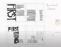
First, Mr Vinod told us to create the sketches first so it can be easier to put them in digital. Here's Mr Vinod's sketches.

Fig. 1.15 / Mr Vinod's Sketches, Week 5 (09.24.2021)
Next, Mr Vinod wanted us to cover them with patches so they can see the division between white areas and the grey areas. The purpose is to look at if there is a balance or movement, etc.
INSTRUCTION
- No images are allowed. Some very minor graphical elements (line, shade, etc) might be allowed.
- Utilising the knowledge gained in the exercises and other modules from the same semester, you will use Adobe InDesign to typographically compose and express the text within a given size (200 x 200 mm per pg).
- May use Adobe Illustrator to create headline expressions should you feel the need to do so. However, the final layout is to be completed in Adobe InDesign.
- Explore several options in expression and layout (sketches). Execute a good layout, with an expressive and appropriate headline in line with the spirit/message of the text.
- Ensure you are only using the prescribed type families: Univers LT Std, Serifa Std, Janson Text LT Std, ITC New Baskerville Std, ITC Garamond Std, Gill Sans Std, Futura Std, Bembo Std, and Adobe Caslon Pro.
TASK 2
1. Task 2 / Progressions
Layout Research
The Impact of Bauhaus on Modern Culture.
What is 'Bauhaus' mean? (Source: Wikipedia)
Sketches
After we watch the demo, we need to make it with our ideas. It was really hard for me to make it. I have rarely had any experience with type formatting before. It takes a long time to come up with ideas. Here are my exploration/ rough sketches in a video (30 secs).
Vid. 1.1 / Exploration Rough Sketch, Week 5 (09.24.2021)
Next, I decided to pick only 4 from all my rough sketches. Here are the clean sketches that I chose. I made it on Procreate.


2. Task 2 / Digitalize
Bauhaus - Visual
Use 10 typefaces: yes

Fig. 3.7 / First Layout, Week 6 (10.01.2021)

Fig. 3.8 / Second Layout, Week 6 (10.01.2021)
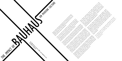
First Layouts - Impact of Bauhaus.
4. First Layout or Second Layout?
When reviewing a student's work, Mr Vinod said that headings in the middle are best avoided, and if possible to not have middle headings at all. This is due to the misalignment when printed in a booklet form. The same goes for body text. In this case, my first layout, which is the Bauhaus one, is a little bit in the middle.
Because of that, I chose the second layout.
5. Final Outcome in JPEG
6. Final Outcome in PDF
FEEDBACK
Week 6 / 10.01.2021
- Exercise:
-
General Feedback
Make sure there is no widows or orphans, the relationship between headline and text are connected. Don't use different line lengths on body text. Also, don't let the graphic elements be the star. -
Specific Feedback
Don't make jpg into pdf, but export pdf from InDesign. The ideas and the sketches for 2 and 3 sketches are excellent. May choose one of them.
- E-Blog:
-
General Feedback
May see trxxah blog as references. Attach the link for Task 1 if needed. -
Specific Feedback
No feedback.
- Exercise:
Good!
-
E-Blog:
Good Progress! Nicely Done! Keep this up!
Experience
FURTHER READING

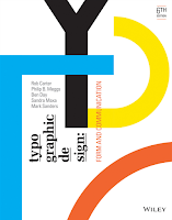
Fig. 5.1 / Typographic Design: Form and Communication 2015 Book, Week 6 (10.01.2021) - Source: Facebook
The Typography Grid.
Background
Structure and Space
Space is the common denominator for all typographic communication. When typographic elements are introduced into space, they create subliminal divisions, and these divisions create spatial structure. As typographic elements shift syntactically in size, weight, and position, new structures emerge (Fig. 5.3).
Proportion


Comments
Post a Comment