
Devina Angeline Wiratama / 0350824
Typography / Bachelor of Design (Hons) in Creative Media
Task 1: Exercises
Jump Link
- Lectures
- Instructions
- Exercise 1 - Type Expression
- Exercise 2 - Type Formatting
- Feedback
- Reflections
- Further Reading
- Typography
- Home
LECTURES
1. WEEK 1 / Introduction & Briefing
Font: a font refers to the individual font or weight within the typeface.
Ex: Georgia regular, Georgia italic, and Georgia bold.
Typeface: a typeface refers to the entire family of fonts/ weights that share
similar characteristics/ styles. Ex: Georgia, Arial, Times New Roman,
Didot, and Futura.
a. Typography: Development and Timeline
Early letterform development: Phoenician to Roman

Fig. 1a.1 / Evolution from Phoenician Letter, Week 1
(08.27.2021)
Phoenicians (like other Semistic peoples), wrote from right to left. The Greeks developed a style of writing
called 'boustrophedon' (how the ox ploughs) → the lines of text read
alternately from right to left and left to right. They also changed
the orientation of the letterforms. Greek like the Phoenicians,
didn't use letter space or punctuations. Latter or the Greeks would
move to strictly left-to-right writing.
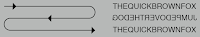
Fig 1a.2 / Writing Direction of Greeks, Week 1 (08.27.2021)
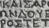
Fig. 1a.3 / Greek fragment, stone engraving (Date
unknown), Week 1 (08.27.2021)
Etruscan (and then Roman)
carvers working in marble painted letterforms before inscribing
them. Certain qualities of their strokes-a change in weight from
vertical to horizontal, a broadening of the stroke at the start and
finish-carried over into the carved letterforms.

Fig. 1a.4 / Late 1st century B. C. E., Augustan inscription in
the Roman Forum, Rome, Week 1 (08.27.2021)
 Fig. 1a. 5 / Phoenician to Roman (Flip horizontal → flip 90°), Week 1 (08.27.2021)
b. Hand script from 3rd - 10th century C.E
Square capitals
were the written version that can be found in Roman monuments.
These letterforms have serifs added to the finish of the main
strokes. The variety of stroke width was achieved by the reed pen
held at an angle of approximately 60° off the perpendicular.

Fig. 1b.1 / 4th or 5th century: Square capitals, Week 1 (08.27.2021)
A
compressed version of square capitals, rustic capitals
allowed for twice as many words on a sheet of parchment and took
far less time to write. The pen or brush was held at an angle of
approximately 30° off the perpendicular. Although rustic capitals
were faster and easier to, they were slightly harder to read due
to their compressed nature.

Fig. 1b.2 / Late 3rd - mid 4th century: Rustic
capitals, Week 1 (08.27.2021)
Both square and rustic
capitals
were typically reserved for documents of some intended
performance. Everyday transactions, however, were typically
written in Roman cursive
hand in which forms were simplified for speed. We can see here the
beginning of what we refer to as lowercase letterforms.

Fig. 1b.3 / 4th century: Roman cursive, Week 1 (08.27.2021)
Uncials
incorporated some aspects of the Roman cursive hand, especially in
the shape of the A, D, E, H, M, U, and Q. 'Uncia’ is Latin for a
twelfth of anything; as a result, some scholars think that uncials
refer to letters that are one inch (one-twelfth of the foot) high.
It might, however, be more accurate to think of uncials simply as
small letters. The board forms of uncials are more readable at
small sizes than rustic capitals.

Fig. 1b.4 / 4th - 5th century: Uncials, Week 1 (08.27.2021)
A
further formalization of the cursive hand, half-uncials
mark the formal beginning of lowercase letterforms, replete with
ascenders and descenders, 2000 years after the origin of the
Phoenician alphabet.

Fig. 1b.5 / 4th - 5th century: Half-uncials, Week 1 (08.27.2021)
Charlemagne, the first unifier of Europe since the Romans, issued an edict
in 789 to standardize all ecclesiastical texts. He entrusted this
task to Alcuin of York, Abbot of St. Martin of Tours. The monks
rewrote the text using both majuscules (uppercase), minuscule,
capitalization, and punctuation which set the standard for
calligraphy for a century.
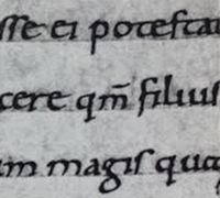
Fig. 1b.6 / C. 925: Caloline Miniscule, Week 1 (08.27.2021)
c. Blackletter to Gutenberg's type
With the dissolution of
Charlemagne's empire came regional variations upon Alcuin's
script. In Northern Europe, a condensed strongly vertical
letterform know as blackletter or texture gained popularity.
In the south, a rounder more open hand gained popularity,
called 'rotunda'. The humanistic scripting in Italy is based
on Alcuin's minuscule.
 Fig. 1c.1 / C. 1300: Blackletter (Textura), Week 1 (08.27.2021)
Gutenberg's skills marshalled them all to build pages that
accurately mimicked the work of the scribe's hand -
Blackletter of northern Europe. His type mould required a
different brass matrix, or negative impression, for each
letterform.
d. Text type classification (Dates of origin approximated to the
nearest quarter-century).
Typeforms have developed in response
to prevailing technology, commercial needs, and esthetic trends.
Certain models have endured well past the cultures that spawned
them. The following Typeform classification here, based on one devised by
Alexander Lawson only covers the main form of text type.
1450 BlackLetter
The
earliest printing type, its forms were based upon the hand-copying
styles that were then used for books in northern Europe. Examples:
Cloister black, Goudy text

Fig. 1d.1 / 1450 BlackLetter, Week 1 (08.27.2021)
1475 Old-style
Based
upon the lowercase forms used by Italian humanist scholars for book
copying (themselves based upon the ninth-century Caroline minuscule)
and the uppercase letterforms found inscribed on Roman ruins, the
forms involved away from their calligraphic origins over zoo years, as
they migrated across Europe, from Italy to England. Examples: Bembo,
Caslon, Dante, Garamond, Janson, Jenson, Palatino

Fig. 1d.2 / 1475 Old-style, Week 1 (08.27.2021)
1500 Italic
Echoing contemporary Italian
handwriting, the first italics were condensed and close-set, allowing
more words per page. Although originally considered their own class of
type, italics were soon cast to complement Roman forms. Since the
sixteenth century, virtually all text typefaces have been designed
with accompanying italic forms.
 Fig. 1d.3 / 1500 Italic, Week 1 (08.27.2021)
1550 Script
Originally attempt to replicate
engraved calligraphic forms, this class of type is not entirely
appropriate in lengthy text settings. In shorter applications,
however, it has always enjoyed wide acceptance. Forms now range from
the formal and traditional to the casual and contemporary. Examples:
Kuenstler script, Mistral, Snell Roundhand.
 Fig. 1d.4 / 1550 Script, Week 1 (08.27.2021)
1750 Transitional
A
refinement of old-style forms, this style was achieved in part because
of advances in casting and printing. Thick to thin relationships were
exaggerated, and brackets were lightened. Examples: Baskerville,
Bulmer, Century, Time Roman
 Fig. 1d.5 / 1750 Transitional, Week 1 (08.27.2021)
1775 Modern
This
style represents a further rationalization of old-style letterforms.
Serifs were unbracketed, and the contrast between thick and thin
strokes was extreme. English versions (like a bell) are also known as
Scotch Romans and more closely resemble transitional forms. Examples:
Bell, Bodoni, Caledonia, Didot, Walbaum
 Fig. 1d.6 / 1775 Modern, Week 1 (08.27.2021)
1825 Square serif/ Slab serif
Originally heavily bracketed serifs
with little variation between thick and thin strokes, these faces
responded to the newly developed needs of advertising for heavy types
in commercial printing. As they evolved, the brackets were dropped.
Examples: Clarendon, Memphis, Rockwell, Serifa
 Fig. 1d.7 / 1825 Square or Slab Serif, Week 1 (08.27.2021)
1900 Sans Serif
As
their name implies, these typefaces eliminated series altogether.
Although the forms were first introduced by William Caslon IV in 1816,
their use did not become widespread until the beginning of the
twentieth century. Variation tended toward either humanist forms (Gill
sans) or rigidly geometric (Futura). Occasionally, strokes were hard
to suggest the calligraphic origins of the form (optima). Sans serif
is also referred to as grotesque (from the German word Grotesk) and
Gothic. Examples: Akzidenz Grotesk, Grotesk, Gill sans, Franklin
gothic, Frutiger, Futura, Helvetica, Meta, News Gothic, Optima,
Syntax, Trade Gothic, Univers.
 Fig. 1d.8 / 1990 Sans Serif, Week 1 (08.27.2021)
1990 Serif / Sans serif
A
recent development, this style enlarges the notion of a family of
typefaces to include both serif and sans serif alphabets (and often
stages between the two). Examples: Rotis, Scala, Stone
Font: a font refers to the individual font or weight within the typeface.
Ex: Georgia regular, Georgia italic, and Georgia bold.
Typeface: a typeface refers to the entire family of fonts/ weights that share
similar characteristics/ styles. Ex: Georgia, Arial, Times New Roman,
Didot, and Futura.
Early letterform development: Phoenician to Roman

Fig. 1a.1 / Evolution from Phoenician Letter, Week 1 (08.27.2021)
Phoenicians (like other Semistic peoples), wrote from right to left. The Greeks developed a style of writing called 'boustrophedon' (how the ox ploughs) → the lines of text read alternately from right to left and left to right. They also changed the orientation of the letterforms. Greek like the Phoenicians, didn't use letter space or punctuations. Latter or the Greeks would move to strictly left-to-right writing.
Fig 1a.2 / Writing Direction of Greeks, Week 1 (08.27.2021)

Fig. 1a.3 / Greek fragment, stone engraving (Date unknown), Week 1 (08.27.2021)
Etruscan (and then Roman)
carvers working in marble painted letterforms before inscribing
them. Certain qualities of their strokes-a change in weight from
vertical to horizontal, a broadening of the stroke at the start and
finish-carried over into the carved letterforms.
Fig. 1a.4 / Late 1st century B. C. E., Augustan inscription in the Roman Forum, Rome, Week 1 (08.27.2021)

Fig. 1a.4 / Late 1st century B. C. E., Augustan inscription in the Roman Forum, Rome, Week 1 (08.27.2021)
b. Hand script from 3rd - 10th century C.E
Square capitals
were the written version that can be found in Roman monuments.
These letterforms have serifs added to the finish of the main
strokes. The variety of stroke width was achieved by the reed pen
held at an angle of approximately 60° off the perpendicular.
Fig. 1b.1 / 4th or 5th century: Square capitals, Week 1 (08.27.2021)

Fig. 1b.1 / 4th or 5th century: Square capitals, Week 1 (08.27.2021)
A
compressed version of square capitals, rustic capitals
allowed for twice as many words on a sheet of parchment and took
far less time to write. The pen or brush was held at an angle of
approximately 30° off the perpendicular. Although rustic capitals
were faster and easier to, they were slightly harder to read due
to their compressed nature.
Fig. 1b.2 / Late 3rd - mid 4th century: Rustic capitals, Week 1 (08.27.2021)

Fig. 1b.2 / Late 3rd - mid 4th century: Rustic capitals, Week 1 (08.27.2021)
Both square and rustic
capitals
were typically reserved for documents of some intended
performance. Everyday transactions, however, were typically
written in Roman cursive
hand in which forms were simplified for speed. We can see here the
beginning of what we refer to as lowercase letterforms.
Fig. 1b.3 / 4th century: Roman cursive, Week 1 (08.27.2021)

Fig. 1b.3 / 4th century: Roman cursive, Week 1 (08.27.2021)
Uncials
incorporated some aspects of the Roman cursive hand, especially in
the shape of the A, D, E, H, M, U, and Q. 'Uncia’ is Latin for a
twelfth of anything; as a result, some scholars think that uncials
refer to letters that are one inch (one-twelfth of the foot) high.
It might, however, be more accurate to think of uncials simply as
small letters. The board forms of uncials are more readable at
small sizes than rustic capitals.

Fig. 1b.4 / 4th - 5th century: Uncials, Week 1 (08.27.2021)
A
further formalization of the cursive hand, half-uncials
mark the formal beginning of lowercase letterforms, replete with
ascenders and descenders, 2000 years after the origin of the
Phoenician alphabet.
Fig. 1b.5 / 4th - 5th century: Half-uncials, Week 1 (08.27.2021)

Fig. 1b.5 / 4th - 5th century: Half-uncials, Week 1 (08.27.2021)
Charlemagne, the first unifier of Europe since the Romans, issued an edict
in 789 to standardize all ecclesiastical texts. He entrusted this
task to Alcuin of York, Abbot of St. Martin of Tours. The monks
rewrote the text using both majuscules (uppercase), minuscule,
capitalization, and punctuation which set the standard for
calligraphy for a century.
Fig. 1b.6 / C. 925: Caloline Miniscule, Week 1 (08.27.2021)

Fig. 1b.6 / C. 925: Caloline Miniscule, Week 1 (08.27.2021)
c. Blackletter to Gutenberg's type
With the dissolution of
Charlemagne's empire came regional variations upon Alcuin's
script. In Northern Europe, a condensed strongly vertical
letterform know as blackletter or texture gained popularity.
In the south, a rounder more open hand gained popularity,
called 'rotunda'. The humanistic scripting in Italy is based
on Alcuin's minuscule.

Fig. 1c.1 / C. 1300: Blackletter (Textura), Week 1 (08.27.2021)
Gutenberg's skills marshalled them all to build pages that
accurately mimicked the work of the scribe's hand -
Blackletter of northern Europe. His type mould required a
different brass matrix, or negative impression, for each
letterform.
d. Text type classification (Dates of origin approximated to the
nearest quarter-century).
Typeforms have developed in response
to prevailing technology, commercial needs, and esthetic trends.
Certain models have endured well past the cultures that spawned
them. The following Typeform classification here, based on one devised by
Alexander Lawson only covers the main form of text type.
1450 BlackLetter
The
earliest printing type, its forms were based upon the hand-copying
styles that were then used for books in northern Europe. Examples:
Cloister black, Goudy text
Fig. 1d.1 / 1450 BlackLetter, Week 1 (08.27.2021)

Fig. 1d.1 / 1450 BlackLetter, Week 1 (08.27.2021)
1475 Old-style
Based
upon the lowercase forms used by Italian humanist scholars for book
copying (themselves based upon the ninth-century Caroline minuscule)
and the uppercase letterforms found inscribed on Roman ruins, the
forms involved away from their calligraphic origins over zoo years, as
they migrated across Europe, from Italy to England. Examples: Bembo,
Caslon, Dante, Garamond, Janson, Jenson, Palatino

Fig. 1d.2 / 1475 Old-style, Week 1 (08.27.2021)
1500 Italic
Echoing contemporary Italian
handwriting, the first italics were condensed and close-set, allowing
more words per page. Although originally considered their own class of
type, italics were soon cast to complement Roman forms. Since the
sixteenth century, virtually all text typefaces have been designed
with accompanying italic forms.

Fig. 1d.3 / 1500 Italic, Week 1 (08.27.2021)
1550 Script
Originally attempt to replicate
engraved calligraphic forms, this class of type is not entirely
appropriate in lengthy text settings. In shorter applications,
however, it has always enjoyed wide acceptance. Forms now range from
the formal and traditional to the casual and contemporary. Examples:
Kuenstler script, Mistral, Snell Roundhand.

Fig. 1d.4 / 1550 Script, Week 1 (08.27.2021)
1750 Transitional
A
refinement of old-style forms, this style was achieved in part because
of advances in casting and printing. Thick to thin relationships were
exaggerated, and brackets were lightened. Examples: Baskerville,
Bulmer, Century, Time Roman
Fig. 1d.5 / 1750 Transitional, Week 1 (08.27.2021)
1775 Modern
This
style represents a further rationalization of old-style letterforms.
Serifs were unbracketed, and the contrast between thick and thin
strokes was extreme. English versions (like a bell) are also known as
Scotch Romans and more closely resemble transitional forms. Examples:
Bell, Bodoni, Caledonia, Didot, Walbaum

Fig. 1d.6 / 1775 Modern, Week 1 (08.27.2021)
1825 Square serif/ Slab serif
Originally heavily bracketed serifs
with little variation between thick and thin strokes, these faces
responded to the newly developed needs of advertising for heavy types
in commercial printing. As they evolved, the brackets were dropped.
Examples: Clarendon, Memphis, Rockwell, Serifa

Fig. 1d.7 / 1825 Square or Slab Serif, Week 1 (08.27.2021)
1900 Sans Serif
As
their name implies, these typefaces eliminated series altogether.
Although the forms were first introduced by William Caslon IV in 1816,
their use did not become widespread until the beginning of the
twentieth century. Variation tended toward either humanist forms (Gill
sans) or rigidly geometric (Futura). Occasionally, strokes were hard
to suggest the calligraphic origins of the form (optima). Sans serif
is also referred to as grotesque (from the German word Grotesk) and
Gothic. Examples: Akzidenz Grotesk, Grotesk, Gill sans, Franklin
gothic, Frutiger, Futura, Helvetica, Meta, News Gothic, Optima,
Syntax, Trade Gothic, Univers.

Fig. 1d.8 / 1990 Sans Serif, Week 1 (08.27.2021)
1990 Serif / Sans serif
A
recent development, this style enlarges the notion of a family of
typefaces to include both serif and sans serif alphabets (and often
stages between the two). Examples: Rotis, Scala, Stone

Fig. 1d.9 / 1990 Serif or Sans Serif, Week 1 (08.27.2021)
2. WEEK 2 - Lectures
1. As with any craft that has evolved over 500 years, typography employs a number of technical terms. These mostly describe specific parts of the letterforms. It is a good idea to familiarize yourself with the lexicon. Knowing a letterform’s component parts make it much easier to identify specific typefaces.
Baseline: imaginary line the visual base of the letterforms
Median: imaginary line defining the x-height of letterforms
X-height: the heigh of the typeface in the lowercase 'X.

2. Stroke: Any line that defines the basic letterforms

3. Apex/ Vertex: the point created by joining two diagonal stems (apex above and vertex below)

Fig. 2a.1 / Baseline, Median, X-height, Week 2 (09.03.2021)
2. Stroke: Any line that defines the basic letterforms

Fig. 2a.2 / Stroke, Week 2 (09.03.2021)
3. Apex/ Vertex: the point created by joining two diagonal stems (apex above and vertex below)

Fig. 2a.3 / Apex or Vertex, Week 2 (09.03.2021)
4. Arm: Short strokes off the stem of the letterform, either horizontal (E, F, L) or inclined upwards (K, Y).

Fig. 2a.4 / Arm, Week 2 (09.03.2021)
5. Ascender: The portion of the stem of a lowercase letterform that projects above the median.

Fig. 2a.5 / Ascender, Week 2 (09.03.2021)
6. Barb: The Half-serif finish on some curved stroke.

Fig. 2a.6 / Barb, Week 2 (09.03.2021)
7. Beak: The half-serif finish on some horizontal arms.

Fig. 2a.7 / Beak, Week 2 (09.03.2021)
8. Bowl: The rounded form that describes a counter. The bowl may be either open or closed.

Fig. 2a.8 / Bowl, Week 2 (09.03.2021)
9. Bracket: The transition between the serif and the stem.

Fig. 2a.9 / Bracket, Week 2 (09.03.2021)
10. Cross Bar: The horizontal stroke in a letterform that joins two
stems together.

Fig. 2a.10 / Cross Bar, Week 2 (09.03.2021)
11. Cross Stroke: The horizontal stroke in a letterform that joins
two stems together.

Fig. 2a.11 / Cross Stroke, Week 2 (09.03.2021)
12. Crotch: The interior space where two strokes meet.

Fig. 2a.12 / Crotch, Week 2 (09.03.2021)
13. Descender: The portion of the stem of a lowercase
letterform that projects below the baseline.

Fig. 2a.13 / Descender, Week 2 (09.03.2021)
14. Ear: The stroke extending out from the main stem or body
of the letterform.

Fig. 2a.14 / Ear, Week 2 (09.03.2021)
15. Em/ en: Originally referring to the width of an uppercase M,
and em is now the distance equal to the size of the typefaces (an em in 48
points, for example). An en is half the size of an em. Most often used to
describe em/en spaces ad em/en dashes.

Fig. 2a.15 / Em or en, Week 2 (09.03.2021)
16. Ligature: Character formed by the combination of two or more letterform.

Fig. 2a.16, Week 2 (09.03.2021)
17. Link: The stroke that connects the bowl and the loop of a
lowercase (G).

18. Loop: in some typefaces, the bowl is created in the descender of the lowercase (G).

Fig. 2a.18 / Loop, Week 2 (09.03.2021)
19. Serif: The right-angled or oblique foot at the end of the
stroke.

Fig. 2a.19 / Serif, Week 2 (09.03.2021)
20. Spine: The curved stem of the (S).

Fig. 2a.17 / Link, Week 2 (09.03.2021)
18. Loop: in some typefaces, the bowl is created in the descender of the lowercase (G).

Fig. 2a.18 / Loop, Week 2 (09.03.2021)

Fig. 2a.19 / Serif, Week 2 (09.03.2021)
20. Spine: The curved stem of the (S).

Fig. 2a.20 / Spine, Week 2 (09.03.2021)

Fig. 2a.21 / Spur, Week 2 (09.03.2021)
22. Stress: The orientation of the letterform, indicated by the thin stroke in round forms.

Fig. 2a.22 / Stress, Week 2 (09.03.2021)
23. Swash: The flourish that extends the stroke of the letterform.

Fig. 2a.23 / Swash, Week 2 (09.03.2021)
24. Terminal: The self-contained finish of a stroke without a serif. This is something of a catch-all term.
- (T) above
- Flared
- Acute
- (t) above
- Grave
- Concave
- Convex
- Rounded as a ball or a teardrop.

Fig. 2a.24 / Terminal, Week 2 (09.03.2021)
b. Typography: Basic/ The Font
The full font of a typeface contains much more than 26 letters, numerals, and a few punctuation marks.
1. Uppercase: Capital letters, including certain accented vowels.
Fig. 2b.1 / Uppercase, Week 2 (09.03.2021)
2. Lowercase: Lowercase letters, include the same character as uppercase.

Fig. 2b.2 / Lowercase, Week 2 (09.03.2021)
3. Small Capitals: Uppercase letterforms draw to the x-height of the typeface. Small Caps are primarily found In serif fonts as part of what is often (expert set). Usually, use acronyms without making the typeface too messy.

Fig. 2b.3 / Small Capitals, Week 2 (09.03.2021)
4. Uppercase Numerals: also called lining figures. Used with tabular material or in any situation that calls for uppercase letters.
Fig. 2b.4 / Uppercase Numerals, Week 2 (09.03.2021)
Fig. 2b.5 / Lowercase Numerals, Week 2 (09.03.2021)
6. Italic: Most fonts today are produced with a matching italic. Small caps, however, are almost always the only roman.

Fig. 2b.6 / Italic, Week 2 (09.03.2021)
7. Punctuation, Miscellaneous Characters: Although all fonts contain standard punctuation marks, miscellaneous characters can change typeface to typeface.

Fig. 2b.7 / Punctuation, Miscellaneous Character, Week 2 (09.03.2021)
8. Ornaments: Used as flourishes in invitations or certificates (usually are provided as a font in larger typeface family).

Fig. 2b.8 / Ornaments, Week 2 (09.03.2021)
c. Typography: Basic / Describing Typefaces
Once you can recognize the parts of a letterform, you can apply what you
know to identify different typefaces.
1. Roman: The letterform is so-called because the uppercase
forms are derived from inscriptions of Roman monuments. A slightly lighter
stroke in roman is known as 'book'.

Fig. 2c.1 / Roman, Week 2 (09.03.2021)
2. Italic: Named for fifteenth-century Italian handwriting on
which the forms are based.
Oblique: conversely
are based on the roman form of the typeface.
Fig. 2c.2 / Italic Oblique, Week 2 (09.03.2021)
3. Boldface: thicker stroke than a roman form. It can be semibold,
medium, black, extra bold. The boldest is referred to as a poster.

4. Light: lighter stroke than roman form. Even lighter strokes are called thin.


Fig. 2c.3 / Boldfave, Week 2 (09.03.2021)
4. Light: lighter stroke than roman form. Even lighter strokes are called thin.

Fig. 2c.4 / Light, Week 2 (09.03.2021)

Fig. 2c.5 / Condonse, Week 2 (09.03.2021)
6. Extended: An extended variation of a roman font.
Fig. 2c.6 / Extended, Week 2 (09.03.2021)

Fig. 2c.7 / Same Category of Roman, Week 2 (09.03.2021)
The typefaces mentioned in the following slide represent 500 years of type design. The men and women who rendered them all sought to achieve two goals: easy readability and an appropriate expression of contemporary aesthetics.

Fig. 2c.8 / Typefaces, Week 3 (09.03.2021)
d. Typography: Basic / Comparing Typefaces
For our
purposes, what is worth noting is not the similarities among these
typefaces, but their differences (each unique, compare). Beyond the gross
differences in x-height, these forms display a wealth of variety in the line
weight, relative stroke width and other internal relationships, and in
feeling.
Fig. 2d.1 / Example letter 'a', Week 2 (09.03.2021)
The
uppercase R (above) displays the range of attitude typefaces are capable of
conveying. id you examine these forms long enough, you are bound to decide
that some of the tails seem more whimsical, some more stately; some will
appear more mechanical, some more calligraphic, some harmonious, some
awkward. As much as anything, what this examination tells you is how you
feel about the type and specific typefaces.
3. WEEK 3 - Lectures
a. Typography: Text / Tracking: Kerning and Letterspacing
The term ‘kerning’ refers to the automatic adjustment of space between
letters. It is often mistakenly referred to as ‘letterspacing. In
fact, letterspacing means adding space between the letters. The
addition and removal of space in a word or sentence are referred to as
‘tracking’.

Fig. 3a.1 / Kerning, Week 3 (09.10.2021)

Fig. 3a.2 / Example Kerning from Mr Vinod, Week 3 (09.10.2021)
Normal tracking, loose tracking and tight tracking
Fig. 3a.3 / Tracking, Week 3 (09.10.2021)
Designers always letter space uppercase letters, but there has long been
strong resistance within the type community to letterspacing lowercase
letters within text.

Fig. 3a.4 / LetterSpace, Week 3 (09.10.2021)
Fig. 3a.5 / Normal and Loose Tracking, Week 3 (09.10.2021)
Fig. 3a.6 / Tight Tracking, Week 3 (09.10.2021)
b. Typography: Text / Formating Text
Flush left: This format most closely mirrors the asymmetrical experience of handwriting. Each line starts at the same point but ends wherever the last word on the line ends. Spaces between words are consistent throughout the text, allowing the type to create an even grey value.

Fig. 3b.1 / Flush Left, Week 3 (09.10.2021)
Centered: This format imposes symmetry upon the text, assigning
equal value and weight to both ends of any line. It transforms fields
of text into shapes, thereby adding a pictorial quality to the
material that is non-pictorial by nature. Because centred type creates
such a strong shape on the page, it's important to amend line breaks
so that the text does not appear too jagged.

Fig. 3b.2 / Centered, Week 3 (09.10.2021)
Flush right: This format places emphasis on the end of a line
as opposed to its start. It can be useful in situations (like
captions) where the relationship between text and image might be
ambiguous without a strong orientation to the right.

Fig. 3b.3 / Flush Right, Week 3 (09.10.2021)
Justified: Like centring, this format imposes a symmetrical
shape on the text. It is achieved by expanding or reducing spaces
between words and, sometimes, between letters. The resulting openness
of lines can occasionally produce ‘rivers’ of white space running
vertically through the text.

Fig. 3b.4 / Justified, Week 3 (09.10.2021)
Type that calls attention to itself before the reader can get to the
actual words is simply interference and should be avoided. Quite
simply if you see the type before you see the words, change
the
type.

c. Typography: Text / Texture
A type with a relatively generous x-height or relatively heavy stroke
width produces a darker mass on the page than a type with a relatively
smaller x-height or lighter stroke. Sensitivity to these differences in
colour is fundamental for creating successful layouts.

Fig. 3c.1 / Text, Week 3 (09.10.2021)

Fig. 3c.2 / Adobe Caslon and Baskerville, Week 3 (09.10.2021)

Fig. 3c.3 / Bembo and Adobe Garamond Pro, Week 3 (09.10.2021)

Fig. 3c.4 / Bauer Bodoni and Adobe Janson Pro, Week 3 (09.10.2021)
d. Typography: Text / Leading and Line Lenght
Type size: Text type should be large enough to be read easily at
arm's length—imagine yourself holding a book in your lap.
Leading: Text that is set too tightly encourages vertical eye
movement; a reader can easily lose his or her place. A type that is set
too loosely creates striped patterns that distract the reader from the
material at hand.
Line Length: Appropriate leading for text is as much a function
of the line length as it is a question of type size and leading. Shorter
lines require less leading; longer lines more. A good rule of thumb is
to keep line length between 55-65 characters. Extremely long or short
lines lengths impairs reading.

Fig. 3d.1 / Leading and Line Lenght, Week 3 (09.10.2021)

Fig. 3d.2 / Adobe Jenson, Week 3 (09.10.2021)
e. Typography: Text / Type Specimen Book
A type specimen book shows samples of typefaces in various different
sizes. Without printed pages showing samples of typefaces at different
sizes, no one can make a reasonable choice of type. You only determine
choice on screen when its final version is to read on-screen. A type
specimen book (or ebook for the screen) is to provide an accurate
reference for type, type size, type leading, type line length etc.

Fig. 3d.3 / Sample Type Specimen Sheet, Week 3 (09.10.2021)
Compositional requirement: Text should create a field that can
occupy a page or a screen. Think of your ideal text as having a
middle grey value (on the left, in the diagram on the next slide),
not a series of stripes (as seen of the one on the right).

Fig. 3d.4 / Compositional Requirement, Week 3 (09.10.2021)
4. WEEK 4 - Lectures
a. Typography: Indicating Paragraphs
In the first example, we see the ‘pilcrow’ (¶), a holdover
from medieval manuscripts seldom use today.

Fig. 4a.1 / Pilcrow, Week 4 (09.17.2021)
The example here displays a ‘line space’ (leading*) between
the paragraphs. Hence if the line space is 12pt, then the
paragraph space is 12pt. This ensures cross-alignment across
columns of text.

Fig. 4a.2 / Line Space, Week 4 (09.17.2021)

Fig. 4a.3 / Line Space Vs Leading, Week 4 (09.17.2021)
The example here displays the standard indentation. Typically
here the indent is the same size of the line spacing or the same as
the point size of your text.

Fig. 4a.4 / Standard Indentation, Week 4 (09.17.2021)
The method of extended paragraphs below creates
unusually wide columns of text. Despite these problems,
there can be strong compositional or functional reasons for
choosing it.

Fig. 4a.5 / Unusually Wide Columns, Week 4 (09.17.2021)
b. Typography: Indicating Widows and Orphans

Fig. 4b.1 / Widow and Orphan, Week 4 (09.17.2021)
In justified text, both widows and orphans are considered serious
gaffes. Flush right and ragged left text are somewhat more
forgiving towards widows, but only a bit. Orphans remain
unpardonable. The only solution to widows is to rebreak your line
endings throughout your paragraph so that the last line of any
paragraph is not noticeably short. Orphans, you might expect,
require more care. Careful typographers make sure that no column
of text starts with the last line of the preceding paragraph.
c. Typography: Highlighting Text
c. Typography: Highlighting Text
The following are some simple examples of how to
highlight text within a column of text. Different kinds
of emphasis require different kinds of contrast.

Fig. 4c.1 / Highlighting Text, Week 4 (09.17.2021)

Fig. 4c.2 / Different Emphasis, Week 4 (09.17.2021)
In this example, the sans serif font (Univers) has been
reduced by .5 to match the x-height of the serif typeface. 8 ≠
7.5

Fig. 4c.3 / Sans Serif Font - Univers, Week 4 (09.17.2021)
Also take note, when highlighting text by placing a field of
colour at the back of the text, maintaining the left reading
axis (right example) of the text ensures readability is at
its best.

Fig. 4c.4 / Colour Back of the Text, Week 4 (09.17.2021)
Sometimes it is necessary to place certain typographic
elements outside the left margin of a column of type
(extending as opposed to indenting) to maintain a strong
reading axis

Fig. 4c.5 / Maintain, Week 4 (09.17.2021)
Quotation marks, like bullets, can create a clear
indent, breaking the left reading axis. Compare the
indented quote at the top with the extended quote at the
bottom.

Fig. 4c.6 / Quotation Mark, Week 4 (09.17.2021)
d. Typography: Headline within Text
There are many kinds of subdivisions within the text of a chapter. In the following visuals, these have been labelled (A, B and C) according to the level of importance. A typographers task is to make sure these heads clearly signify to the reader the relative importance within the text and to their relationship to each other.
There are many kinds of subdivisions within the text of a chapter. In the following visuals, these have been labelled (A, B and C) according to the level of importance. A typographers task is to make sure these heads clearly signify to the reader the relative importance within the text and to their relationship to each other.
A head indicates a clear break between the
topics within a section. In the following examples,
‘A’ heads are set larger than the text, in small
caps and in bold. The fourth example shows an A head
‘extended’ to the left of the text.

Fig. 4d.1 / A head, Week 4 (09.17.2021)
The B head here is subordinate to A heads. B
heads indicate a new supporting argument or example
for the topic at hand. As such they should not
interrupt the text as strongly as A heads do. Here the
B heads are shown in small caps, italic, bold serif,
and bold san serif.

Fig. 4d.2 / B head, Week 4 (09.17.2021)
The C heads, although not common, highlights
specific facets of material within B head text. They
not materially interrupt the flow of reading. As with
B heads, these C heads are shown in small caps,
italics, serif bold and san serif bold. C heads in
this configuration are followed by at least an em
space for visual separation.

Fig. 4d.3 / C head, Week 4 (09.17.2021)
Putting together a sequence of subheads = hierarchy.
Obviously, there is no single way to express hierarchy
within the text; in fact, the possibilities are
virtually limitless.

Fig. 4d.4 / Subheads, Week 4 (09.17.2021)
e. Typography: Cross Alignment
Cross aligning headlines and captions with text type reinforces the architectural sense of the page—the structure—while articulating the complimentary vertical rhythms. In this example, four lines of caption type (leaded 9 pts.) cross-align with three lines of text type (leaded to 13.5pts).
Cross aligning headlines and captions with text type reinforces the architectural sense of the page—the structure—while articulating the complimentary vertical rhythms. In this example, four lines of caption type (leaded 9 pts.) cross-align with three lines of text type (leaded to 13.5pts).

Fig. 4e.1 / Cross Aligning Headlines and Captions, Week 4 (09.17.2021)
Below, one line of headline type cross-aligns with two
lines of text type, and (right; bottom left) four
lines of headline type cross-align with five lines of
text type.

Fig. 4e.2 / One Line of Headline Type Cross-Align with Two Lines of Text Type, Week 4 (09.17.2021)
💁♀️: Lectures 5 to 6 completed in Task 2.
INSTRUCTIONS
<iframe
src="https://drive.google.com/file/d/1IU579rmoOSTlxMggAhc4KIvTATiBU7EP/preview"
width="640" height="480" allow="autoplay"></iframe>
a. Task 1: Exercise 1 - Type Ekspression
For exercise 1, we are given some words to create type expressions. Those
words are Terror, Space, Glitch, Water, Broken, Abyss, Bark, and Colossal.
We need to choose Terror and 3 words out of 8 words. For each of the
words, we need to create a minimum of 3 sketches, it can be traditional
and digital drawing. No graphical elements are allowed, we are limited to only 10 typefaces
which are Adobe Caslon Pro, Bembo Std, Bodoni Std, Futura Std, Gill Sans
Std, ICT Garamond Std, ICT New Baskerville Std, Janson Text LT Std, Serifa
Std, and Univers LT Std.
Here are my sketches:
1. Rough Sketches (Traditional)

Fig. 3a.1 / Rough Sketches or Traditional, Week 2
(09.03.2021)
2. Clean Sketches (Digital)
 Fig. 3a.2 / Clean Sketches or Digital, Week 2 (09.03.2021)
Words I chose: Terror, Layers, Space, and Water. The first one is
my rough sketches which are I drew on paper. The second is my clean
sketches, I drew on digital on Procreate. I personally like sketch
Terror#1, Layers#2, Space#1, and Water#2.
3. First Attempt (Adobe Illustrator)
 Fig. 3a.3 / Terror, Week 2 (09.03.2021)
Here are my sketches:

Fig. 3a.1 / Rough Sketches or Traditional, Week 2 (09.03.2021)
2. Clean Sketches (Digital)
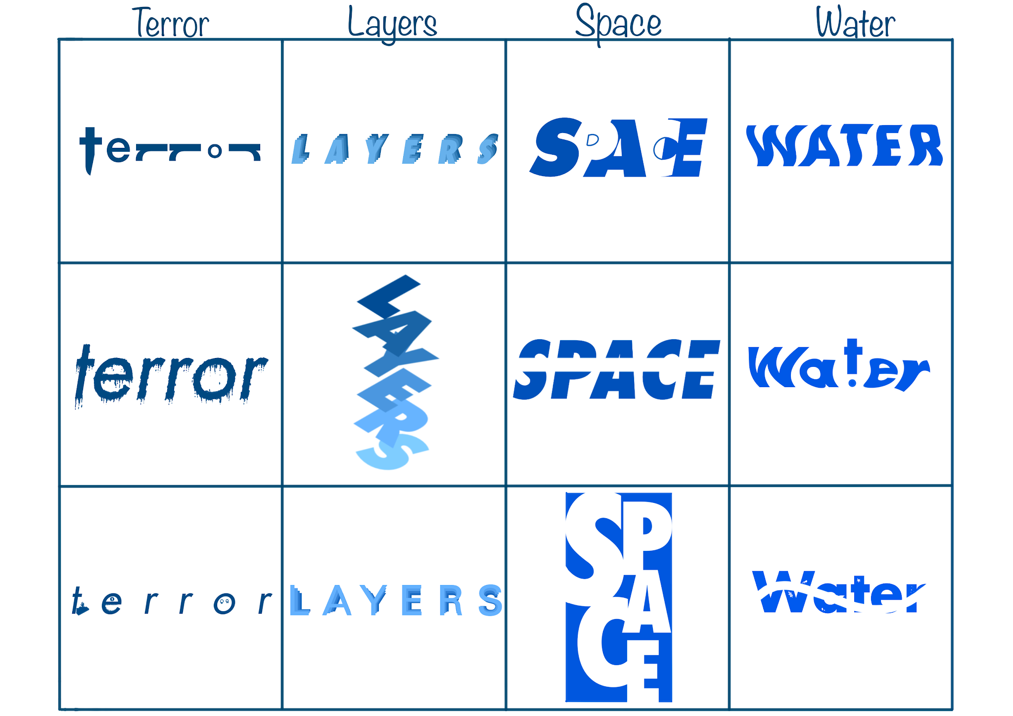
Fig. 3a.2 / Clean Sketches or Digital, Week 2 (09.03.2021)
Words I chose: Terror, Layers, Space, and Water. The first one is my rough sketches which are I drew on paper. The second is my clean sketches, I drew on digital on Procreate. I personally like sketch Terror#1, Layers#2, Space#1, and Water#2.

Fig. 3a.3 / Terror, Week 2 (09.03.2021)
For the first word, "Terror", I used ICT New Baskerville Std - Bold. I wanted to create some guns with "r" words. I flip the "r" letters horizontal and rotate into -90°. I make the "o" letter smaller than else because I wanted to create it like a bullet.

Fig. 3a.4 / Layers, Week 2 (09.03.2021)
For the second word, "Layers", I used Futura Std - Extra Bold. I wanted
to create something like layering. So, I reduce the opacity or change
the colour, <100% opacity into 100% opacity (up-down). It's like
going into deeper "layers".

Fig. 3a.5 / Space, Week 2 (09.03.2021)
For the third word, "Space", I used Gill Sans Std - Ultra Bold. I
wanted to utilize the positive and negative space. I coloured the artboard into black colour and the word itself is white colour.
 Fig. 3a.6 / Water, Week 2 (09.03.2021)
For the
last word, "Water", I used Futura Std - Book. I wanted to describe how
there is a drop of water that falls from a water faucet into a puddle of
water. I separated the "wa er" and the "t". I gave the fisheye effect to
the word "wa er". I put a small circle in the bottom on "t" and gave both
of them a squishing effect. As the result, the circle shape squishing like
a water drop. Here's the first attempt in JPG.
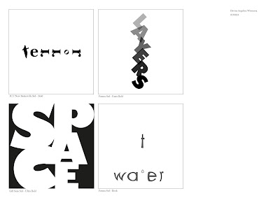 Fig. 3a.7 / First Attempt JPG, Week 2 (09.03.2021)
4. Finale Outcome (Adobe Illustrator)
Mr Vinod suggested I change the typeface into Futura
Std, so the "gun" from "r" is simpler. Also, for the "water" no need to
be distorted. I changed the "water" and recreate the new "terror". Here
is the final outcome in JPG.
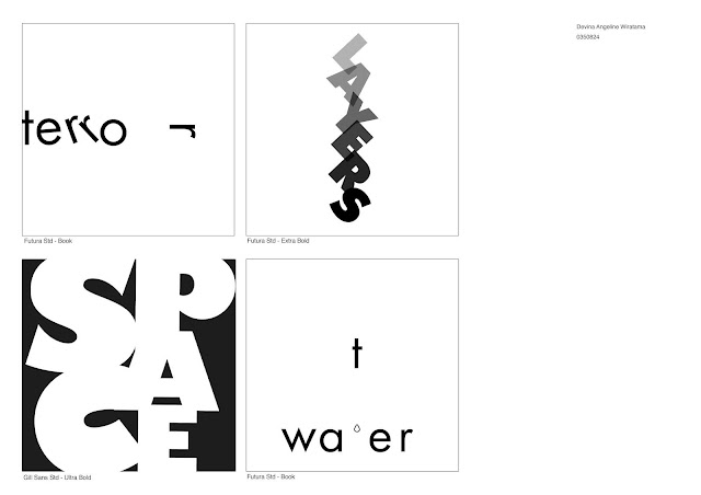 Fig. 3a.8 / Final Outcome JPG, Week 3 (09.10.2021)
Here is the final outcome in PDF.
<iframe
src="https://drive.google.com/file/d/1nXsVB2RzTN8tyGdsDDLgiKSkQ4KXHvxY/preview"
width="640" height="480" allow="autoplay"></iframe>
5. Type Expression: Animation
Mr Vinod
demonstrated how to create a basic type of animation using Illustrator and
Photoshop. This is my first animation demo.

Fig. 3a.9 / First Type Animation, Week (09.10.2021)
This is my second attempt at type
animation.

Fig. 3a.10 / Second Type Animation, Week 3 (09.10.2021)
I'm quite
like my second attempt. I wanted to create the last "r" it'll be a gun.
The letter "o" and the second "r" are dying. The last word, "ter" is avoiding. Here's my timeline in Adobe Illustrator.

Fig. 3a.11 / Second Animation Timeline - 32 Frames, Week 3
(09.10.2021)
I used
the red box on the left side as a guide so each of my words stay stable in
the middle of the artboard. This is my third attempt at type
animation.
 Fig. 3a.12 / Third Type Animation, Week 4 (09.17.2021)
I put
more "pause" time when the "r" becomes a gun like Mr Vinod said. So,
people can recognize them clearly. I feel the "O" is a little bit odd so I tried to create again.
This is my fourth attempt at type animation.

Fig. 3a.13 / Fourth Type Animation, Week 4 (09.17.2021)
I
decided to make the "O" and "R" when dying they'll fall off. It's like they walk in the rope, if unstable, they will die. I like it. I hope
I'm not recreating again.
Final Animated Type Expression

Fig. 3a.14 / Final Animated Type Expression, Week 4 (09.17.2021)
b. Task 1: Exercise 2 - Text Formating
First, we need to watch video 3, video 4, ex text formatting 1:4, 2:4, 3:4, 4:4, and 4:4A. In exercise 2, we learnt about how to create one final layout addressing different areas of text formatting, for example kerning, leading, paragraph spacing, alignment, etc. We used Adobe Indesign for this exercise. This exercise helps us to demonstrate the use of Grids, layouts and page flow and to apply the necessary skills and sensibilities for effective typographic communication.
Lecture 1:4 - Text Formatting: Kerning and TrackingIn this section, we learnt how to create a new document in InDesign and insert the text with only 10 typefaces that are provided by Mr Vinod.Here is the text formating without kerning.

Fig. 3b.1 / Text Formating without Kerning, Week 4 (09.17.2021)
Here is the text formating with kerning.

Fig. 3b.2 / Text Formating with Kerning, Week 4 (09.17.2021)
And here is the text formating comparison between w/ kerning and w/o kerning.

Fig. 3b.3 / Text Formating Comparison w/ and w/o Kerning, Week 4 (09.17.2021)
Lecture 2:4
Here are the notes that I took from the video.
Notes:
- A good page layout is heavily dependent on an attractive margin space- Point size within A4 and A3 is generally between 8 to 12 points- Use 10 typefaces that are provided- A-line length or number of characters (under info) always be about 55 to 65- Take note of your leading size- Separate the heading and sub-heading on the left side- Size of the leading is equal to paragraph spacing bellow (under paragraph control)- Keep text width the same for the same text of information. If they differ it confuses the audience, making them think it's a separate piece of information.- See whether the positive and negative space has to be equal (middle grey value)
Here's the progress.

Fig. 3b.4 / Progress 2:4, Week 4 (09.17.2021)
Lecture 3:4
Here are the notes that I took from the video.Notes:
- Alignment and raging.- Before beginning the design of anything, you must understand the different levels of information that are contained within the document.- Place the picture. - Whenever you're dealing with information, which is body text, you cannot have different sizes of text width.- Before you make kerning and letter adjustments, you need to make sure that your InDesign kerning/ tracking must be 5/ 1000 em.- You can use left align, left justify, and centre justify.- Don't use central alignment and right alignment.- If you use left justify, check the hyphenate and try to reduce the hyphenation using letter spacing and kerning, and take note the column interval needs to be increased from 5-7 mm, or sometimes 10 mm.
Here's the progress.

Fig. 3b.5 / Progress 3:4, Week 4 (09.17.2021)
Lecture 4:4
Here are the notes that I took from the video.Notes:- Cross alignment and baseline grids.- Sometimes headlights can be outside of the body text because it's not the major part of the text field. The major part of the text field is always the body text.- Headings: Double point size and leading of body text.- Sub-headline make it italic/ oblique.- View > Grids & guides > Show baseline grid (zoom in to see it).- Adjust the baseline grid. Edit > Prefences > Grids > Increment (same number with size of the leading) > threshold (50%) > select the body text > (right click) select text frame options > Baseline options (offset: leading) > General (align: top).
Here's the progress.

 Fig. 3b.6 - 3b.7 / Progress 4:4, Week 4 (09.17.2021)
Next, I made six texts formatting. 


Fig. 3b.8 - 3b.10 / 4th - 6th Layouts, Week 4 (09.17.2021)


 Fig. 3b.11 - 3b.13 / 7th - 9th Layouts, Week 4 (09.17.2021)
Here are in the small picture.

Fig. 3b.14 / 8 Texts Formatting, Week 4 (09.17.2021)
I think the 7th is better in fig.3b.13 one. Here's the result.
 Fig. 3b.15 / Last Text Formating, Week 4 (09.17.2021)

Fig. 3b.16 / Screenshot of Hidden Characters, Week 4 (09.17.2021)
Make sure you fulfil this, Devina!
#Week4_202108 (Wednesday & Friday) Things to look out for when completing Exercise 2 of Task 1:- Font size (8–12)
- Line Length (55–65/50–60 characters)
- Text Leading (2, 2.5, 3 points larger than font size)
- Ragging (left alignment) / Rivers (Left Justification)
- Cross Alignment
- No Widows / Orphans
Fulfil the Instructions.
- Font size (9 pt)
- Line length (55-65 characters)
- Text leading (11.5 pt)
- Rivers (left justification)
- Cross alignment
- No widows/orphans
- The kerning is no more or less than +/- 3 (15)
Final Outcome
Final in JPG
 Fig. 3b.17 / Final Outcome in JPG, Week 5 (09.24.2021)
Final in PDF
<iframe src="https://drive.google.com/file/d/1ADg8tpLlY1N8X5hcyCJESzxS47_VaQG8/preview" width="640" height="480" allow="autoplay"></iframe>

Fig. 3a.4 / Layers, Week 2 (09.03.2021)

Fig. 3a.5 / Space, Week 2 (09.03.2021)
For the third word, "Space", I used Gill Sans Std - Ultra Bold. I wanted to utilize the positive and negative space. I coloured the artboard into black colour and the word itself is white colour.

Fig. 3a.6 / Water, Week 2 (09.03.2021)

Fig. 3a.7 / First Attempt JPG, Week 2 (09.03.2021)
4. Finale Outcome (Adobe Illustrator)Mr Vinod suggested I change the typeface into Futura Std, so the "gun" from "r" is simpler. Also, for the "water" no need to be distorted. I changed the "water" and recreate the new "terror". Here is the final outcome in JPG.

Fig. 3a.8 / Final Outcome JPG, Week 3 (09.10.2021)
Here is the final outcome in PDF.
<iframe
src="https://drive.google.com/file/d/1nXsVB2RzTN8tyGdsDDLgiKSkQ4KXHvxY/preview"
width="640" height="480" allow="autoplay"></iframe>
5. Type Expression: Animation
Mr Vinod demonstrated how to create a basic type of animation using Illustrator and Photoshop. This is my first animation demo.

Fig. 3a.9 / First Type Animation, Week (09.10.2021)

Fig. 3a.10 / Second Type Animation, Week 3 (09.10.2021)

Fig. 3a.11 / Second Animation Timeline - 32 Frames, Week 3 (09.10.2021)
I used the red box on the left side as a guide so each of my words stay stable in the middle of the artboard.

Fig. 3a.12 / Third Type Animation, Week 4 (09.17.2021)
Fig. 3a.13 / Fourth Type Animation, Week 4 (09.17.2021)
I put
more "pause" time when the "r" becomes a gun like Mr Vinod said. So,
people can recognize them clearly. I feel the "O" is a little bit odd so I tried to create again.
This is my fourth attempt at type animation.

Fig. 3a.13 / Fourth Type Animation, Week 4 (09.17.2021)
I
decided to make the "O" and "R" when dying they'll fall off. It's like they walk in the rope, if unstable, they will die. I like it. I hope
I'm not recreating again.
Final Animated Type Expression

Fig. 3a.14 / Final Animated Type Expression, Week 4 (09.17.2021)
Lecture 1:4 - Text Formatting: Kerning and Tracking
Fig. 3b.1 / Text Formating without Kerning, Week 4 (09.17.2021)
Fig. 3b.2 / Text Formating with Kerning, Week 4 (09.17.2021)
Fig. 3b.3 / Text Formating Comparison w/ and w/o Kerning, Week 4 (09.17.2021)
Lecture 2:4
Here are the notes that I took from the video.
Notes:
- A good page layout is heavily dependent on an attractive margin space
- Point size within A4 and A3 is generally between 8 to 12 points
- Use 10 typefaces that are provided
- A-line length or number of characters (under info) always be about 55 to 65
- Take note of your leading size
- Separate the heading and sub-heading on the left side
- Size of the leading is equal to paragraph spacing bellow (under paragraph control)
- Keep text width the same for the same text of information. If they differ it confuses the audience, making them think it's a separate piece of information.
- See whether the positive and negative space has to be equal (middle grey value)
Here's the progress.

Fig. 3b.4 / Progress 2:4, Week 4 (09.17.2021)
Lecture 3:4
Here are the notes that I took from the video.
Notes:
- Alignment and raging.
- Before beginning the design of anything, you must understand the different levels of information that are contained within the document.
- Place the picture.
- Whenever you're dealing with information, which is body text, you cannot have different sizes of text width.
- Before you make kerning and letter adjustments, you need to make sure that your InDesign kerning/ tracking must be 5/ 1000 em.
- You can use left align, left justify, and centre justify.
- Don't use central alignment and right alignment.
- If you use left justify, check the hyphenate and try to reduce the hyphenation using letter spacing and kerning, and take note the column interval needs to be increased from 5-7 mm, or sometimes 10 mm.
Here's the progress.

Fig. 3b.5 / Progress 3:4, Week 4 (09.17.2021)
Lecture 4:4
Here are the notes that I took from the video.
Notes:
- Cross alignment and baseline grids.
- Sometimes headlights can be outside of the body text because it's not the major part of the text field. The major part of the text field is always the body text.
- Headings: Double point size and leading of body text.
- Sub-headline make it italic/ oblique.
- View > Grids & guides > Show baseline grid (zoom in to see it).
- Adjust the baseline grid. Edit > Prefences > Grids > Increment (same number with size of the leading) > threshold (50%) > select the body text > (right click) select text frame options > Baseline options (offset: leading) > General (align: top).
Here's the progress.


Next, I made six texts formatting.


Fig. 3b.8 - 3b.10 / 4th - 6th Layouts, Week 4 (09.17.2021)


Fig. 3b.14 / 8 Texts Formatting, Week 4 (09.17.2021)
I think the 7th is better in fig.3b.13 one. Here's the result.

Fig. 3b.15 / Last Text Formating, Week 4 (09.17.2021)

Fig. 3b.16 / Screenshot of Hidden Characters, Week 4 (09.17.2021)
Make sure you fulfil this, Devina!
#Week4_202108 (Wednesday & Friday) Things to look out for when completing Exercise 2 of Task 1:
- Font size (8–12)
- Line Length (55–65/50–60 characters)
- Text Leading (2, 2.5, 3 points larger than font size)
- Ragging (left alignment) / Rivers (Left Justification)
- Cross Alignment
- No Widows / Orphans
- Font size (9 pt)
- Line length (55-65 characters)
- Text leading (11.5 pt)
- Rivers (left justification)
- Cross alignment
- No widows/orphans
- The kerning is no more or less than +/- 3 (15)
Final in JPG

Fig. 3b.17 / Final Outcome in JPG, Week 5 (09.24.2021)
Final in PDF
<iframe src="https://drive.google.com/file/d/1ADg8tpLlY1N8X5hcyCJESzxS47_VaQG8/preview" width="640" height="480" allow="autoplay"></iframe>
FEEDBACK
Here are some questions to help to create the feedback (Type Expression)
- Are the explorations sufficient?
- Does the expression match the meaning of the word?
- On a scale of 1–5, how strong is the idea?
- How can the work be improved?
- Is the animation suitable?
- Does the animation reflect or enhance the meaning of the word?
- Does the animation reflect the form being expressed?
- Does the animation create a smile in your mind?
- How can it be improved?
Week 1: E-Portfolio Briefing
-
General Feedback
Please do not change your E-Portfolio with a different theme (if
you're not used to it) and black/ white background
-
Specific Feedback
Update the E-Portfolio with the embed, line/ horizontal rule,
and descriptions.
Week 2: Type Expression
- Exercise:
-
General Feedback
Height, thin-thick, big-small exaggerate more. Not much
feedback because we need to improve ourselves, not depend on
what the lecture said. It's your art and it's your
Journey.
-
Specific Feedback
Extremely careful how much distortion had been used, use very
min distort, focus on the text. Communication only through the
word/ understanding just using the word. Give more Depth
dimension in Layers' words.
- E-Blog:
-
General Feedback
Watch out for the themes, formating space (paragraph spacing,
force break), don't embed the sketches (embed is only for
MIB).
-
Specific Feedback
Update the further reading, reflection, and the date of
description. Take a picture with sunlight, not with a
lamp.
Week 3: Type Expression
-
General Feedback
No colour allow. Don't use too much distortion. Don't forget
to put the font description and name. Try not to choose the
wrong font
-
Specific Feedback
No need to distort the "t" in the "Water" word. Change the
font "terror" into Futura so the "r" can see as a gun.
Week 4: Type Expression and Animation
- Exercise:
-
General Feedback
Must use 10 typefaces. Try to convey to people with your
work.
-
Specific Feedback
Interesting and great work. Pause in the R when it becomes a
gun. The scenes need to be broken down into constituent parts
so that clearly understandable. The idea is excellent and the
execution is almost there.
- E-Blog:
-
General Feedback
Don't forget about the horizontal rule, headline lectures,
etc. No need date for the lectures. It is not compulsory to
add pictures to the lectures.
-
Specific Feedback
Use Helvetica font in the name and description in exercise 1.
Might see trxssah blog as a reference.
Week 5: Submission
- Exercise:
Good.
- E-Blog:
Excellent use of "Jump Links". All info present.
-
General Feedback
Please do not change your E-Portfolio with a different theme (if you're not used to it) and black/ white background
-
Specific Feedback
Update the E-Portfolio with the embed, line/ horizontal rule, and descriptions.
Week 2: Type Expression
- Exercise:
-
General Feedback
Height, thin-thick, big-small exaggerate more. Not much
feedback because we need to improve ourselves, not depend on
what the lecture said. It's your art and it's your
Journey.
-
Specific Feedback
Extremely careful how much distortion had been used, use very
min distort, focus on the text. Communication only through the
word/ understanding just using the word. Give more Depth
dimension in Layers' words.
Height, thin-thick, big-small exaggerate more. Not much feedback because we need to improve ourselves, not depend on what the lecture said. It's your art and it's your Journey.
Extremely careful how much distortion had been used, use very min distort, focus on the text. Communication only through the word/ understanding just using the word. Give more Depth dimension in Layers' words.
- E-Blog:
-
General Feedback
Watch out for the themes, formating space (paragraph spacing, force break), don't embed the sketches (embed is only for MIB).
-
Specific Feedback
Update the further reading, reflection, and the date of description. Take a picture with sunlight, not with a lamp.
Week 3: Type Expression
-
General Feedback
No colour allow. Don't use too much distortion. Don't forget to put the font description and name. Try not to choose the wrong font
-
Specific Feedback
No need to distort the "t" in the "Water" word. Change the font "terror" into Futura so the "r" can see as a gun.
- Exercise:
-
General Feedback
Must use 10 typefaces. Try to convey to people with your work.
-
Specific Feedback
Interesting and great work. Pause in the R when it becomes a gun. The scenes need to be broken down into constituent parts so that clearly understandable. The idea is excellent and the execution is almost there.
- E-Blog:
-
General Feedback
Don't forget about the horizontal rule, headline lectures, etc. No need date for the lectures. It is not compulsory to add pictures to the lectures.
-
Specific Feedback
Use Helvetica font in the name and description in exercise 1. Might see trxssah blog as a reference.
- Exercise:
Good. - E-Blog:
Excellent use of "Jump Links". All info present.
REFLECTION
Experience
I like how the lectures taught us coherently and clearly. Due to the
class often conveys things that are important and useful to me, it wasn’t
boring and I didn’t fall asleep. Every time before the class start, I was
always feeling anxious because there are a lot of things that I need to
finish and learn. I was greatly helped by the feedback from the
lecturers.
Observation
I observed that don’t give up if you haven’t tried. The subjects might
be a lot and tough let alone just starting uni-life, just do it. I
noticed that I had a struggle finding and borrow the book of typography
in the library in an online situation. I also examined that I had
trouble learning adobe in an online way.
Findings
I realized that typography is not as simple as I thought. there are many rules that must be followed and must be observed. very disciplined. I am grateful to be able to learn about typography because it is very useful for my blog, my work, and things in the future. I also learned about 10 typefaces where there is a good history behind them.
FURTHER READING

Fig. 4.1 / The Complete Manual of Typography (2011), source: The Complete Manual of Typography
Based on one of the requirements of this typography blog, I did some further
reading with the book "The Complete Manual of Typography, Second Edition" by
James Felici. This pdf book is Excellent! It tells us how the type should
look and how to set type like a professional. The writing is clear and
straightforward. I'm a bit surprised that it's free in pdf (I think it's
legal).
Chapter 1 "Typography Basics": What Makes Good Type Good (and Bad Type Bad)
- page 105.
James said, the goal here is not connoisseurship (although people who care
about type are often labelled “type snobs”) but rather knowing the rules of
the craft, so that the type you set serves the text and the reader in ways
they both deserve.
1. Legibility and Readability
1. Legibility and Readability
When most
people look at a page, they don’t see typefaces and they don’t see type.
They see words. They’re not admiring the page—they’re reading it, and
reading is all about rhythm. Legibility refers to a reader’s
ability to easily recognize letterforms and the word forms built from
them. Readability refers to the facility and comfort with which
text can be comprehended. Text with good readability must also be legible,
but mere legibility doesn’t make text readable.
Design—in the form of page size, type
size, and line length—also has a lot to do with legibility and
readability. Paperback editions of hardbound books often suffer from
this problem because cheapskate publishers simply reduce the larger
hardbound pages photographically and print them in
a smaller paperback format. Ultimately, though, the most poorly set type
isn’t illegible or even unreadable; it’s just carelessly set.
2. Type Colour
2. Type Colour
When
this texture is consistent and even, the type is said to have good
colour. The tightly spaced type will have a darker colour than the
loosely spaced type, but the most important thing is for the colour to
be even and consistent. Alternately tight and loose lines are a colour
problem at a very “local” level, but colour problems are most
noticeable at a larger scale.
Such
variations in colour don’t necessarily affect readability, but they
are a distraction. When one dark paragraph stands out on a page, it
catches your eye. This shouldn’t happen. Variations in colour like
this give the impression of a lack of quality control, a lack of care,
a lack of expertise. It gives the text a slack and unkempt
appearance.
3. Overly Tight Facing
3. Overly Tight Facing
Tight spacing interferes with the
reader’s ability to recognize word forms. Readers who have to do a
double-take to recognize a word or phrase are at once slowed down
and annoyed. An rn that melts together to look like an m, a; cl that
looks like a d; or vv that looks like a w is bound to trip people
up. More generally, in tightly spaced text, character-sequence
patterns that are usually easy to recognize become unfamiliar, and
readers are forced back toward reading letter by letter, as if in a
foreign language.
4. Overly Loose Spacing
4. Overly Loose Spacing
The strategy is based on the
ability of the eye to pick out differences between tight and
tighter types more easily than between loose and looser types. In
other words, loosely spaced type more readily creates a sense of
consistent type colour—even though that colour is quite
pale—because tight lines aren’t allowed and everything is set so
loose that the loosest lines don’t stand out. Typeset this way is
not a pretty sight, but it does have the practical benefit of
always looking the same, and everyday composition problems are
masked by the slack spacing.
Comments
Post a Comment