
Devina Angeline Wiratama / 0350824
Design Principles / Bachelor of Design in Creative Media
Task 1: Exercise 3
Jump Link
- Lectures
- Instructions
- Visual Research
- Unity Exercise
- Harmony Exercise
- Feedback
- Reflections
- Design Principles
- Home
LECTURES
Teaching from lecturers are as
follows.
- WEEK 4 - 09.14.2021
This week we were briefed about the next
exercise. Dr Jinchi explained Harmony, Unity, Symbol, Word and Image
in the 4 and 5 videos.
HARMONY AND UNITY
I. Harmony
Harmony involves and the selection of elements that share a
common trait. Harmony becomes monotony without variety (is about
a change or slight difference in element and objects in the
composition, to avoid a boring composition. Variety can also
involve varying angles, exposure, opposition, etc). Harmony is
the sense that all of the elements of your design fit together.
They may fit the same theme, aesthetic style or mood.

Fig. 1.1 / Harmony, Week 4 (09.14.2021)
II. Unity
Unity refers to the repetition of particular elements
throughout your design - whether they’re colours, shapes, or
materials - to pull the look together. Unity occurs when these.
Elements are opposed in such a way that they are balanced and
give a sense of oneness, creating a theme. Although unity and
harmony may sound similar, they each play distinct roles in the
way we experience design.


Fig. 1.2 / Unity#1; Fig. 1.3 / Unity#2, Week 4
(09.14.2021)
1. Scale and Proportion
Scale and proportion are both design elements that have to do
with size. Scale I the size of one object in relation to the
other objects in a design or artwork. Proportion refers to the
size of the parts of an object in relation to other parts of the
same object. Throughout the centuries, designers have used scale
and proportion to depict or distract from the ideal.
a. Scale
Scale refers to the size and dimension of figures and forms
relative to a specific unit of measure. Scale can be determined
in two ways: Actual measurement and Visual estimates based on
the comparison.

Fig. 1.4 / Actual Measurement and Visual Estimates, Week 4
(09.14.2021)
Architectural ratings and scale models are examples of the
applied use of scale. Scale is used to specify or illustrate
details based on the relative size of objects. Substantial
deviation from a normal scale relationship can create dramatic
results and visual interest within the design or
composition.

Fig. 1.5 / Architechtural, Week 4 (09.14.2021)
b. Proportion
proportion in art and design is the relationship of two or more
elements in a composition and how they compare to one another
with respect to size, colour, quantity, degree, setting, etc
(ratio). Proportion is said to be harmonious when a correct
relationship exists between the elements with respect to size or
quantity. The effective use of proportion in design often
results in harmony and unity.

Fig. 1.6 / Proportion, Week 4 (09.14.2021)
SYMBOL, WORD, AND IMAGE
I. Symbol
A sign, shape, or object that is used to represent
something else. In design, symbols can provide or covey
information, equivalent to one or more sentences of text
or even a whole story.

Fig. 1.7 / Symbols, Week 4 (09.14.2021)
1. Pictorial Symbols
Image-related and simplified pictures.


Fig. 1.8 / Pictorial#1, Fig. 1.9 / Pictorial#2, Week 4
(09.14.2021)
2. Abstract Symbols
Abstract symbols can look like the objects that they
represent but have fewer details.

Fig. 1.10 / Abstract Symbols, Week 4 (09.14.2021)
3. Arbitrary Symbol
Arbitrary symbols have no resemblance at all to the
objects or the ideas they represent. The symbol s invented
with the meaning constructed. Many are based on geometric
shapes and colours.
 Fig. 1.11 / Arbitrary Symbol, Week 4 (09.14.2021)
4. Word and image
Imagery is a vital part of the design, be it print or
digital. Users and viewers are able to relate to a concept
or a brand if the right images are used in a work of
design. It s therefore important to use suitable and
relevant images when designing. Choosing the right
words to pair with the imagery is of high importance as it
would deepen the meaning of the design. Suitable typeface
and strategic positioning of the type will result in
visual hierarchy and balance in a work of design.
Typography is the design and arrangement of text to convey
a message or concept.
 Fig. 1.12 / Word and Image, Week 4 (09.14.2021)
This week we were briefed about the next
exercise. Dr Jinchi explained Harmony, Unity, Symbol, Word and Image
in the 4 and 5 videos.
Fig. 1.2 / Unity#1; Fig. 1.3 / Unity#2, Week 4 (09.14.2021)
Fig. 1.4 / Actual Measurement and Visual Estimates, Week 4 (09.14.2021)
Fig. 1.5 / Architechtural, Week 4 (09.14.2021)
Fig. 1.6 / Proportion, Week 4 (09.14.2021)
Fig. 1.8 / Pictorial#1, Fig. 1.9 / Pictorial#2, Week 4 (09.14.2021)
Fig. 1.10 / Abstract Symbols, Week 4 (09.14.2021)
HARMONY AND UNITY
I. Harmony
Harmony involves and the selection of elements that share a
common trait. Harmony becomes monotony without variety (is about
a change or slight difference in element and objects in the
composition, to avoid a boring composition. Variety can also
involve varying angles, exposure, opposition, etc). Harmony is
the sense that all of the elements of your design fit together.
They may fit the same theme, aesthetic style or mood.
Fig. 1.1 / Harmony, Week 4 (09.14.2021)
II. Unity
Unity refers to the repetition of particular elements throughout your design - whether they’re colours, shapes, or materials - to pull the look together. Unity occurs when these. Elements are opposed in such a way that they are balanced and give a sense of oneness, creating a theme. Although unity and harmony may sound similar, they each play distinct roles in the way we experience design.


Fig. 1.2 / Unity#1; Fig. 1.3 / Unity#2, Week 4 (09.14.2021)
1. Scale and Proportion
Scale and proportion are both design elements that have to do
with size. Scale I the size of one object in relation to the
other objects in a design or artwork. Proportion refers to the
size of the parts of an object in relation to other parts of the
same object. Throughout the centuries, designers have used scale
and proportion to depict or distract from the ideal.
a. Scale
Scale refers to the size and dimension of figures and forms
relative to a specific unit of measure. Scale can be determined
in two ways: Actual measurement and Visual estimates based on
the comparison.

Fig. 1.4 / Actual Measurement and Visual Estimates, Week 4 (09.14.2021)
Architectural ratings and scale models are examples of the
applied use of scale. Scale is used to specify or illustrate
details based on the relative size of objects. Substantial
deviation from a normal scale relationship can create dramatic
results and visual interest within the design or
composition.

Fig. 1.5 / Architechtural, Week 4 (09.14.2021)
b. Proportion
proportion in art and design is the relationship of two or more
elements in a composition and how they compare to one another
with respect to size, colour, quantity, degree, setting, etc
(ratio). Proportion is said to be harmonious when a correct
relationship exists between the elements with respect to size or
quantity. The effective use of proportion in design often
results in harmony and unity.

Fig. 1.6 / Proportion, Week 4 (09.14.2021)
SYMBOL, WORD, AND IMAGE
I. Symbol
A sign, shape, or object that is used to represent
something else. In design, symbols can provide or covey
information, equivalent to one or more sentences of text
or even a whole story.
Fig. 1.7 / Symbols, Week 4 (09.14.2021)

Fig. 1.7 / Symbols, Week 4 (09.14.2021)
1. Pictorial Symbols
Image-related and simplified pictures.


Fig. 1.8 / Pictorial#1, Fig. 1.9 / Pictorial#2, Week 4 (09.14.2021)
2. Abstract Symbols
Abstract symbols can look like the objects that they
represent but have fewer details.

Fig. 1.10 / Abstract Symbols, Week 4 (09.14.2021)
3. Arbitrary Symbol
Arbitrary symbols have no resemblance at all to the
objects or the ideas they represent. The symbol s invented
with the meaning constructed. Many are based on geometric
shapes and colours.

Fig. 1.11 / Arbitrary Symbol, Week 4 (09.14.2021)
4. Word and image
Imagery is a vital part of the design, be it print or
digital. Users and viewers are able to relate to a concept
or a brand if the right images are used in a work of
design. It s therefore important to use suitable and
relevant images when designing. Choosing the right
words to pair with the imagery is of high importance as it
would deepen the meaning of the design. Suitable typeface
and strategic positioning of the type will result in
visual hierarchy and balance in a work of design.
Typography is the design and arrangement of text to convey
a message or concept.

Fig. 1.12 / Word and Image, Week 4 (09.14.2021)
INSTRUCTIONS
<iframe
src="https://drive.google.com/file/d/1gnxmGcKqLPFjNqEvooUwyFBYEfO4NJJF/preview"
width="640" height="480" allow="autoplay"></iframe>
<iframe
src="https://drive.google.com/file/d/1gnxmGcKqLPFjNqEvooUwyFBYEfO4NJJF/preview"
width="640" height="480" allow="autoplay"></iframe>
Instructions for exercises are as
follows.
Task 1: Exercise 3 - Harmony/ Unity/ Symbol / Word and Image
A. Here are the instructions for exercise 2
-
Choose 2 principles from Harmony/ Unity/ Symbol/ Word and Image. Produce
1 design for each chosen principle.
- Only send e-blog link beginning on week 1
-
Must contain a recap of the selected design principles
B. Make sure the design process has:
- Visual research
- Idea exploration and description
- The final outcome in PDF and short rationale
- Feedback by lecturer
- Reflection on the particular exercise
VISUAL RESEARCH
Visual
researches are as follows.
Harmony (Source: Judy's Art Buss Centre)
- Coherence
- Similar and compatible elements
- The principle of harmony can be compared to singers. They are all singing the same song but with different blending musical notes.
- It can be in harmony with shape, colour, form, line texture, and space.

Fig. 2.1 / Harmony Visual Research, Week 6 (09.28.2021)
Unity (Source: Judy's Art Buss Centre)
- Coherence
- All the parts are working together.
- Achieved by using elements that are all the same rather than elements that are similar and compatible.
- Like singers, who all sing in the same note at the same time as they sang one song together.
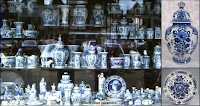
Fig. 2.2 / Unity Visual Research, Week 6 (09.28.2021)
- Coherence
- Similar and compatible elements
- The principle of harmony can be compared to singers. They are all singing the same song but with different blending musical notes.
- It can be in harmony with shape, colour, form, line texture, and space.

Fig. 2.1 / Harmony Visual Research, Week 6 (09.28.2021)
Unity (Source: Judy's Art Buss Centre)
- Coherence
- All the parts are working together.
- Achieved by using elements that are all the same rather than elements that are similar and compatible.
- Like singers, who all sing in the same note at the same time as they sang one song together.
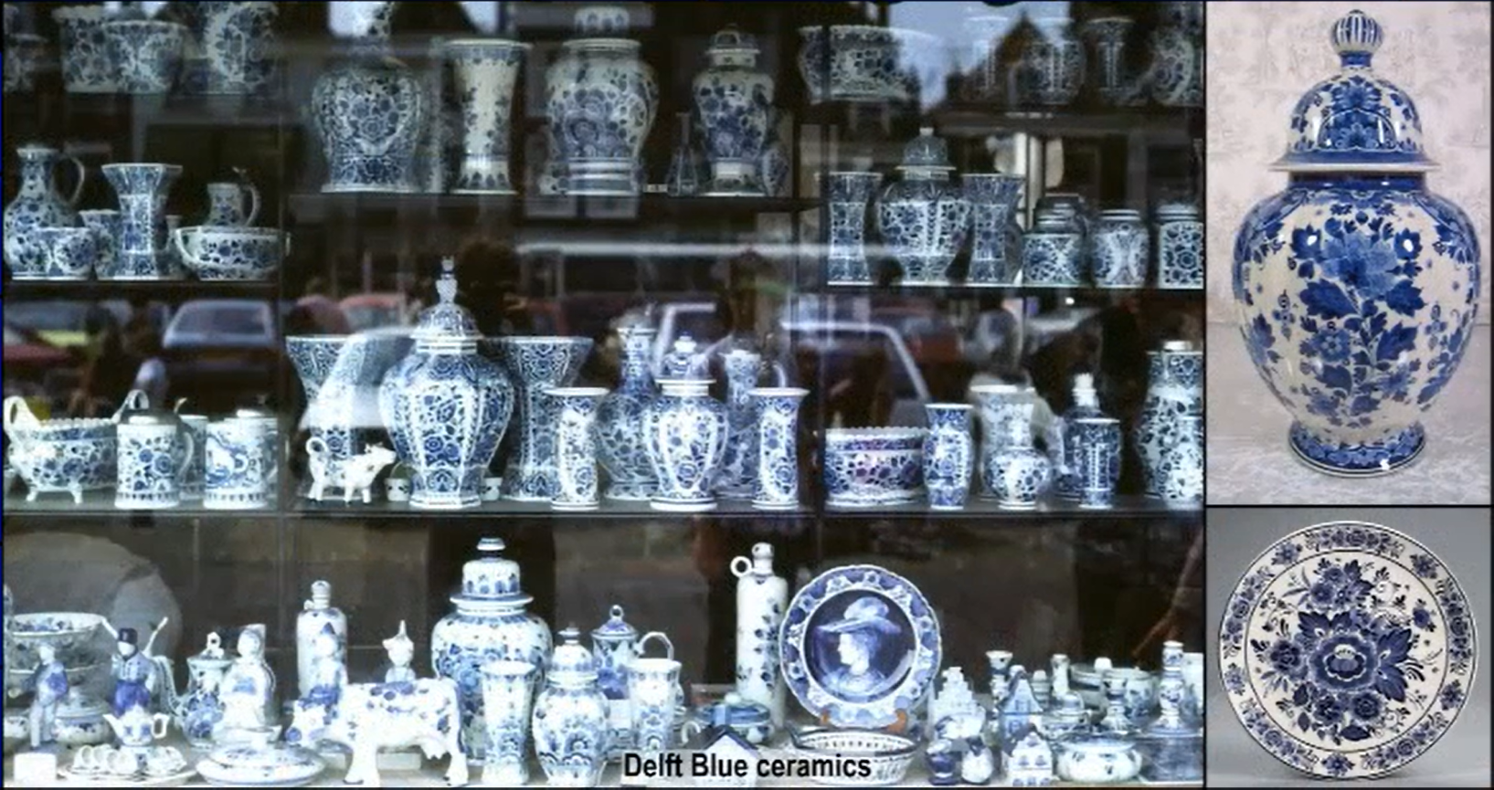
Fig. 2.2 / Unity Visual Research, Week 6 (09.28.2021)
IDEA EXPLORATION, PROGRESS, & FINALE OUTCOME
Ideas exploration, progress, and final outcome are as follows.
-
Exercise 3 - Unity and Harmony
Unity
Ideas Exploration

Fig. 3.1 / Unity Reference, Week 4 (09.14.2021)
I want to create something unity in the forest and I found this
on this website (Unity Website). I like this picture, it's work and banding together. The
painter use of the brush brings the whole composition into one.
Progress
This is my progress, in 30 seconds video. I drew it on procreate.
Vid. 3.1 / Unity Video, Week 4 (09.14.2021)
It's quite challenging when I drew this draw. I'm not very good at drawing trees and here I've tried. The trees are balanced and give a sense of oneness (creating a
theme). One also we can see is the colour, analogous colour. I
changed the colour from warm to cold, cause the autumn is too
mainstream I guess (?). So it's like cold, blueish, and fantasy.
Here's my final outcome unity.
 Fig. 3.2 / Final Outcome Unity, Week 4 (09.14.2021)
Harmony
Ideas Exploration
 Fig. 3.3 / Harmony Reference, Week 4 (09.14.2021)
Actually, it's hard for me to distinguish between unity and
harmony. That's why I tried to choose harmony and unity. This is
my harmony reference, from the Up movie.
Progress
For harmony, I wanted to create an abstract tree (the leaves). So, I
sketched the forest (fig. 3.4) and I colour it with watercolour.
Usually, people will use cotton buds (mainstream, not abstract), so I
tried to make it with bubble wrap. As you can see, I tried colouring it on another paper first to see how it turned out.
I am quite happy with the result. it looks abstract and colourful
(harmony in colour).

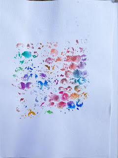 Fig. 3.4 / Sketch Harmony#1; Fig. 3.5 / Sketch Harmony#2, Week 4
(09.14.2021)
Fig. 3.4 / Sketch Harmony#1; Fig. 3.5 / Sketch Harmony#2, Week 4
(09.14.2021)
Here are my first and second attempts at traditional design.

 Fig. 3.6 / Harmony#1; Fig. 3.7 / Harmony#2, Week 4 (09.14.2021)


Fig. 3.8 - 3.9 / Step by step, Week 5 (09.21.2021)
First, I tried to change it to digital from traditional. So in this image (fig. 3.6), I removed the white background of the paper (into fig. 3.8). After that, I tried to reduce its size, reduce its opacity and double it so that there are two trees at the bottom. The two trees that I had duplicated and flipped vertically so that the two new trees were on top. In the fourth image, I changed the adjustment into a pin light. Next, I add the original tree into the centre and changed the adjustment into a pin light. Last but not least, I put two trees in the bottom, reducing the opacity and the size, and changing the adjustment into a divide. The last two trees are to make a thin texture, unobtrusive. Here's the progress, I made on Procreate.
Vid. 3.1 / Harmony Progress, Week 5 (09.21.2021)

Fig. 3.10 / Final Outcome, Week 5 (09.21.2021)
I love the result. It looks harmonious and abstract. I'm glad that I improve it as directed by Mr Charles.
Final Outcome in PDF
<iframe src="https://drive.google.com/file/d/150oDhIIYLAlAvulRb6hhXnOGok9-1RoK/preview" width="640" height="480" allow="autoplay"></iframe>
<iframe src="https://drive.google.com/file/d/1-1oB6ODCVxc7tpGSw1Jn_ufaW3nzPSbm/preview" width="640" height="480" allow="autoplay"></iframe>
Ideas Exploration

Fig. 3.1 / Unity Reference, Week 4 (09.14.2021)
I want to create something unity in the forest and I found this on this website (Unity Website). I like this picture, it's work and banding together. The painter use of the brush brings the whole composition into one.
Progress
This is my progress, in 30 seconds video. I drew it on procreate.
Vid. 3.1 / Unity Video, Week 4 (09.14.2021)
It's quite challenging when I drew this draw. I'm not very good at drawing trees and here I've tried. The trees are balanced and give a sense of oneness (creating a
theme). One also we can see is the colour, analogous colour. I
changed the colour from warm to cold, cause the autumn is too
mainstream I guess (?). So it's like cold, blueish, and fantasy.
Here's my final outcome unity.

Fig. 3.2 / Final Outcome Unity, Week 4 (09.14.2021)
Harmony

Fig. 3.3 / Harmony Reference, Week 4 (09.14.2021)
Actually, it's hard for me to distinguish between unity and harmony. That's why I tried to choose harmony and unity. This is my harmony reference, from the Up movie.
Actually, it's hard for me to distinguish between unity and harmony. That's why I tried to choose harmony and unity. This is my harmony reference, from the Up movie.
Progress
For harmony, I wanted to create an abstract tree (the leaves). So, I sketched the forest (fig. 3.4) and I colour it with watercolour. Usually, people will use cotton buds (mainstream, not abstract), so I tried to make it with bubble wrap. As you can see, I tried colouring it on another paper first to see how it turned out. I am quite happy with the result. it looks abstract and colourful (harmony in colour).
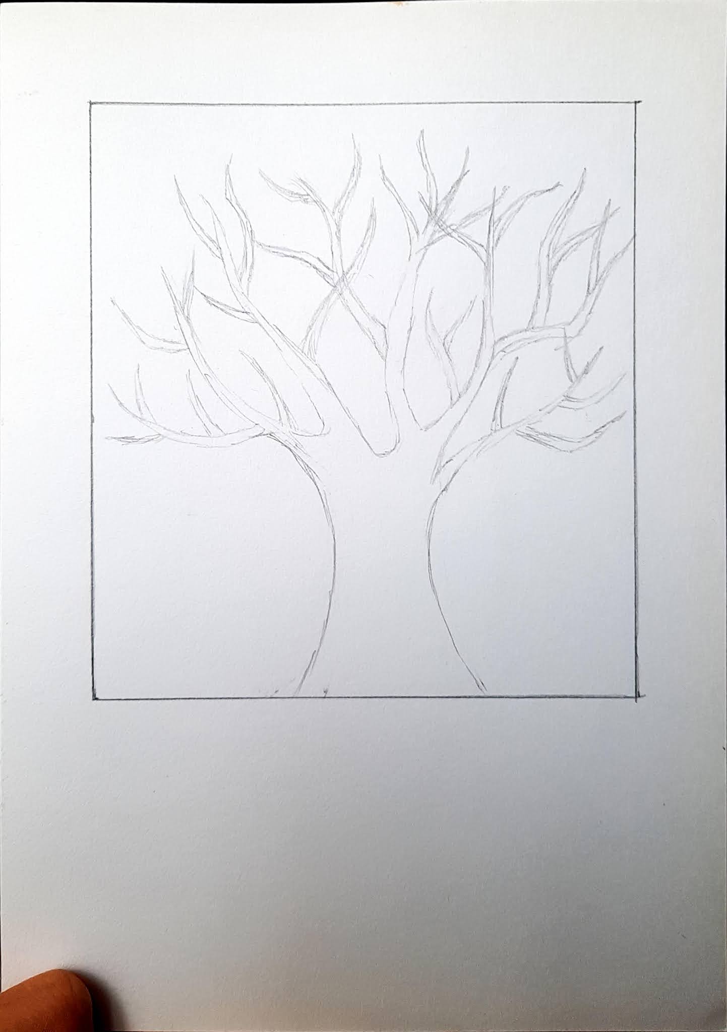
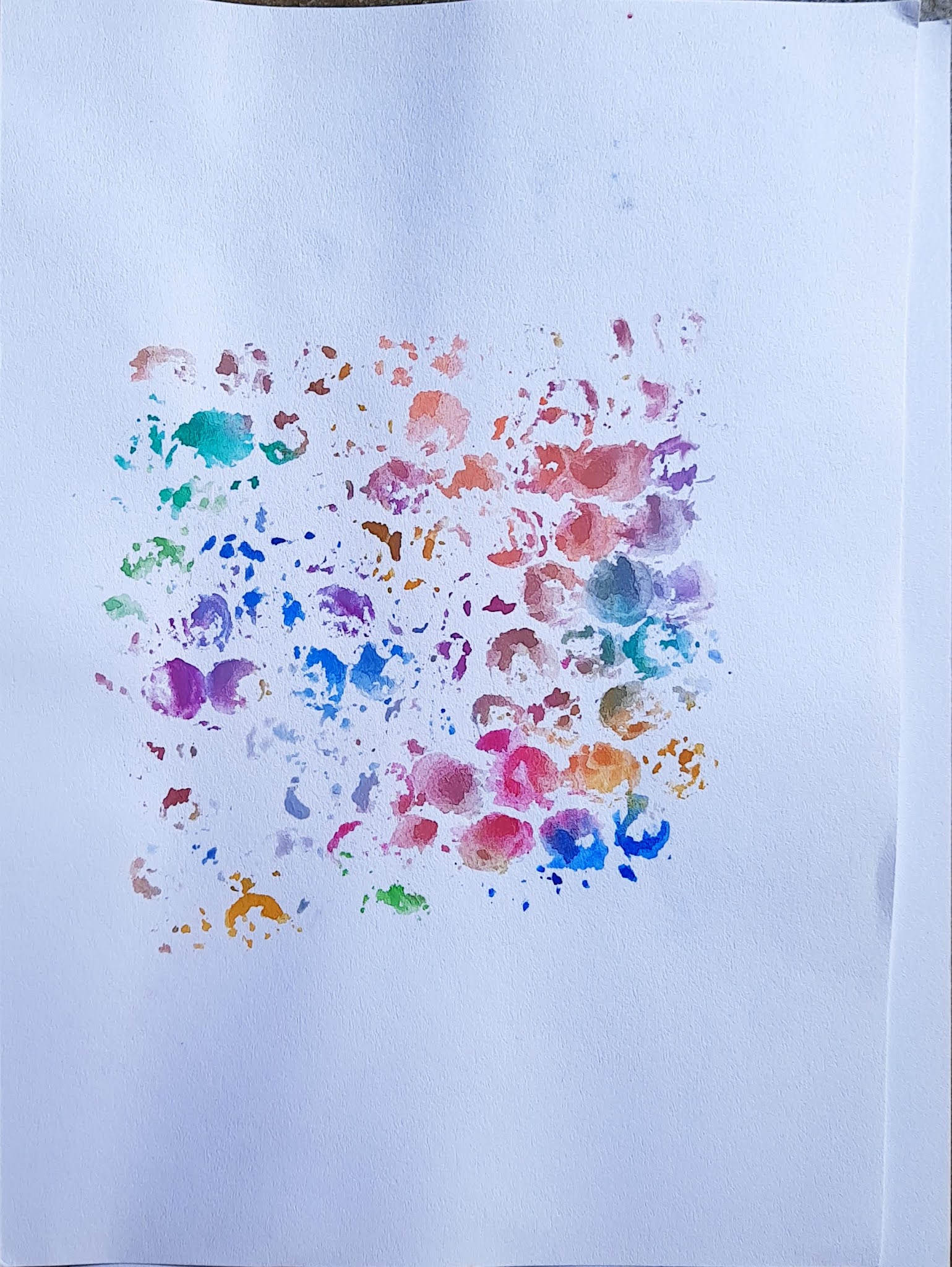
Fig. 3.4 / Sketch Harmony#1; Fig. 3.5 / Sketch Harmony#2, Week 4
(09.14.2021)
Here are my first and second attempts at traditional design.


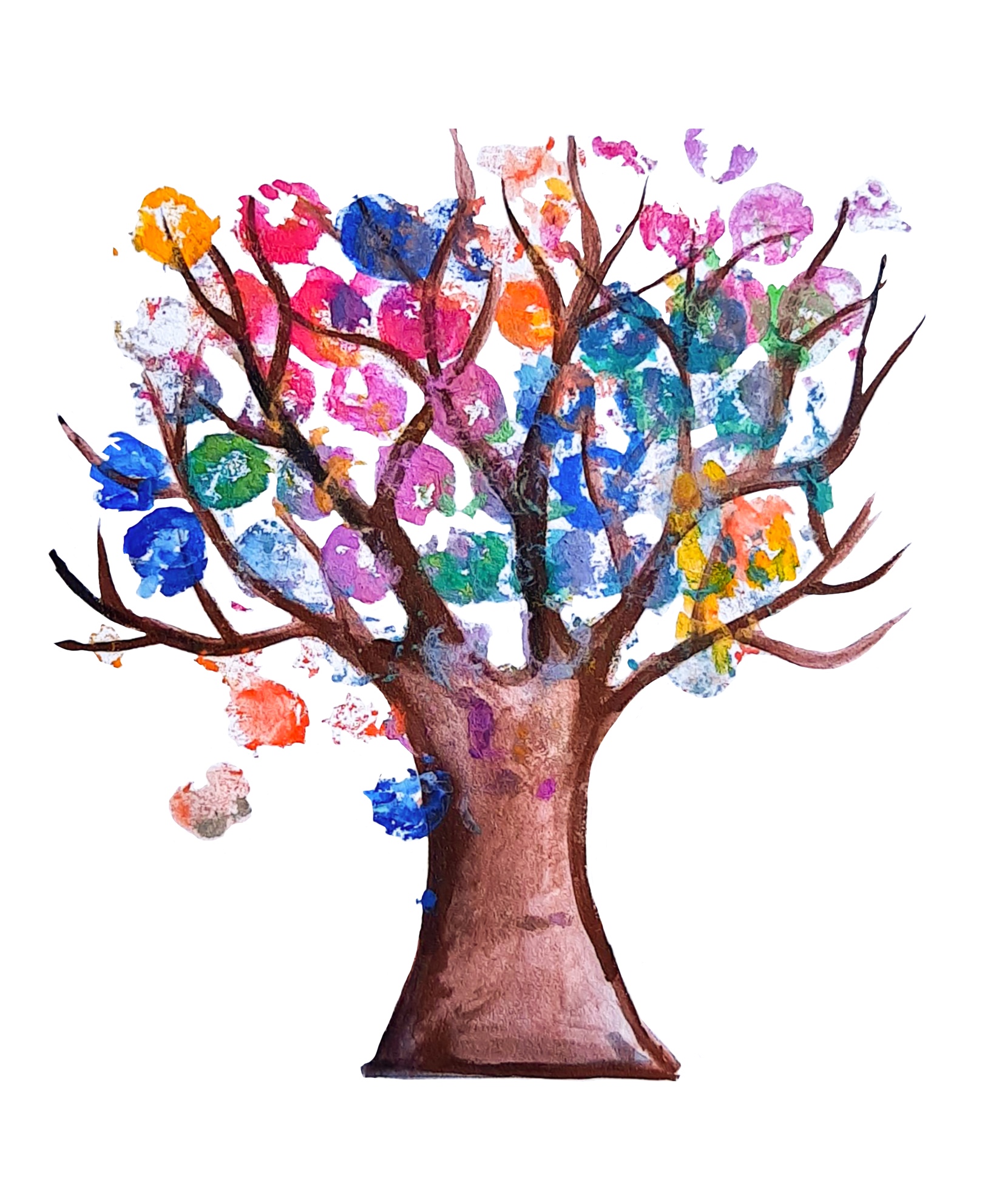

Fig. 3.8 - 3.9 / Step by step, Week 5 (09.21.2021)
First, I tried to change it to digital from traditional. So in this image (fig. 3.6), I removed the white background of the paper (into fig. 3.8). After that, I tried to reduce its size, reduce its opacity and double it so that there are two trees at the bottom. The two trees that I had duplicated and flipped vertically so that the two new trees were on top. In the fourth image, I changed the adjustment into a pin light. Next, I add the original tree into the centre and changed the adjustment into a pin light. Last but not least, I put two trees in the bottom, reducing the opacity and the size, and changing the adjustment into a divide. The last two trees are to make a thin texture, unobtrusive. Here's the progress, I made on Procreate.
Vid. 3.1 / Harmony Progress, Week 5 (09.21.2021)
Vid. 3.1 / Harmony Progress, Week 5 (09.21.2021)

Fig. 3.10 / Final Outcome, Week 5 (09.21.2021)
I love the result. It looks harmonious and abstract. I'm glad that I improve it as directed by Mr Charles.
Final Outcome in PDF
Final Outcome in PDF
<iframe src="https://drive.google.com/file/d/150oDhIIYLAlAvulRb6hhXnOGok9-1RoK/preview" width="640" height="480" allow="autoplay"></iframe>
<iframe src="https://drive.google.com/file/d/1-1oB6ODCVxc7tpGSw1Jn_ufaW3nzPSbm/preview" width="640" height="480" allow="autoplay"></iframe>
<iframe src="https://drive.google.com/file/d/1-1oB6ODCVxc7tpGSw1Jn_ufaW3nzPSbm/preview" width="640" height="480" allow="autoplay"></iframe>
Good exploration!
ReplyDeleteThank you, sir!
Delete