
08.26.2021 - 09.23.2021 (Week 1 - Week 5)
Devina Angeline Wiratama /
0350824
Illustration and Visual Narrative / Bachelor of Design (Hons) in
Creative Media
Task 1: Exercises
Jump Link
- Lectures
- Practical
- Visual Research
- Instructions
- Feedback
- Reflections
- Illustration and Visual Narrative
- Home
LECTURES
Week 1 / Introduction and Briefing
A
warm welcome from Ms Anis, Ms Jennifer, and Ms Anis's cat to us, new
semester students. In this section, they briefed us about Module
Information and the exercise that we need to complete such as create a
sketch of character design from Vormator shapes. It was really new and
challenging to me to make something new with the Vormator. I hope I
can do well.
Week 2 / Character Design
Introduction to Character
Design. We were taught stylized character design that makes
unique, which are shapes, colour, emphasis and contrast, harmony,
expression/poses, and also what makes a good character
design.
1. Shapes
Shapes define a character's
silhouette. It is used to identify a character from one
another. Commonly, the more stable shape, the good character of the male
lead.

Fig. 1.1 / Shape Example, Week 2 (09.02.2021)
2. Colour
Colour play an important role in
determining who are the heroes/ protagonists or villains/
antagonists. Colours have qualities that can cause certain emotions
in people.
 Fig. 1.2 / Colour Example, Week 2 (09.02.2021)
3. Emphasis and Contrast
A
good character design is when you pick one visual element in a
character and exaggerate it, making the character outstanding and
memorable. Sometimes picking a cultural element and adding it to a
design makes it uniquely authentic. For example, are Hercules and
Hades.
 Fig. 1.3 / Emphasis and Contrast Example, Week 2
(09.02.2021)
Fig. 1.3 / Emphasis and Contrast Example, Week 2
(09.02.2021)
4. Harmony
All
shapes, lines, colours, motifs, patterns must be put together
tastefully. Every element used in your design must work together
like they compliment each other - A balance of visual elements that
has a visual hierarchy.
 Fig. 1.4 / Harmony Example, Week 2 (09.02.2021)
5. Expressions/ Poses
What makes your character wins the
heart of an audience is their behaviour/ quirks/ personalities that
are visually shown.
 Fig. 1.5 / Poses Example, Week 2 (09.02.2021)
Week 3 / Composition
Introduction to Composition. Many
Instagram looks good because they followed the principles of the
magical thing called composition. Here are the types of shots or
compositions (establishing, bird's eye view, framing, medium
shot, close-up, and worm's eye view).

Fig. 1.6 / Types of Shots or Compositions, Week 3
(09.09.2021)
Ms Anis told us about industry techniques, which finds a
balance of negative and positive and visual hierarchy (mood,
rhythm/ movement, visual elements). There is no right or wrong
in composition, only bad and tasteful in composition! So we need
to study more, observation is the key. In this section, we also
tried to identify the positive and negative space in a
composition.

Fig. 1.7 / Practice + and - Space, Week 3
(09.09.2021)
A
warm welcome from Ms Anis, Ms Jennifer, and Ms Anis's cat to us, new
semester students. In this section, they briefed us about Module
Information and the exercise that we need to complete such as create a
sketch of character design from Vormator shapes. It was really new and
challenging to me to make something new with the Vormator. I hope I
can do well.
Week 2 / Character Design
Introduction to Character
Design. We were taught stylized character design that makes
unique, which are shapes, colour, emphasis and contrast, harmony,
expression/poses, and also what makes a good character
design.
1. Shapes
Shapes define a character's
silhouette. It is used to identify a character from one
another. Commonly, the more stable shape, the good character of the male
lead.
Fig. 1.1 / Shape Example, Week 2 (09.02.2021)
2. Colour
Colour play an important role in
determining who are the heroes/ protagonists or villains/
antagonists. Colours have qualities that can cause certain emotions
in people.
Fig. 1.2 / Colour Example, Week 2 (09.02.2021)
3. Emphasis and Contrast
A
good character design is when you pick one visual element in a
character and exaggerate it, making the character outstanding and
memorable. Sometimes picking a cultural element and adding it to a
design makes it uniquely authentic. For example, are Hercules and
Hades.
Fig. 1.3 / Emphasis and Contrast Example, Week 2
(09.02.2021)
4. Harmony
All
shapes, lines, colours, motifs, patterns must be put together
tastefully. Every element used in your design must work together
like they compliment each other - A balance of visual elements that
has a visual hierarchy.
Fig. 1.4 / Harmony Example, Week 2 (09.02.2021)
5. Expressions/ Poses
What makes your character wins the
heart of an audience is their behaviour/ quirks/ personalities that
are visually shown.
Fig. 1.5 / Poses Example, Week 2 (09.02.2021)
Week 3 / Composition
Introduction to Composition. Many
Instagram looks good because they followed the principles of the
magical thing called composition. Here are the types of shots or
compositions (establishing, bird's eye view, framing, medium
shot, close-up, and worm's eye view).
Fig. 1.6 / Types of Shots or Compositions, Week 3
(09.09.2021)
Ms Anis told us about industry techniques, which finds a
balance of negative and positive and visual hierarchy (mood,
rhythm/ movement, visual elements). There is no right or wrong
in composition, only bad and tasteful in composition! So we need
to study more, observation is the key. In this section, we also
tried to identify the positive and negative space in a
composition.
Fig. 1.7 / Practice + and - Space, Week 3
(09.09.2021)
1. Shapes
Shapes define a character's silhouette. It is used to identify a character from one another. Commonly, the more stable shape, the good character of the male lead.

Fig. 1.1 / Shape Example, Week 2 (09.02.2021)
2. Colour
Colour play an important role in determining who are the heroes/ protagonists or villains/ antagonists. Colours have qualities that can cause certain emotions in people.

A good character design is when you pick one visual element in a character and exaggerate it, making the character outstanding and memorable. Sometimes picking a cultural element and adding it to a design makes it uniquely authentic. For example, are Hercules and Hades.

Fig. 1.3 / Emphasis and Contrast Example, Week 2
(09.02.2021)
4. Harmony
All shapes, lines, colours, motifs, patterns must be put together tastefully. Every element used in your design must work together like they compliment each other - A balance of visual elements that has a visual hierarchy.

Fig. 1.4 / Harmony Example, Week 2 (09.02.2021)
5. Expressions/ Poses
What makes your character wins the heart of an audience is their behaviour/ quirks/ personalities that are visually shown.

Fig. 1.5 / Poses Example, Week 2 (09.02.2021)
Week 3 / Composition
Introduction to Composition. Many
Instagram looks good because they followed the principles of the
magical thing called composition. Here are the types of shots or
compositions (establishing, bird's eye view, framing, medium
shot, close-up, and worm's eye view).
Fig. 1.6 / Types of Shots or Compositions, Week 3
(09.09.2021)
Ms Anis told us about industry techniques, which finds a
balance of negative and positive and visual hierarchy (mood,
rhythm/ movement, visual elements). There is no right or wrong
in composition, only bad and tasteful in composition! So we need
to study more, observation is the key. In this section, we also
tried to identify the positive and negative space in a
composition.
Fig. 1.7 / Practice + and - Space, Week 3
(09.09.2021)

Fig. 1.6 / Types of Shots or Compositions, Week 3 (09.09.2021)

Fig. 1.7 / Practice + and - Space, Week 3 (09.09.2021)
Week 4 / Composition (2) - Perspective
Introduction to Perspective. These are
paintings from before the 14th century. The art was rich and beautiful but
there is no attempt to create the illusion of depth and space. Perspective
note (from Ms Anis)

Fig. 1.8 / Before 14th Century, Week 4 (09.17.2021)
Filippo has come and produced the
first known picture to make use of linear perspective (project
the illusion of depth onto a two dimensional.

Fig. 1.9 / First Known Picture that uses perspective, Week 4
(09.17.2021)

Fig. 1.10 / The Last Suffer - Da Vinci, Week 4 (09.17.2021)

Fig. 1.11 / The School of Athens - Raphael, Week 4
(09.17.2021)
Perspective is an illusion to
create depth. A representation of objects, from a 2D surface to
create a 3D optical illusion. Types of perspectives 1, 2, 3, 4-5
points.

Fig. 1.12 / One Perspective, Week 4 (09.17.2021)

Fig. 1.13 / Two Perspective, Week 4 (09.17.2021)

Fig. 1.14 / Eye Worm, Week 4 (09.17.2021)

Fig. 1.8 / Before 14th Century, Week 4 (09.17.2021)
Filippo has come and produced the
first known picture to make use of linear perspective (project
the illusion of depth onto a two dimensional.

Fig. 1.9 / First Known Picture that uses perspective, Week 4 (09.17.2021)

Fig. 1.10 / The Last Suffer - Da Vinci, Week 4 (09.17.2021)

Fig. 1.11 / The School of Athens - Raphael, Week 4 (09.17.2021)
Perspective is an illusion to
create depth. A representation of objects, from a 2D surface to
create a 3D optical illusion. Types of perspectives 1, 2, 3, 4-5
points.
Fig. 1.12 / One Perspective, Week 4 (09.17.2021)
Fig. 1.13 / Two Perspective, Week 4 (09.17.2021)
Fig. 1.14 / Eye Worm, Week 4 (09.17.2021)

Fig. 1.12 / One Perspective, Week 4 (09.17.2021)

Fig. 1.13 / Two Perspective, Week 4 (09.17.2021)

Fig. 1.14 / Eye Worm, Week 4 (09.17.2021)
PRACTICAL
Week 2 / Character Design
Ms
Jennifer taught us the basics of Adobe Illustrator during our
practice. Specifically, we focused on mastering the pen tool, colour while
creating a Chameleon (Vormator Shape).

Fig. 2.1 / Chameleon Vormator Challenge by Ms Jennifer, Week 2
(09.02.2021)
Week 3 / Character Design and Game Card Design
First, Ms Jennifer taught us
about the pathfinder tool (it makes it easier to combine
paths, divide objects and subtract shapes) - unite, merge. Ms
Jennifer also taught us how to use the gradient.

Fig. 2.2 / Pathfinder Tool, Week 3 (09.09.2021)
Second, Ms Jennifer taught us how to create the game card. In
this section, ms Jennifer taught us about knife tools.

Fig. 2.3 / Ms Jennifer's Card, Week 3 (09.09.2021)
Week 2 / Character Design
Ms
Jennifer taught us the basics of Adobe Illustrator during our
practice. Specifically, we focused on mastering the pen tool, colour while
creating a Chameleon (Vormator Shape).
Fig. 2.1 / Chameleon Vormator Challenge by Ms Jennifer, Week 2
(09.02.2021)
Week 3 / Character Design and Game Card Design
First, Ms Jennifer taught us
about the pathfinder tool (it makes it easier to combine
paths, divide objects and subtract shapes) - unite, merge. Ms
Jennifer also taught us how to use the gradient.
Fig. 2.2 / Pathfinder Tool, Week 3 (09.09.2021)
Second, Ms Jennifer taught us how to create the game card. In
this section, ms Jennifer taught us about knife tools.
Fig. 2.3 / Ms Jennifer's Card, Week 3 (09.09.2021)

Fig. 2.1 / Chameleon Vormator Challenge by Ms Jennifer, Week 2 (09.02.2021)
Week 3 / Character Design and Game Card Design
First, Ms Jennifer taught us about the pathfinder tool (it makes it easier to combine paths, divide objects and subtract shapes) - unite, merge. Ms Jennifer also taught us how to use the gradient.
First, Ms Jennifer taught us about the pathfinder tool (it makes it easier to combine paths, divide objects and subtract shapes) - unite, merge. Ms Jennifer also taught us how to use the gradient.

Fig. 2.2 / Pathfinder Tool, Week 3 (09.09.2021)
Second, Ms Jennifer taught us how to create the game card. In this section, ms Jennifer taught us about knife tools.

Fig. 2.3 / Ms Jennifer's Card, Week 3 (09.09.2021)
Week 4 / Background
First, Ms Jennifer taught us how to play around with the
background. She reviewed again about path tools, shape builder tools,
and textures.

Fig. 2.4 / Background of Cammy, Week 4 (09.16.2021)
And here's the final result of Cammy Card.

Fig. 2.5 / Cammy Card by Ms Jennifer, Week 4 (09.16.2021)

Fig. 2.4 / Background of Cammy, Week 4 (09.16.2021)
And here's the final result of Cammy Card.
Fig. 2.5 / Cammy Card by Ms Jennifer, Week 4 (09.16.2021)

Fig. 2.5 / Cammy Card by Ms Jennifer, Week 4 (09.16.2021)
VISUAL RESEARCH
Week 1 / Vormator ChallengeAfter I learn about stylized character design from lectures, I just found out why a character can be unique and easy to remember. One example is Spongebob.

Fig. 3.1 / Visual Research, Week (09.02.2021)
One of my childhood cartoons is
Spongebob. The main shape is square, which is a very stable shape and the
protagonist one. Spongebob's colour is yellow. It’s the colour of
happiness, and optimism, of enlightenment and creativity, sunshine and
spring. (source: Yellow Colour). That's right, Spongebob has a very cheerful and friendly personality,
the cartoon itself is also depicted as SpongeBob who likes to laugh
(suitable for kids). I think there is an emphasis on Spongebob's nose
because it's the only one in an organic shape. For the expression, the
author often describes Spongebob's laughter and that is what is often in
the minds of the audience, which is a little bit annoying laugh. All in
all, Spongebob has a simple shape and simple colour but it's very
memorable and iconic. Good character design!
a. Arthemis

Fig. 3.2 / Reference of Arthemis, Week 2 (09.02.2021)
I'm very
like this draw. It looks elegant and beautiful. I found it on Pinterest.
This is one of the zodiac characters, which is Capricorn (my zodiac😎). If
you look at my first design, you can recognize there are similarities
(tail, horn, and coth in waist).
b. Ramona

Fig. 3.3 / Reference of Ramona, Week 2 (09.02.2021)

Fig. 3.3 / Reference of Ramona, Week 2 (09.02.2021)
I'm also
like this draw. It looks bossy and sexy. I found it on Pinterest. This is
also one of the zodiac characters, which is Aries (my sister's zodiac). If
you look at my second design, you can recognize there is a similarity
(their personalities).
INSTRUCTIONS
<iframe
src="https://drive.google.com/file/d/1iRQma5c6Mn8eC_LPk5Ui9Y7-7-4XfMfl/preview"
width="640" height="480" allow="autoplay"></iframe>
Task 1: Exercise 1 - Vormator Challenge
<iframe
src="https://drive.google.com/file/d/1eHZLSsSEGTIU1_DetJAvZI8W0awd5jQL/preview"
width="640" height="480" allow="autoplay"></iframe>
<iframe
src="https://drive.google.com/file/d/1k3jlUv4qxOQvGLnh6cemvIkucaAbKdex/preview"
width="640" height="480" allow="autoplay"></iframe>
<iframe src="https://drive.google.com/file/d/1k3jlUv4qxOQvGLnh6cemvIkucaAbKdex/preview" width="640" height="480" allow="autoplay"></iframe>
Task 1: Exercise 2 - Vector Illustration
<iframe
src="https://drive.google.com/file/d/1EsEv1EmHhgrpI5w8Nzj0AVtzwOLG043l/preview"
width="640" height="480" allow="autoplay"></iframe>
SUBMISSION DEADLINE
Friday 24 September 2021 by 11.59PM
Upload these files into your Google Drive Folder under Task 1
[Refer to the folder arrangement in Module details]. Also, please
ensure that the details you shared in the Contact Sheet are up to
date.
-
Exercise 1: Vormator Challenge Final *.jpg for character
design [600 x 600 pix]
-
Exercise 2: Game Card Final *.jpg of the character +
background + card composite [Tarot size 897 x 1479 pix]
-
Blog update for Task 1 in your e-portfolio
1. SKETCHES
Ms Anis wanted to us make
sketches (more than one sketch), so I only sketched two sketches.
They were Arthemis and Ramona.
a. Arthemis (Goddes of the Moon)


Fig. 4.1 / Sketch Arthemis#1; Fig. 4.2 / Sketch ArthemisFix, Week 2
(09.02.2021)
This is my first character.
First, I got frustrated to taught the ideas with limited shapes
(Vormator shapes). I tried approximately 2-3 sketches to get this
design. I named it Arthemis, cause in many movies Arthemis is a
person who had arrows as her main weapon. I tried to make an
elegant and calm character. The tail has changed into water
drops because of the advice of the lecturer. I personally love this
sketch than my second sketch.
Vid. 4.1 / Arthemis, Week 2 (09.02.2021)
This is how I explore my
character (video speed in 30 seconds). First, when I showed it to
my sister, she said it looks like a souvenir 😂 so I decided to
give her a tail (mermaid tail). I imagine this character has a cool tone (blue, purple,
etc).
b. Ramona (Protector, Guide)

Fig. 4.3 / Sketch Ramona#1, Week 2 (09.02.2021)
This is my second character. My
brother gave me an advice, how about creating something like
insects. I suddenly thought about chains. Because the main
weapon is a chain, I want to create a sexy and bossy look, but I
also want to make something like a protector. That's why I give
the eye looks soft.
Vid. 4.2 / Ramona, Week 2 (09.02.2021)
This is how I explore my character (video speed in 30
seconds). I had a very long time finishing this picture, especially in the
chains. I'm glad that Ms Anis and Ms Jennifer vote for the
Arthemis one (Thank You, Miss, 😊). I imagine this character has a warm tone (red, brown, etc).
2. Vormator Challenge!
a. Colour Inspiration

Fig. 5a.1 / Colour Reference#1, Week 2 (09.02.2021)
I found this on Pinterest. I
very like the colour combination browny-pink/ rose gold (#fde4e8), white (#ffffff), and baby Tosca/ green-blue (#c6f0ee). Note 💁♀️: It might be a different device, different
colour.

Fig. 5a.1 / Colour Reference#2, Week 3 (09.09.2021)
I
also found this on Pinterest. I'm very like the premium and
aesthetic theme like this! I used this as my colour reference in
character design#2
b. Digital Look
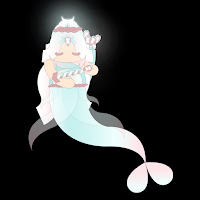
 Fig. 5b.1 / Character Design#1; Fig. 5b.2 / Close up#1, Week 2
(09.02.2021)
Fig. 5b.1 / Character Design#1; Fig. 5b.2 / Close up#1, Week 2
(09.02.2021)
First, I draw the Vormator
shapes with the pen tool (as exemplified by Ms Jennifer).
Second, I arrange that Vormator shapes into my sketches as my
guide. Next, I colour them with the gradient method (white,
rose gold, and baby Tosca). I tried to make it looks like a
transparent cloth, so reduce the opacity of cloth in the
Arthemis's waist. As you can see, the ")(" symbol at the
middle of the upside-down water drop and also the "moon"
crown, are glowing. I used inner glow in-fills, outer glow
in-fills, and gaussian blur in stroke. I knew this glow/ neon
method from Vector Slate (youtube).
I tried to recreate it again
with another colour. I don't like the previous one. I changed
into a premium theme and this is it. I like it!

Fig. 5b.3 / Character Design#2, Week 3 (09.09.2021)
3. Vector Illustration!
a. Inspirations
Back Card


Fig. 6a.1 / Back Card Reference#1; Fig. 6a.2 / Back Card
Reference#2, Week 3 (09.09.2021)
I found these vectors on
Pinterest. I chose these because I think it fits the premium theme that
I want. I used (Fig. 6a.1) and (Fig. 6a.2 - only the king's
crown) as my back card.
Front Card

Fig. 6a.3 / Front Reference, Week 4 (09.16.2021)
I found this on
Pinterest. This is an architectural Romanian. I chose this
to make aesthetic vibes. I drew it with a pen tool in
Adobe Illustrator.


Fig. 6a.4 / Background Reference#1; Fig. 6a.5 / Background
Reference#2, Week 4 (09.16.2021)
I'm not fascinated with my
game card#1 result (Fig. 6b.1). So, I decided to make the sea
look like my background and here are my references.
b. Progression

Fig. 6b.1 / Game Card#1, Week 3 (09.09.2021)
This is my first progress
in Game Card Design. Honestly, I don't like it 😢. I tried
so hard to change a little for the better, but still, I don't like it :'). Then, I decided to make a
new one.

Fig. 6b.2 / Background, Week 4 (09.16.2021)
This is my second
progress (background of front card) in Game Card Design.
First, I made a blue-green colour gradient with an
airbrush. After that, I added a yellow colour like the
light of the sun/moon entering the dark ocean. It's simple
and I like it. Next, I added fishes in dark blue colour
and reduce the opacity so that the fish don't become the centre of attention.
Last but not least, I put two pillars, vectors, and words.
For the texture of pillars and gold back card, I used that
method from Nick (Source: Textures from Nick)


Fig. 6b.3 / Front Card#2; Fig. 6b.4 / Back Card#2, Week 4
(09.16.2021)
This is my Game Card Design! I love it!
Q&A
🤷♂️:
Why did you choose number nine/ IX?
💁♀️: My favourite
number!
🤷♂️: Why is the symbol on the back of the card like a
balance?
💁♀️: Because because it describes justice
(she had a high spirit of justice)
🤷♂️: What does the
name "Arthemis" mean?
💁♀️: Goddes of the Moon.
d. Character Identification & Story Background
Name: Arthemis
Main Weapon: Arrows
Live: Water, Sea
Story:
Once upon a time, there was a female archer who had a high spirit
of justice. She often helps people who are in trouble. But one
night, when she came home after practising archery, there was a
series of accidents and she became one of the victims. Her leg was
injured and she fell into the sea. Due to the wound on her leg,
she couldn't swim up and she could only thrash around in the
water. On that dark and cold night, she could only see the
refractive light of the moonlight which for some reason shone very
brightly. Her bow had fallen to the bottom of the ocean but a few
arrows were still on her back. At that time, the blue light from
the moon enveloped her and she got another life, she turned into a
half-mermaid. Yes, She is Arthemis, the Goddess of the Moon.
She discovered that there was a world in the sea below,
UnderWorld.
Skill:
Transferring one's own prejudices, good or bad, into the mind
of the opponent. If the opponent is careless and thinks about
the meaning of those words, it will become a reality for a
while.
e. Final Outcome in PDF
Here's the final outcome in PDF.
<iframe
src="https://drive.google.com/file/d/1bS4hXT-X5hz6mbvmd2myrT0EMmPchz9K/preview"
width="640" height="480"
allow="autoplay"></iframe>
SUBMISSION DEADLINE
Friday 24 September 2021 by 11.59PM
Upload these files into your Google Drive Folder under Task 1
[Refer to the folder arrangement in Module details]. Also, please
ensure that the details you shared in the Contact Sheet are up to
date.
- Exercise 1: Vormator Challenge Final *.jpg for character design [600 x 600 pix]
- Exercise 2: Game Card Final *.jpg of the character + background + card composite [Tarot size 897 x 1479 pix]
- Blog update for Task 1 in your e-portfolio
1. SKETCHES
Ms Anis wanted to us make
sketches (more than one sketch), so I only sketched two sketches.
They were Arthemis and Ramona.
a. Arthemis (Goddes of the Moon)


Fig. 4.1 / Sketch Arthemis#1; Fig. 4.2 / Sketch ArthemisFix, Week 2 (09.02.2021)
This is my first character.
First, I got frustrated to taught the ideas with limited shapes
(Vormator shapes). I tried approximately 2-3 sketches to get this
design. I named it Arthemis, cause in many movies Arthemis is a
person who had arrows as her main weapon. I tried to make an
elegant and calm character. The tail has changed into water
drops because of the advice of the lecturer. I personally love this
sketch than my second sketch.
Vid. 4.1 / Arthemis, Week 2 (09.02.2021)
This is how I explore my
character (video speed in 30 seconds). First, when I showed it to
my sister, she said it looks like a souvenir 😂 so I decided to
give her a tail (mermaid tail). I imagine this character has a cool tone (blue, purple,
etc).
b. Ramona (Protector, Guide)

Fig. 4.3 / Sketch Ramona#1, Week 2 (09.02.2021)
This is my second character. My
brother gave me an advice, how about creating something like
insects. I suddenly thought about chains. Because the main
weapon is a chain, I want to create a sexy and bossy look, but I
also want to make something like a protector. That's why I give
the eye looks soft.
Vid. 4.2 / Ramona, Week 2 (09.02.2021)
This is how I explore my character (video speed in 30
seconds). I had a very long time finishing this picture, especially in the
chains. I'm glad that Ms Anis and Ms Jennifer vote for the
Arthemis one (Thank You, Miss, 😊). I imagine this character has a warm tone (red, brown, etc).
2. Vormator Challenge!
a. Colour Inspiration

Fig. 5a.1 / Colour Reference#1, Week 2 (09.02.2021)
I found this on Pinterest. I
very like the colour combination browny-pink/ rose gold (#fde4e8), white (#ffffff), and baby Tosca/ green-blue (#c6f0ee). Note 💁♀️: It might be a different device, different
colour.

Fig. 5a.1 / Colour Reference#2, Week 3 (09.09.2021)
b. Digital Look


Fig. 5b.1 / Character Design#1; Fig. 5b.2 / Close up#1, Week 2
(09.02.2021)
First, I draw the Vormator
shapes with the pen tool (as exemplified by Ms Jennifer).
Second, I arrange that Vormator shapes into my sketches as my
guide. Next, I colour them with the gradient method (white,
rose gold, and baby Tosca). I tried to make it looks like a
transparent cloth, so reduce the opacity of cloth in the
Arthemis's waist. As you can see, the ")(" symbol at the
middle of the upside-down water drop and also the "moon"
crown, are glowing. I used inner glow in-fills, outer glow
in-fills, and gaussian blur in stroke. I knew this glow/ neon
method from Vector Slate (youtube).
I tried to recreate it again with another colour. I don't like the previous one. I changed into a premium theme and this is it. I like it!
I tried to recreate it again with another colour. I don't like the previous one. I changed into a premium theme and this is it. I like it!

Fig. 5b.3 / Character Design#2, Week 3 (09.09.2021)
3. Vector Illustration!
a. Inspirations
Back Card
Back Card


Fig. 6a.1 / Back Card Reference#1; Fig. 6a.2 / Back Card Reference#2, Week 3 (09.09.2021)
I found these vectors on Pinterest. I chose these because I think it fits the premium theme that I want. I used (Fig. 6a.1) and (Fig. 6a.2 - only the king's crown) as my back card.
Front Card

Fig. 6a.3 / Front Reference, Week 4 (09.16.2021)
I found this on
Pinterest. This is an architectural Romanian. I chose this
to make aesthetic vibes. I drew it with a pen tool in
Adobe Illustrator.


Fig. 6a.4 / Background Reference#1; Fig. 6a.5 / Background Reference#2, Week 4 (09.16.2021)
I'm not fascinated with my game card#1 result (Fig. 6b.1). So, I decided to make the sea look like my background and here are my references.
b. Progression

Fig. 6b.1 / Game Card#1, Week 3 (09.09.2021)
This is my first progress
in Game Card Design. Honestly, I don't like it 😢. I tried
so hard to change a little for the better, but still, I don't like it :'). Then, I decided to make a
new one.

Fig. 6b.2 / Background, Week 4 (09.16.2021)
This is my second
progress (background of front card) in Game Card Design.
First, I made a blue-green colour gradient with an
airbrush. After that, I added a yellow colour like the
light of the sun/moon entering the dark ocean. It's simple
and I like it. Next, I added fishes in dark blue colour
and reduce the opacity so that the fish don't become the centre of attention.
Last but not least, I put two pillars, vectors, and words.
For the texture of pillars and gold back card, I used that
method from Nick (Source: Textures from Nick)


Fig. 6b.3 / Front Card#2; Fig. 6b.4 / Back Card#2, Week 4 (09.16.2021)
This is my Game Card Design! I love it!
Q&A
🤷♂️: Why did you choose number nine/ IX?
💁♀️: My favourite number!
🤷♂️: Why is the symbol on the back of the card like a balance?
💁♀️: Because because it describes justice (she had a high spirit of justice)
🤷♂️: What does the name "Arthemis" mean?
💁♀️: Goddes of the Moon.
Q&A
🤷♂️: Why did you choose number nine/ IX?
💁♀️: My favourite number!
🤷♂️: Why is the symbol on the back of the card like a balance?
💁♀️: Because because it describes justice (she had a high spirit of justice)
🤷♂️: What does the name "Arthemis" mean?
💁♀️: Goddes of the Moon.
Name: Arthemis
Main Weapon: Arrows
Live: Water, Sea
Story:
Once upon a time, there was a female archer who had a high spirit of justice. She often helps people who are in trouble. But one night, when she came home after practising archery, there was a series of accidents and she became one of the victims. Her leg was injured and she fell into the sea. Due to the wound on her leg, she couldn't swim up and she could only thrash around in the water. On that dark and cold night, she could only see the refractive light of the moonlight which for some reason shone very brightly. Her bow had fallen to the bottom of the ocean but a few arrows were still on her back. At that time, the blue light from the moon enveloped her and she got another life, she turned into a half-mermaid. Yes, She is Arthemis, the Goddess of the Moon. She discovered that there was a world in the sea below, UnderWorld.
Skill:
Transferring one's own prejudices, good or bad, into the mind of the opponent. If the opponent is careless and thinks about the meaning of those words, it will become a reality for a while.
e. Final Outcome in PDF
Here's the final outcome in PDF.
<iframe
src="https://drive.google.com/file/d/1bS4hXT-X5hz6mbvmd2myrT0EMmPchz9K/preview"
width="640" height="480"
allow="autoplay"></iframe>
FEEDBACK
Week 2 / 09.02.2021
May start to work on it in Adobe Illustrator. Ms Anis and Ms Jennifer
vote for my first character design (Arthemis). Change the tail shape
with the water drop shape (because the above is already complicated,
make it simple on the under). Start to create the story of character
design.
Week 3 / 09.09.2021
Try to remove the outline. Might see hello kitty mermaid as the
reference on the internet.
Week 4 / 09.16.2021
💁♀️: It's Public Holiday
Week 5 / 09.23.2021
Looking good. Actually, there are some design characters that are not centered in the middle, but it's okay.
Week 4 / 09.16.2021
💁♀️: It's Public Holiday
Looking good. Actually, there are some design characters that are not centered in the middle, but it's okay.
REFLECTIONS
If I may
describe one word about this class, it is challenging and exciting, from the
material and the lecturers. Now, when I look at a cartoon character, I don't
just see it as ordinary as it used to be, but now I observe and try to think
about how the shape, colour, emphasis, harmony, and expression that make a
character unique and memorable. I'm grateful to have learned about this
because it might be very useful in the future when I want to create a
character design. Even though it takes time, energy, and mind, I really
enjoy making this game card. Thankfully, if it wasn't taught like this,
maybe my skills in adobe illustration wouldn't have progressed this far.
Comments
Post a Comment